
How to Choose Window and Door Colors: RAL, Dual Colors and Finish Samples
Window and door color planning
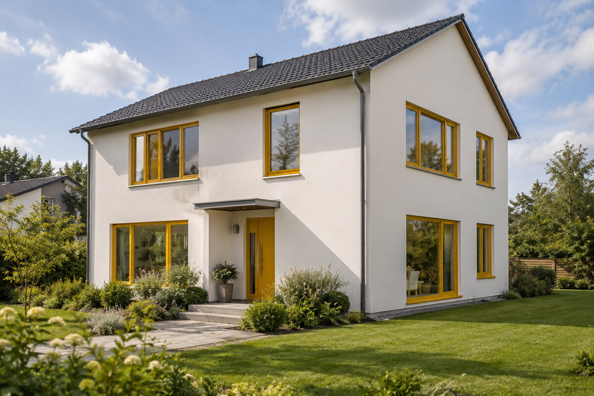
A color decision works best after the window and door operation, sightlines, and project scope are settled. A folding glazed door, sliding patio door, and outward-opening casement do not show the same amount of frame from indoors or outdoors, so one shade can read differently across them. List every opening included in the order, then identify the exterior surfaces that must work together: siding, brick, stucco, roofing, trim, gutters, and nearby metalwork. Next, decide whether the inside should follow the exterior or respond to individual rooms. Only then should you narrow the palette, discuss a RAL reference, and request physical finish samples. This sequence helps prevent an attractive isolated swatch from looking too stark, too heavy, or disconnected when repeated across the house.
Start with the opening, not the color card
Color is carried by frames, sashes, panels, and repeated profile lines, making operating style part of the visual brief. A row of casements creates a different rhythm from one broad fixed opening, while a patio door establishes a strong frame pattern at eye level. Mark each unit on elevation drawings or facade photos, noting its approximate size, operation, grouping, and viewing direction. Then decide whether the frames should recede, emphasize the geometry, or connect visually with another exterior element. A shade that feels restrained on one small window may become dominant when repeated across an entire glazed wall.
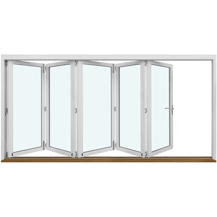
Scope determines how much freedom the palette allows. When only a rear opening is being replaced, its color must relate to the windows and materials that will remain. A whole-house project can establish a more consistent frame language. Review an outswing bifold door configuration at the same scale as adjoining units because its closed panel grid carries more visual weight than a compact sample window. Ask for drawings or available representations of the actual configuration in the proposed color. Settle the openings before comparing shades so every color decision has a clear architectural context.
Build the exterior palette from fixed materials
Begin with materials that are unlikely to change: masonry, stone, roofing, permanent siding, and substantial exterior woodwork. Look beyond broad labels such as white, gray, or red. A gray roof may lean blue or brown, while red brick may contain cream, charcoal, or buff tones in the brick and mortar. Compare candidate samples directly against these surfaces rather than relying on memory. The frame can echo a quieter color already present or create deliberate contrast. Be cautious with near-matches, which may appear accidental when the two materials are close but visibly different.
Study the front and rear elevations independently before requiring the same visual effect from both. Smaller street-facing openings may need a different degree of emphasis from a glass-dominant garden elevation. A fixed window makes the perimeter particularly noticeable because no operable sash interrupts the framed view. Place the finish sample beside the wall near an opening, then step back to the distance from which the facade is normally seen. The objective is not always blending. Contrast, a quiet border, or a clear connection to the roof or trim can each be appropriate when chosen intentionally.
Review the whole opening
Use RAL references as a communication tool
A RAL reference provides a specific point of discussion among the homeowner, designer, supplier, and installer. It is clearer than descriptions such as warm gray or nearly black, which different people may interpret differently. Enter the reference in the selection schedule beside the surface it controls: exterior frame, interior frame, door panel, or another confirmed component. For dual colors, record both references and identify which faces indoors and which faces outdoors. Retain that information with the approved sample, quotation, drawings, and revision history so an outdated early description does not override the final selection.
The reference alone does not define the complete appearance. Sheen, texture, substrate, profile shape, glazing reflections, and surrounding light can all affect the result. Images on a phone, monitor, or printed brochure are useful for narrowing choices but are unreliable for final approval. Ask whether a physical finish sample represents the proposed product treatment. For an outswing exterior door, distinguish between the panel color and frame color instead of assuming one reference covers both. The order record should connect the RAL reference, physical sample, product, and visible component without ambiguity.
Use dual colors to solve a defined conflict
Dual colors allow the exterior frame to support the facade while the interior face coordinates with walls, flooring, cabinetry, and furnishings. This can be useful when a dark exterior outline is wanted but a lighter interior is preferred in smaller or softly lit rooms. It can also maintain exterior consistency across a house whose rooms have distinct palettes. However, dual color is not automatically the better design. One color may create a calmer result, simplify coordination, and make connected spaces feel more unified. Identify the actual interior-exterior conflict before selecting two finishes.
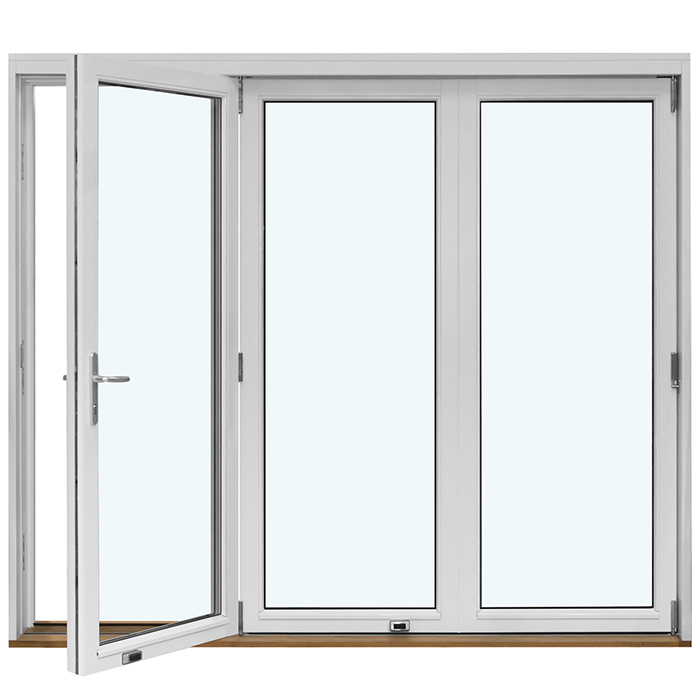
Map the surfaces visible in normal use before approval. At a doorway, the interior face, exterior face, panel edge, frame, adjoining glazing, and threshold may enter one view. A single-panel inswing patio door should therefore be reviewed from inside, outside, open, and closed. Ask how each selected color is assigned to the frame and panel or sash, and request a drawing or written clarification when the transition is unclear. Avoid shorthand such as dark outside and light inside. Every opening needs a component-level assignment that can be checked against the final order documents.
Test finish samples in their intended setting
Take the finish sample to the building rather than approving it solely in a showroom. Hold it vertically beside the siding, brick, stone, or trim close to the planned opening. View it in direct sun, open shade, overcast light, and at the time when that elevation is used most. Indoors, compare it with wall paint, flooring, cabinetry, and window treatments that will remain. Reflections from sky, trees, paving, and nearby buildings can alter the perceived relationship between the frame, glass, and facade. Label photographs by location and time so everyone compares the same observations.
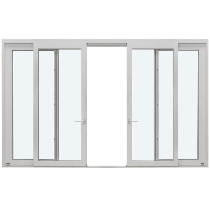
Position and distance matter. Mount the sample flush on a neutral board where practical, then inspect it from several feet away and from the normal approach to the house. For a wide Patio Life sliding patio door, compare the finish near both the fixed area and operating panel because reflections may vary across the opening. Indoors, view it with lights on and off, particularly when warm evening lighting is common. A small sample cannot reproduce an entire installation, but repeated checks can reveal unwanted undertones, excessive contrast, or a color that loses definition against adjacent materials.
Judge light and dark colors by visual weight
Light frames can merge gently with pale walls and make the glass feel less tightly outlined. Midtones often connect with muted masonry, weathered wood, and neutral interiors. Dark frames create stronger graphic definition and make sashes and panel divisions more visible. None is universally preferable. Decide what should lead the composition: the view, frame pattern, surrounding architecture, or a focal door. Try shading frame lines on a printed elevation in light, middle, and dark values. This simple comparison shows whether repeated divisions reinforce the design or make an otherwise quiet facade feel unnecessarily busy.
Include grilles and meeting lines in the comparison. Decorative bars can give a light frame a strong pattern, while a dark frame around one uninterrupted pane may appear crisp and simple. Ask how any decorative bars or glass-dividing bars relate in color to the frame. A two-sash outward-opening casement window has a central meeting line that changes its visual weight compared with a fixed pane of the same overall width. Review configurations closed and in balanced lighting. Choose the value that establishes the intended hierarchy across the elevation, not merely the shade that looks most dramatic as a small swatch.
Review the whole opening
Coordinate doors, windows, and hardware selectively
An entry door may be a focal point while the windows form a quieter background, or all openings may share a color for a continuous composition. Decide on that strategy before selecting individual shades. Review the door with sidelights, porch columns, exterior lighting, railings, and nearby garage doors that will remain. Exact matching is not always necessary; several materials in one identical color can appear flat, while related values can create depth. Define which elements should match, which should contrast, and which permanent feature takes priority when two parts of the palette compete.
Treat hardware as a separate selection. Handles and escutcheons are small but viewed closely, and they may either recede into the door or provide useful contrast. Do not assume hardware will match the panel or frame reference; confirm the options for the proposed order. When considering outswing panel entry doors, compare the door color with permanent house numbers, fixtures, railings, and mailbox finishes as one arrival composition. A close but unintended mismatch may be more distracting than a deliberate contrast. Use physical samples or confirmed finish representations instead of relying on unrelated product photography.
Plan interior continuity along real sightlines
Interior frame colors are seen closely and repeatedly. Walk the principal routes through the home and note which openings appear in the same sightline: entry to living room, kitchen to patio, or hallway to bedroom. One interior color can connect an open plan, but it does not need to copy every nearby finish. Dark cabinetry may coexist successfully with a lighter frame when the aim is to maintain a brighter perimeter. Also review wall depth, casing, and trim. Contrasting layers emphasize the opening, while related tones let the glass and view take priority.
A door needs a different interior review because it interacts with circulation, curtains, rugs, and furniture on one or both sides. Consider a two-panel inswing patio door with the proposed room layout and confirm that its operation suits the space before using color to refine its presence. Then decide whether it should recede behind the furnishings or form an architectural edge. Dual color cannot give one door a different interior face for every adjoining room. Where palettes conflict, prioritize the more public sightline or use wall and trim colors to create a controlled transition.
Give unusual shapes their own color review
Round, arched, angled, and roof openings attract attention because their outlines depart from standard rectangles. A dark finish can emphasize the geometry; a lighter related tone may let daylight and proportion provide the interest. Decide whether the opening should be a feature from outside, a subtle source of light, or both. Compare it with nearby standard windows from realistic viewing distances rather than judging it alone. Even when all units share one palette, a curved or angled perimeter may appear more prominent because the eye naturally follows its unfamiliar shape.
Grouped glazing should be reviewed as one composition. On a facade containing standard windows, a door, and an accent opening, place samples near each location and step back far enough to see their relationship. A triangular or angled fixed window should be assessed with the roofline, cladding transitions, and adjacent trim rather than as an isolated decoration. Check interior views as well, since sky and surrounding landscape can change reflection and contrast. Record the configuration, exterior color, interior color, and bar selection for every special unit instead of relying on a generic all-windows note.
Convert the choice into an order-ready schedule
Prepare a schedule that someone outside the design conversation can interpret. Give every opening an identifier matching the plan or elevation. Record its configuration, location, handing or opening direction where relevant, exterior color, interior color, panel color, decorative bar choice, and approved sample reference. Put exceptions in a visible field rather than burying them in comments. Ask the supplier to compare the schedule with the quotation and drawings, then perform the same comparison yourself. This catches inconsistencies such as one room receiving the wrong interior color or a door panel being assigned the frame finish.
Use the final review to ask precise questions: which visible parts each color covers, whether grouped units share the same reference, and how dual colors are shown in the order. Keep photographs of retained openings beside the chosen sample when an approximate relationship matters. Bloomcabin states a 4–6 week delivery period subject to order confirmation, and its windows and doors carry a 5-year warranty. Confirm the applicable order details before approval, since color changes made afterward can affect the process. Retain the signed documents, correspondence, and approved samples for future maintenance, additions, or replacement planning.
Frequently asked questions
Is a RAL number enough to choose a window or door color?
No. A RAL reference creates a clear shared language, but it does not replace a physical finish sample. Compare the sample with siding, masonry, trim, flooring, and paint. Confirm which visible parts the reference covers, particularly when a door has separately selected panel and frame colors.
When is dual color worth considering?
Consider dual color when the exterior must coordinate with the facade but the interior needs a different relationship to the rooms. It can support a dark exterior and lighter interior preference. Confirm the assignment for every frame, sash, and panel in writing rather than relying on a general two-color description.
Why does a finish sample change during the day?
Sun direction, cloud cover, shade, indoor lighting, surrounding colors, and reflections in the glass affect perception. Compare the sample outdoors in several conditions and indoors with lights on and off. This shows how the finish relates to the materials and lighting around the actual opening.
Should patio doors match every window exactly?
Not necessarily. Matching can create a unified elevation, while a contrasting door can serve as a deliberate focal point. Compare frame width, panel divisions, sightlines, and adjacent materials. A related color family may work better than an exact match when the door has a different architectural role.
What should I check before approving the colors?
Check every opening against a written schedule covering configuration, location, exterior color, interior color, panel color where applicable, and decorative bars. Compare the schedule with the quotation and drawings. Resolve unclear component assignments, then retain the approved physical sample and final written selection with the project records.
Next step
Choose window and door colors at building scale, then verify them at sample scale. Start with each opening’s operation and place in the elevation, build the exterior palette around permanent materials, and use interior sightlines to decide whether one finish or dual colors make sense. RAL references improve communication, while physical samples reveal the effects of light, texture, reflection, and neighboring surfaces. A component-level color schedule then turns a subjective preference into a coordinated specification that can be reviewed before order confirmation and retained for future work.
