
Black, Anthracite, White, or Greige: Choosing Your Pergola Color
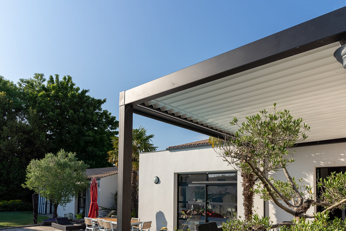
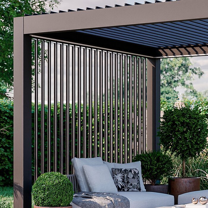
Outdoor design guide
The short answer
Choose black when you want a sharply defined contemporary frame, anthracite for a softer dark neutral, white for an airy connection to light-colored architecture, and greige for a calm bridge between hardscape and planting. Start with permanent house materials, then check samples in the actual patio light before making a final choice.
For most projects, matching every exterior finish is less important than creating a clear hierarchy. Let the pergola relate to the most visually important fixed element, such as window trim, roof accents, stonework, or the patio surface. Keep furniture and textiles flexible enough to evolve around that foundation.
01
For modern contrast
Black gives strong definition against pale siding, stucco, and open sky, but it becomes a highly visible design line from every viewpoint.
02
For versatile depth
Anthracite offers a charcoal-like presence that can coordinate with gray masonry, dark trim, and contemporary landscaping without reading as absolute black.
03
For softer integration
White and greige reduce visual heaviness; choose white for a bright architectural look and greige where warm neutrals, stone, or planting lead the palette.
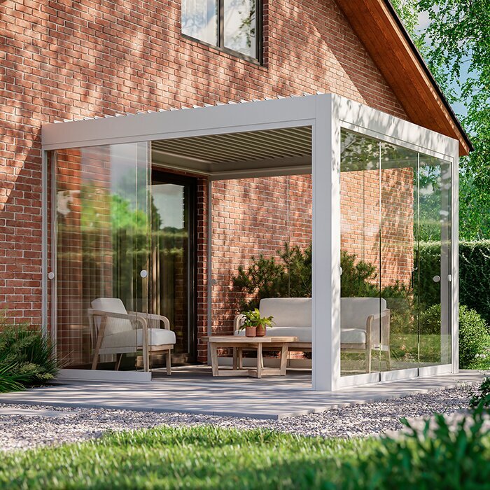
Choose a pergola color that makes your patio feel intentionally connected to the home.
Learning how to choose pergola color starts with looking beyond the pergola itself. Siding, brick, stone, window frames, gutters, fencing, and outdoor furniture already establish a palette. The most convincing choice usually either repeats one of those established notes or provides a deliberate, restrained contrast. A finish that looks appealing as a small swatch can feel much stronger once it outlines an entire patio.
Color also changes the way the structure reads in space. A dark frame can make a pergola appear crisp and architectural, while a light finish can make it recede against a pale house. Mid-tone greige often softens the transition between built surfaces and planting. Consider where you will view it most often: from indoors, from the yard, or while seated beneath it.
Practicality belongs in the decision as much as style. Pollen, dust, water spotting, fallen leaves, and fingerprints show differently from one finish to another, as do sun and shade throughout the day. Rather than chase a universally right answer, choose a color that suits your setting and the level of visual contrast you genuinely enjoy maintaining.
01 · Start with context
Read the house before the swatch
Begin with the colors that are hardest and most expensive to change: exterior cladding, brick, roofing, masonry, window frames, and doors. Photograph the house in morning, midday, and late-afternoon light, then identify whether its dominant cast is warm, cool, or mixed. This exercise often reveals that a favorite standalone pergola color does not support the home’s underlying palette as well as another option would.
Next, decide whether the pergola should blend into the architecture or act as a purposeful garden feature. Matching dark windows can create a cohesive elevation, while a contrasting frame can mark the patio as its own outdoor room. Neither approach is inherently more refined. The successful choice is the one that feels repeated elsewhere or clearly intentional, rather than accidental.
Treat roof, masonry, and window frames as primary references because they remain visible year-round and set the strongest exterior color cues.
Use movable cushions, planters, and rugs as secondary accents; they should support the pergola finish rather than determine it.
For a strong architectural focal point, explore bioclimatic pergola designs in a finish that relates to your home’s most permanent details.
02 · Dark finishes
When black makes sense
A black pergola creates the clearest graphic outline of the four choices. It can give a pale stucco, cream siding, or light stone facade a precise contemporary edge, especially when black appears in window mullions, railings, lighting, or door hardware. Against lush planting, it tends to frame the greenery rather than compete with it, giving the patio a composed, garden-room character.
Its visual strength requires honest assessment. On a small patio, black can feel substantial, particularly when the home and paving are also dark. Dust, pollen, and light mineral residue may be more apparent on broad dark surfaces, depending on local conditions. Before choosing it, look at the view from inside the house; that dark outline will be present even when the patio is not in use.
Choose black to repeat existing dark metalwork or to create a confident contrast against a predominantly light exterior palette.
Balance a black frame with lighter paving, cushions, or surrounding planting if the patio already has many dark surfaces.
If you prefer a straightforward, fixed-look outdoor structure, compare regular pergola options that let a black finish carry the visual definition.
03 · Dark neutrals
Why anthracite feels more forgiving
Anthracite is often the useful middle ground for homeowners drawn to dark framing without wanting the full intensity of black. Its deep gray character works naturally beside charcoal roofing, gray composite decking, slate-toned pavers, and many contemporary window colors. It still gives the patio definition, yet its softer tonal shift can make transitions between house, hardscape, and landscape feel less abrupt.
Pay attention to undertones when comparing anthracite with existing materials. A blue-leaning gray may sit differently beside warm tan stone than a warmer, softer gray. Bring samples outdoors and place them directly against siding and paving rather than judging under indoor lighting. On overcast days, anthracite can appear more understated; under bright sun, its shape and texture may become more pronounced.
Anthracite suits projects with layered grays, natural stone, or dark trim where pure black would feel too stark.
Check the finish beside warm brick and wood as well as cool paving, since undertones influence the final impression.
For adaptable shade-oriented styling with this softer dark neutral, consider anthracite bioclimatic pergola models alongside your exterior material samples.
04 · Light architecture
Use white to open the patio
A white pergola can make an outdoor area feel lighter, especially beside white trim, pale siding, coastal-inspired facades, or sun-washed stucco. Rather than drawing a dark line around the patio, it reflects the home’s brightness and can visually reduce the apparent weight of the structure. This is especially helpful where the terrace sits close to the house and you want the architecture to read as one connected composition.
White needs context to avoid looking disconnected. On a house with dark bronze windows and saturated brick, a bright frame may feel like a separate object unless white already appears in trim, columns, fencing, or furniture. It may also reveal dirt, splash marks, and airborne grime differently than darker finishes. Regular gentle cleaning habits matter more than the assumption that one color stays cleaner.
Use white to echo light trim, columns, and siding, particularly where the goal is a bright, open patio atmosphere.
Add warmth through wood furniture, terracotta pots, or textured fabrics when an all-white outdoor scheme feels too clinical.
A light finish can keep the profile visually calm on white regular pergola designs when the house already carries a bright architectural palette.
05 · Warm-neutral balance
Let greige connect patio and garden
Greige combines gray restraint with a warmer, beige-leaning softness, making it a practical answer for homes that mix stone, wood, taupe, cream, and muted gray. It does not demand the contrast of black or the brightness of white. Instead, it can act as a transition color, helping an aluminum pergola sit comfortably between a paved terrace and the more variable colors of planting.
This finish is particularly worth considering where the outdoor palette changes across seasons. Fresh green foliage, dry grasses, weathered wood, and warm evening light can all sit easily beside an understated neutral. Greige is not invisible, however; its warmth should relate to the dominant masonry or decking tone. Test it near the actual patio surface, because surrounding gray concrete can make a warm greige appear noticeably different.
Choose greige when stone, wood, and planting are more influential than crisp black-and-white architectural contrast.
Pair greige with layered neutral textiles and natural materials for a patio that feels relaxed without becoming visually flat.
To make a warm-neutral frame part of a flexible outdoor room, view greige bioclimatic pergola styles with your paving and wall finishes in mind.
06 · Light and scale
See color through the day
The same pergola color can look dramatically different in direct sun, open shade, reflected light from pale paving, and evening illumination. Dark finishes often stand out most against bright sky, while white may merge into a light facade at midday. Greige and anthracite shift more subtly, but their undertones still respond to nearby materials. A sample viewed only on a phone or in a showroom cannot replace an outdoor check.
Scale also alters perception. A small swatch of black may feel elegant, but a full perimeter of posts and beams creates a much stronger visual boundary. Conversely, white on a large structure may become a clear architectural statement rather than disappearing. Mark the planned footprint with tape or stakes where possible, then stand at key viewpoints to imagine how the chosen color will occupy the space.
Assess samples against vertical walls and horizontal paving because reflected light from each surface changes perceived color differently.
Review the patio after rain or irrigation too, when darker paving and wet planting can shift the overall color balance.
When evaluating how a finish reads across changing daylight, look at traditional regular pergola forms as a simple way to judge frame color and proportion together.
07 · Care expectations
Choose for real-life upkeep
No color eliminates outdoor cleaning. The visible evidence simply varies: pale finishes can show mud splashes and dark streaks, while black and deep gray may highlight pollen, dust, water spots, or dried residue. Nearby trees, roof runoff, irrigation, traffic dust, and coastal or urban exposure all influence what you notice. Choose the finish whose normal signs of use will bother you least between routine cleaning sessions.
Think beyond the frame alone. A dark pergola may look best with furniture that holds its own against the contrast, while white can make fading cushions or stained umbrellas seem more obvious. Greige and anthracite often provide a more accommodating backdrop for seasonal changes in textiles and containers. Plan storage and cleaning access early, especially around posts near planting beds or outdoor kitchens.
Match your expectation to the site: tree pollen, sprinkler overspray, and dusty roads create different cleaning patterns than sheltered patios.
Select accessories after the finish, using fabric and planter colors that remain comfortable when weathering or seasonal change occurs.
For a polished frame that can anchor changing furnishings, browse black bioclimatic pergola configurations as part of a complete patio color plan.
08 · Confident final choice
Coordinate, do not overmatch
A well-integrated patio does not need every metal surface to be identical. In fact, trying to match an existing color perfectly can draw attention to small differences in sheen, age, and undertone. Aim instead for coordination: repeat a color family, balance warm and cool notes, and give the eye a few intentional connections. A black pergola can relate to dark windows without duplicating them exactly; greige can complement stone without imitating every vein.
Before ordering, make a simple decision board with photos of the facade, paving, furniture, planting, and candidate finishes. Reduce the choices to two, then view them at the site under different weather conditions. If the property is subject to community guidelines, local review, or insurance considerations, check the relevant authority or insurer before proceeding. A current quotation can clarify available finish choices for your selected configuration.
Choose the color that works from the interior view, the seating area, and the yard rather than favoring one photographable angle.
Keep one dominant neutral, one supporting neutral, and a limited accent palette to prevent the patio from feeling visually crowded.
For an understated framework that coordinates rather than competes, consider warm-neutral regular pergola choices as you finalize the overall exterior palette.
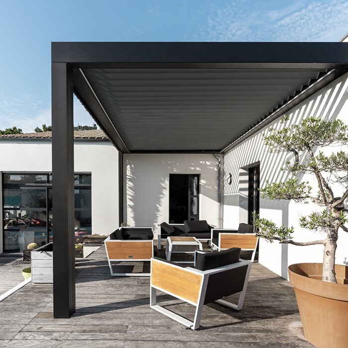
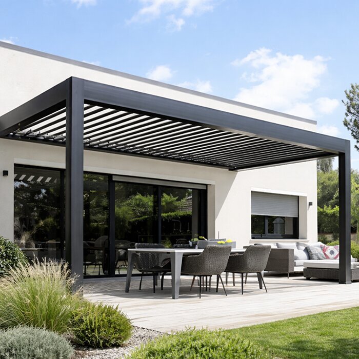
Compare the four pergola colors
Use this comparison as a design filter, not a substitute for seeing finishes beside your home. Each color can work beautifully when its contrast, undertone, and maintenance visibility fit the site.
Black
Bold architectural outline
Light siding, black trim, lush planting
Anthracite
Softened dark definition
Gray masonry, slate tones, contemporary exteriors
White
Bright, open connection
White trim, pale facades, sunlit patios
Greige
Warm neutral transition
Stone, wood, taupe finishes, natural gardens
Any finish
Coordinated overall palette
Samples reviewed in actual patio light
A practical color-selection process
A short, site-based process prevents an attractive swatch from becoming an awkward full-scale choice. Work from fixed materials outward, and give daylight equal weight with personal taste.
01
Photograph the exterior
Take wide and close views of the house, patio, windows, and garden in sun and shade. These reveal recurring colors and competing undertones.
02
Name the dominant materials
List the finishes you cannot easily change, such as brick, siding, roofing, paving, and window frames. Rank them by visual prominence.
03
Set the desired contrast
Decide whether the pergola should blend with the facade, repeat dark trim, or become a distinct garden feature. Avoid an undecided middle ground.
04
Test two finalists outdoors
Place finish samples beside wall and paving materials at different times of day. Include the view from inside the home before choosing.
05
Build the accessory palette
Choose cushions, planters, lighting, and dining furniture after selecting the frame color. These flexible layers should reinforce the final direction.
Pergola color checklist
Use this checklist before moving from inspiration images to a final finish selection. It keeps design preferences tied to the realities of your property and daily use.
01. Identify the exterior material that visually dominates the patio: siding, brick, stone, or the paving surface.
02. Check whether window frames, gutters, railings, or doors offer a useful existing color to repeat.
03. View candidate finishes in morning, midday, late-day, and overcast conditions at the planned installation area.
04. Decide whether you want the frame to blend into the home or establish a clear outdoor-room boundary.
05. Consider how nearby trees, irrigation, dust, and roof runoff may affect visible marks on each finish.
06. Review the color from indoors, where the pergola will become part of your everyday window view.
07. Plan a restrained furniture and textile palette that supports the frame instead of competing with it.
08. Confirm any community, local authority, or insurance questions with the relevant organization before finalizing plans.
Frequently asked questions
Is black or anthracite better for a pergola?
Neither is universally better. Black creates stronger contrast and a more graphic silhouette, which suits homes with black trim or pale facades. Anthracite is a softer dark neutral that can be easier to integrate with gray masonry and mixed materials. Compare both against your exterior finishes in natural light.
Does a white pergola make a patio look larger?
White can make a structure feel lighter and less visually heavy, which may help a compact patio feel more open. The result also depends on post placement, paving color, surrounding walls, and planting. It works best when white or other pale tones already appear on the house or nearby details.
Is greige a good choice with natural stone?
Greige can be an excellent companion for natural stone because its warm-neutral character often bridges beige, gray, and weathered wood tones. Still, stone varies widely. Check a sample beside the actual stone in changing daylight, since a greige that appears balanced indoors may look too warm or too cool outside.
Which pergola color hides dirt best?
There is no finish that hides every kind of outdoor residue. White may reveal mud and dark streaking, while black can show pollen, dust, and water spotting. Anthracite and greige may look less stark between cleanings in some settings, but nearby trees, sprinklers, and local conditions matter more.
Should the pergola match the window frames exactly?
Exact matching is not required and can be difficult when materials have different sheens or ages. A coordinated relationship is usually enough. You might repeat the same dark family as the windows, use a lighter neutral to soften it, or select greige to connect trim with stone and paving.
Should I check rules before choosing a color?
Yes, if your home is subject to an HOA, architectural review, local planning requirements, or insurance conditions, confirm relevant expectations before committing. Requirements and decisions vary by location and policy. It is also sensible to review the available finish options in a current quotation for your intended pergola configuration.
Explore pergola finishes
Make color part of the whole patio plan
The right pergola color is the one that makes the patio look settled into its surroundings. Black delivers deliberate contrast, anthracite brings adaptable depth, white adds brightness, and greige offers a softer route between architecture and garden. Let fixed materials and real daylight guide the decision more than a trend image.
Take the final two finishes outside, compare them from every everyday viewpoint, and picture them alongside the furniture and planting you plan to keep. Bloomcabin can help you explore a pergola direction that supports the character of your home without turning the color choice into an afterthought.
Find a frame color that brings your house, terrace, and garden into one considered outdoor setting.
