
Warm or Cool Pergola Lighting: Choosing Color Temperature
Pergola lighting
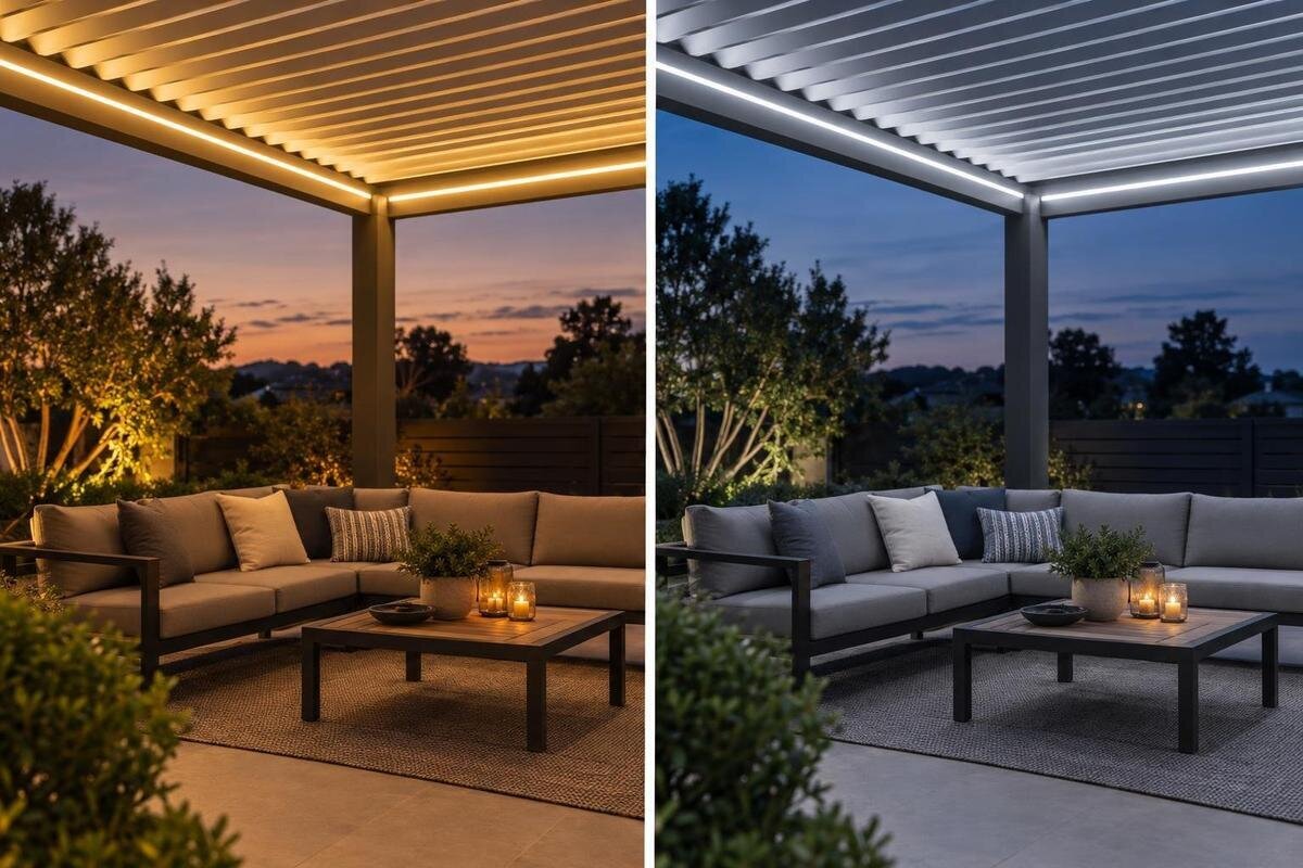
An evening pergola may serve as a place for long dinners, conversation, reading, or games, and the white light that suits one activity may feel too crisp or too amber for another. Color temperature gives a useful starting point for comparing those impressions, but it does not prescribe a correct setup. The most reliable choice is the one that looks comfortable with the actual seating, finishes, and view at night, using a fixture whose specifications and approved use are known.
01
What color temperature measures
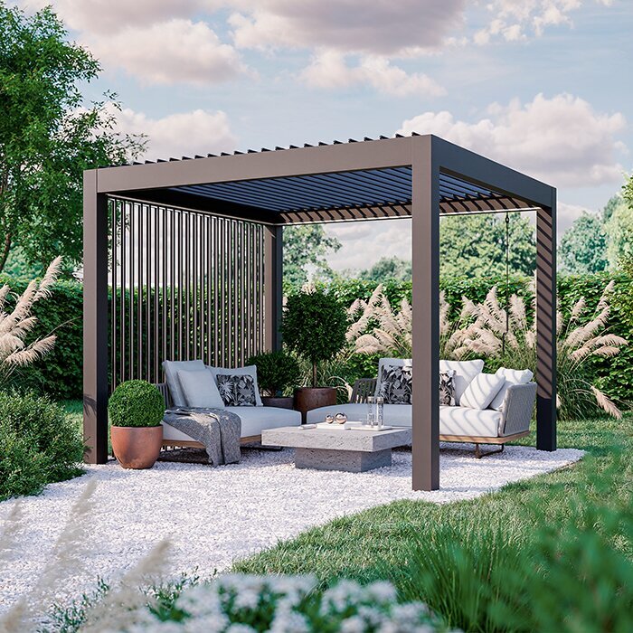
Color temperature, often listed as correlated color temperature or CCT, describes the appearance of white light in kelvins (K). A lower number generally looks warmer, with an amber or yellow cast; a higher number looks cooler and can seem more neutral or bluish. Around 2700 K is commonly sold as warm white, and many 3000 K products also read as warm. Light around 3500–4000 K may be described as neutral or cool. These are useful reference points, not fixed boundaries: manufacturers use labels differently, and the fixture affects what you see. Kelvin describes color appearance, not physical heat or brightness.
Use CCT as one part of a lighting specification, not as a substitute for other decisions. Lumens describe light output; optics and placement affect where light falls; color rendering affects how objects appear. Lower Kelvin does not automatically mean dimmer, softer, more efficient, or more suitable outdoors. Ask for the exact fixture’s stated CCT rather than relying on a phrase such as warm glow or a color-adjusted product photo. A useful comparison sheet keeps color temperature, output, color rendering, and control features in separate columns so that one appealing feature does not obscure another difference. If you are comparing the structure and lighting at the same time, Bloomcabin Bioclimatic Aluminum Pergola identifies a pergola model; it does not establish a compatible light or its Kelvin value. Keep the structure selection and the lighting specifications separate until the proposed combination has been verified.
Warm white for dinners and conversation
Warm white gives an evening scene an amber-leaning cast that many people associate with lamplight and relaxed dining. It can make cream, warm wood stains, brick, and red or orange details appear more golden, while cool-toned finishes may look less crisp beside it. That impression is not a guarantee of coziness: personal preference, the exact shade, and the strength and direction of the light all matter. Two sources labeled 3000 K can still look different, so a marketing label alone will not predict how welcoming the finished space feels.
Try warm white as one candidate when you mainly use the pergola for supper or conversation. Look at faces, plates, menus, and nearby surfaces at the brightness you expect to use. If food or print needs to be seen clearly, check light output and distribution separately instead of assuming a higher CCT is the answer. For a useful dinner comparison, put out the dishes and linens you normally use rather than judging an empty table. Notice whether white plates look pleasantly warm or more yellow than you prefer, and whether the people across the table look natural to you. If you are considering the Bloomcabin Lean-To Pergola, include the home’s exterior finish in your comparison. A warm light that looks appealing on wood furniture may create a different impression against a cool-colored wall, especially when both occupy much of your evening view.
02
Cooler white for detail-focused activities
Neutral or cooler white can feel crisper, with less amber in its appearance. Some people prefer it for reading, board games, or tasks involving printed details, and it may look more at home beside cool-gray finishes. That does not make it inherently more functional: visibility depends on suitable light output and coverage, as well as contrast and personal preference. A high Kelvin value cannot compensate for a table that is not receiving enough light.
Consider whether the main activity really calls for a cooler tone, or whether a suitable task light would meet the need while the rest of the space stays warm. A table used for both dinner and games may call for a middle ground rather than a stark white. Test with an actual book or game: compare small lettering, colored pieces, and the table surface instead of judging only the light source. If one option makes details easier to distinguish, consider whether it also has more output or better coverage; the improvement may not come from its color temperature. When reviewing the Bloomcabin Pergola for a planned seating area, describe the activities you want the lighting to support before selecting a tone. That gives the configuration discussion a concrete purpose without assuming that a particular lighting option is available for the structure.
Color temperature and color rendering are separate
Color temperature and color rendering answer different questions. CCT describes whether white light appears warm or cool; color rendering describes how a source reveals the colors of objects. Two lights with the same Kelvin rating can make skin, food, leaves, and fabric look different. A daylight label or a higher CCT does not prove that colors will look more accurate. If faithful color matters to you, look for the fixture’s color-rendering information in its technical specifications rather than relying on the warm-or-cool description.
This distinction matters around an outdoor table, where dishes, cushions, napkins, and plants may appear together. If a sample or demonstration is available, view objects whose colors matter to you under that light. Include several colors rather than just a white surface: a white plate helps you judge the overall tint, while a red napkin or patterned cushion shows another aspect of the result. If specifications list a color rendering index, or CRI, treat it as color-rendering information, not a Kelvin value. The two measures are not interchangeable, and a sample remains useful even when both are documented. As you review the bioclimatic aluminum pergola listing, keep your finish samples alongside the separate lighting comparison. Phone screens, cameras, and daylight can change how a product image looks, so the listing’s photographs cannot establish how your selected light will render those materials.
03
How surrounding materials change the impression
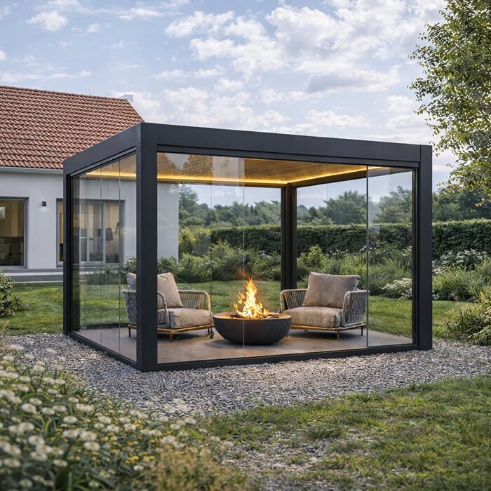
The pergola’s surroundings are part of the scene your eye reads. A pale painted wall can pick up a warm tint, while colored walls, decking, stone, rugs, and upholstery can shift the overall impression. Darker surfaces generally return less light toward the eye than pale ones, and greenery and the dusk sky add colors that change as daylight fades. These factors do not alter the fixture’s stated CCT, but they do affect how its light looks in context. A label alone cannot predict the result against every combination of finishes.
Gather useful samples—such as fabric swatches, a cushion, or a plate—and compare them with the light after sunset, when the setting resembles its usual evening use. Avoid making the choice from a daytime view or a phone photo alone. Place the samples where you would normally see them, not all directly beneath the brightest part of the light. This helps distinguish the appearance of the whole seating area from one strongly illuminated surface. For a wall-mounted design, you can use the Lean-To Pergola product page as a reference while assembling your finish choices, but assess your home’s actual exterior paint separately. If you plan to repaint or replace the furniture, compare those proposed finishes too. Otherwise, you may choose a tone that suits today’s patio but gives an unwanted cast to the larger pale or colored surfaces in your intended design.
Choose for the way you use the pergola
List the activities that happen most often beneath the pergola: a long dinner, conversation, reading, or a game at the table. Pick the main use first, then consider what tone you enjoy for the less frequent ones. You might compare warm options around 2700–3000 K with a neutral option, if that is available; treat the numbers as candidates, not recipes. A household that values a calm evening look may choose differently from one that prefers a cleaner, cooler appearance, even for the same activity.
Think about the transition from dusk to full darkness and the view from indoors as well as from the seats outside. An outdoor light may appear alongside interior lamps through a window, but matching those tones is a preference rather than a requirement. If activities vary, decide whether one consistent tone works or whether separate settings would be useful. For a project involving the Bloomcabin Pergola page, a brief description such as “mostly dinner, occasional reading, visible from the living room” is more helpful than simply requesting warm lighting. Rank those uses so an occasional task does not dictate the appearance of every evening. You might accept a slightly less amber tone for the whole space, or prefer a warm general setting with a separately considered reading light. These are choices to compare, not assumed features of the pergola.
04
Keeping multiple lights visually consistent
When several lights contribute to one seating area, a consistent color temperature can make the scene feel more unified. Matching stated Kelvin values helps reduce obvious differences, but it does not guarantee identical-looking light: sources can vary in tint and color rendering as well as output. This is why replacing one fixture with a different model can change the appearance even when both packages use a similar warm-white label. Compare the listed specifications and, when possible, view the sources together.
Mixing tones can still work when the difference is deliberate, such as a warmer dining area beside a separate space for reading. Randomly mixing warm and cool bulbs close together can instead make surfaces look unevenly colored. Pay particular attention to areas where the light overlaps: a tablecloth or pale wall can make a difference between sources easier to notice than two separated pools of light. Also include existing porch lights and light spilling through windows in the comparison, since they may remain visible even after you select new fixtures. If you are planning lighting around a bioclimatic pergola model, note which existing lights will normally be on at the same time. You do not have to replace or match every source; decide whether their contrast looks intentional from the seats and from the house before choosing the new lighting.
What dimming can—and cannot—change
Dimming and changing color temperature are separate capabilities. A basic dimming control generally reduces a light’s output without changing its selected CCT. Some products are designed to shift warmer as they dim; tunable-white products let you select a range of color temperatures. Names for these functions vary, so look for the exact behavior and range in the manufacturer’s specifications. Do not assume that every LED, dimmer, or control system supports the same adjustments.
If you want a single, predictable evening tone, a fixed-CCT fixture may be all you need. If the pergola will serve both relaxed dinners and detail-focused tasks, selectable tones may be worth comparing, provided the specific fixtures and controls support them. Distinguish a fixture with a few preset color temperatures from one offering an adjustable range; either could meet your needs, but they provide different choices. Also ask whether selecting a tone is an everyday control function or a setting made during setup. When considering a wall-mounted pergola listing, include those preferences in the lighting discussion rather than assuming the structure determines the control features. For shared use, check whether the preferred setting is easy to recall and whether the light returns to it after being switched off. A feature is only useful if its actual operation suits the household.
05
Check the exact fixture’s outdoor specification
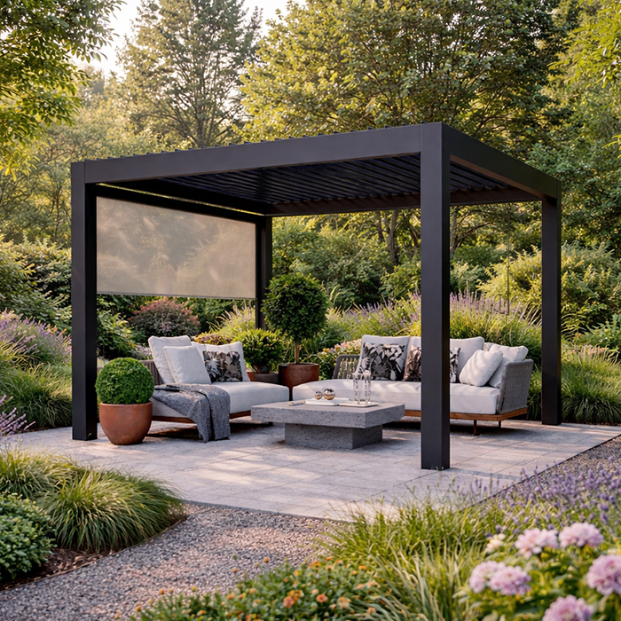
Before settling on a color temperature, identify the exact fixture being considered and read its manufacturer information. Check that its declared outdoor rating is appropriate for the location and exposure, and look for a specific Kelvin value rather than an informal description alone. Also verify the fixture’s control requirements and any limitations on where or how it may be mounted. A pleasing color temperature says nothing about whether a particular product is suitable for a particular outdoor setting.
Pergola designs and lighting products can have their own instructions, so ask for documented confirmation that the specific fixture and proposed mounting arrangement are approved together. Where electrical work or mounting suitability needs review, have a qualified professional use the exact product manuals and project details. This is especially important if parts of the structure move or the light may be exposed to changing weather. A general color preference cannot replace those checks, and a product image is not evidence of an approved installation.
Compare samples in the evening setting
If samples or demonstrations are available, compare the candidate lights in an evening setting that resembles your usual use. View them against the actual table, finishes, and nearby wall or planting, rather than deciding from a bright showroom or a web image. Compare at similar brightness where the controls allow; otherwise, a difference in output can distract from the color-temperature comparison. First view each option on its own, then compare them together if the demonstration permits. Side-by-side viewing makes differences obvious, but seeing each light alone helps you judge whether you actually enjoy it as the main source. Give yourself time to look around instead of deciding from the first glance. Keep the same nearby lights on for each comparison so the background does not change. Use a demonstration in the way the manufacturer specifies rather than improvising a temporary installation.
Write down the CCT, fixture model, color-rendering information, and dimming behavior for each option you like. Note whether it suits dinner, conversation, or a task, and whether it looks consistent with other lights in view. A brief comparison after dusk can reveal a preference that is hard to predict from Kelvin values alone. Once the visual choice is clear, keep it separate from the final check of outdoor rating, controls, and documented mounting approval.
Frequently asked questions
Is warm or cool light better for pergola dining?
Warm white is a common starting point for relaxed meals because many people like its amber-leaning appearance in the evening. Cooler white may suit you better if you prefer a crisper look. Compare actual fixtures with your table and finishes rather than treating either choice as a rule.
What Kelvin range is considered warm white?
Around 2700 K is commonly labeled warm white, and many 3000 K lights also appear warm. Descriptions vary between manufacturers, so check the stated Kelvin value and, if possible, view a sample before deciding.
Does cool white make a pergola brighter?
No. Kelvin describes the apparent color of the white light, not its output. Compare the fixture’s lumen information and how its light is distributed separately; a cooler color temperature does not make a low-output light brighter.
Can warm and cool lights be used together?
Yes, if the difference is intentional—for example, to give separate activity areas distinct tones. Randomly mixing color temperatures can make nearby parts of one seating area look inconsistent. Check how the actual fixtures appear together, not just their labels.
Does dimming change a light’s color temperature?
A basic dimming control generally lowers output without changing the selected color temperature. Some products are designed to become warmer as they dim, while tunable-white products let you select a range. Check the exact fixture and control specifications.
Warm white is a sensible first sample for relaxed dining and conversation, while a neutral or cooler tone may better suit people who prefer a crisper look or need to focus on details. Neither is automatically brighter, more accurate, or more appropriate outdoors. Compare the actual light with the materials and activities under your pergola after dark. Then use the fixture’s exact specifications and documented approval—not its color label alone—to confirm that it is suitable for the intended setting.
