
How to choose window and door colours, finishes and samples
Colour planning for windows and doors
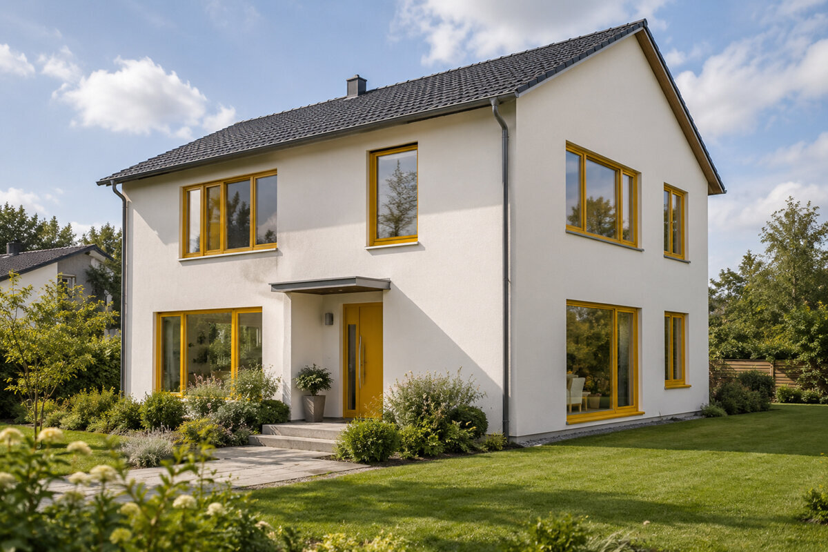
Measurements may be settled and the door shape agreed, yet one modest finish sample can decide whether the façade, roof, rainwater goods, floors and furnishings feel coherent. Colour deserves more thought than a last-minute ordering choice. On any window or door, hue interacts with sheen, texture, glazing bars and the proportion of glass. Its appearance also shifts between north-facing daylight, low sunshine and warm lamps indoors. Begin by mapping every opening, noting fixed building materials and testing physical samples on site. That groundwork reveals whether a single restrained palette will unite the design or whether different finishes indoors and outdoors will serve it better.
Review the building before choosing an individual frame
Begin with the street front, garden elevation, gables, roof windows and doorway as one composition. Dark framing may give pale render welcome definition, yet it can add clutter where the façade already has many lines. Change your viewing position as well. At a distance, the spacing of openings and the overall frame pattern dominate; nearby, handles, seals, profile edges and texture attract notice. Mark every window, external door and broad glazed area on photographs or elevation drawings. Beside them, record the roof tone, wall finish, plinth, metal details and shading devices. The resulting overview shows where colour should command attention and where it ought to remain quiet.
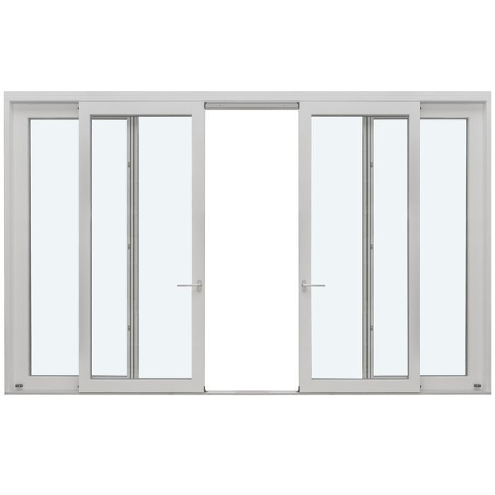
Consistent colouring outdoors need not make all products visually identical. The broad Patio Life lift-and-slide model presents much more framing than a modest window and therefore carries greater weight on the garden side. Judge its finish beside façade joints, paving and nearby balustrades. The entrance door might provide the main colour note while the windows remain subdued. Alternatively, repeating the window shade on the door can steady a frontage already animated by brick, a porch roof or lighting. Before requesting samples, state a simple design intention—for example, that openings should recede into the walls or that the doorway should draw the eye. Use this sentence to guide each later decision.
Use RAL references to coordinate the specification
RAL terminology gives everyone involved a precise reference when coordinating windows, doors, sun shading, a letterbox or painted metalwork. A broad label such as green or grey is too vague; record the complete designation agreed within the selected system. This reduces the risk of trades or suppliers interpreting similar names as different hues. Ask the adviser which visible part each entry describes, including the room-side frame, weather-side frame, leaf, infill panel, fixed outer frame and accessories. Where two colours are ordered, both references must appear clearly on the specification and final approval.
Even an exact colour reference cannot make unlike materials appear identical. Surface relief, reflectivity, form, illumination and area all influence what the eye sees. The same swatch may seem different beside coarse render and beside a slim glazed profile. Check the intended RAL shade against actual neighbouring materials rather than trusting a screen: use spare render, masonry, flooring or a finished metal component where available. If an adjoining product follows another colour system, compare physical pieces instead of assuming similarly named shades will agree. The code removes uncertainty from the written instruction; the sample reveals whether the visual relationship works.
Judge the complete opening
Make separate decisions for each face
Outside, a frame relates to the house, nearby buildings and natural light. Inside, it belongs with paint, furniture, flooring and the atmosphere of the room. Those different settings can justify two finishes: an external shade that settles into the elevation and a paler or warmer room-side treatment that feels less heavy. The distinction matters particularly around expansive glazing, where framing remains prominent from the living space. A dark external scheme may look crisp from the garden but form an imposing grid in a low room or across numerous small openings. Choosing a light internal face does not oblige you to repeat it on the façade.
Consider internal finishes room by room without creating needless variations. Set samples beside flooring, skirting, internal doors, cabinetry and radiator recesses. On single-sash windows that open inwards the room-side shade becomes especially noticeable once the sash swings away, exposing its edge beside the fixed frame. Observe which surfaces face the room in the open position. Repeated spaces can share one base finish, with exceptions reserved for a clear reason, such as a deliberately moody study or a period palette. Record that reasoning. It will still make sense when hardware, dimensions or matching additions are discussed many months later.
Choose texture and sheen as well as colour
A shade name tells only part of the story. Matt, satin and brighter finishes return light in different ways, while smooth and textured surfaces create distinct shadows and tactile effects. Dark texture may suppress broad reflections but become pronounced under light from the side. Smooth material can appear restrained and graphic, although highlights show more readily. Examine samples vertically rather than leaving them on a tabletop. Turn each one towards and away from the light, then step back to a normal viewing distance. Inspect profile corners, rebates, seal junctions and other places where narrow shadows alter the perceived depth of the finish.
Repeat the test in several settings: outdoors beneath cloud, in direct sunshine and inside under the lighting normally used after dark. Place each option beside both pale and deep-toned materials. Photographs are useful records, but displays, camera exposure and automatic colour correction can misrepresent the result, so inspect the pieces themselves. Request the specified production surface rather than a generic paint swatch. If the door and windows are intended to use unlike textures, put those exact samples together. Ask whether they read as a purposeful pairing, not simply whether either looks attractive alone. A convincing relationship between the two is more useful than pursuing a supposedly universal perfect finish.
Bring large glazing and moving panels into the plan early
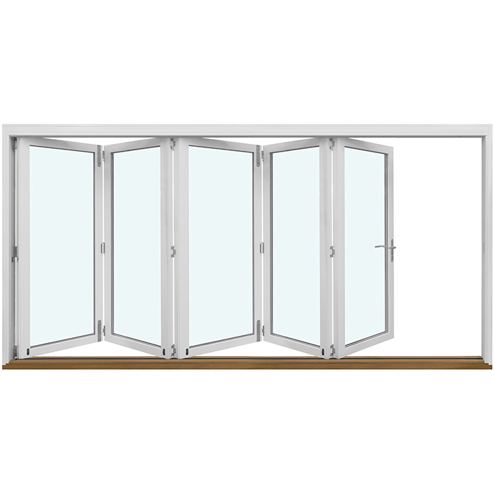
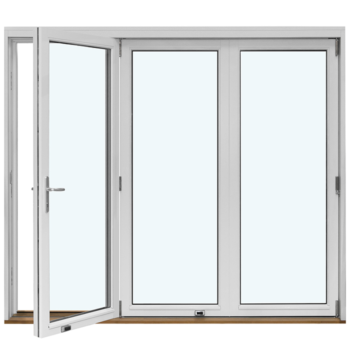
Frames around patio doors, sliding units and folding systems often divide an entire wall, so their colour affects the whole room. Pale framing may blend gently with the glazed area, whereas a dark outline can give the garden view a picture-like boundary. Review both effects alongside the proposed furniture, window dressings and principal sightline outdoors. For folding doors that open outwards the composition changes once the panels stack at the side. Request more than a closed drawing: study how the frame lines gather in the open arrangement likely to be used through summer.
Include every exposed system component in the colour review. Confirm the intended finish of handles, hinges, covers, fittings and visible threshold sections from both directions. Carefully selected framing can lose coherence if these smaller items introduce several accidental tones. Exact matching is not compulsory; a measured contrast can clarify where the door is operated. It should, however, be intentional. Save an open and a closed view for every major glazed opening, and annotate sample photographs with the adjacent floor, wall and curtain finishes. This converts a collection of swatches into a record of how the design will look and function in daily use.
Coordinate glazing bars, subdivisions and frame colour
Glazing bars increase the proportion of colour seen across an opening. Closely spaced subdivisions create a stronger pattern over the glass, particularly in a deep shade; a pale tone or one close to the wall colour can make the pattern quieter. Establish whether the bars are decorative additions or components that physically separate panes. Their construction is different, though both change the elevation. Decide first which lines remain perceptible at the normal viewing distance. In drawings, colour every proposed crosspiece and upright rather than indicating only the perimeter, so the full rhythm can be assessed.
Consider the historic-style outward-opening “Kombi” casement window as a composition of colour and subdivision. Period character depends on the balance among frame depth, opening sashes, glazing bars and the surrounding wall—not simply on selecting a light or dark shade. Review a scaled drawing or a photograph with comparable proportions, rather than judging from a tiny swatch. Decide, too, whether the entrance and windows should follow one visual idea. A sleek contemporary doorway can sit deliberately beside strongly divided traditional windows, but a repeated hardware finish or related colour should connect the contrast.
Review the complete opening
Test unusual window shapes on their own terms
Circles, semicircles, triangles and angled formats place colour around an opening differently from ordinary rectangles. Because the outline already draws attention, its frame can become a bold graphic feature. With fixed glazing in triangular or sloping forms review the intended weather-side shade on a full drawing of the gable. Strong separation from the wall can underline the roof geometry, while a closely related tone lets the unusual outline settle more gently into the façade. Base the decision on the architectural role, not merely on the rarity of the shape: should it organise the elevation or supply a focal point? Check this from realistic distances, including the far end of the garden and the opposite side of the road.
Centre-pivot roof windows require their own review. Outdoors, changing viewpoints and light from the sky alter their presence; indoors, the reveal, ceiling and wall finishes frame them. Do not copy the vertical-window colour automatically without first treating the roof as a separate plane. Identify which internal sections will sit beside the ceiling or wall. For an unusual outline, photograph the intended location and draw its approximate shape over the image before comparing samples. This visual exercise supports colour judgement but is not a substitute for technical design. Record the result apart from decisions about dimensions, glazing and opening operation, keeping aesthetic choices distinct from product configuration.
Decide whether the entrance should stand out or align with the windows
An entrance concentrates render or brick, a canopy, number, lamp, handle, sidelight and paving within a small area. Its door colour should therefore be planned alongside the windows, not afterwards. Choose whether the door is to announce the arrival point or sit quietly within the framing scheme. A bold shade works best with calm surroundings, while matching colour can still leave the door distinctive through its scale, infill or handle. For an outward-opening front door with an infill panel compare the leaf, exposed frame and panel together. One isolated swatch cannot communicate how colour is distributed across those parts.
Glazing beside the door broadens the entrance composition and extends its lines. For a single-piece glazed door sidelight, assess whether its frame, the door proportions and the glazing read as one assembly, or whether the door should retain the appearance of a solid central form. Position samples at the intended point on the wall and view them while the door is shut and swung open. Close-range details—handles, edges and junctions—matter more here than they do on an upstairs opening. Specify the hall-facing finish as well. A restrained pale face may suit the interior even if the external treatment is emphatic. Considering arrival from outdoors and movement from the hall keeps the result coherent.
Turn sample comparison into a structured test
Arrange samples early, whether purchased or borrowed, so the final choice is not rushed by an order deadline. Label each piece with its complete shade, surface and intended face. Limit each session to a small group; subtle differences become harder to judge when too many near-identical options compete. First identify a broad family, perhaps a warm charcoal, balanced pale grey or subdued green, then shortlist two or three versions. Hold them in the correct orientation at the façade and revisit them later the same day. Time and changing illumination help distinguish a considered preference from an immediate reaction.
Use a written test sheet. Note the response to sunshine, the relationship with the wall and roof, the appearance beside the indoor floor and the proposed hardware shade. Record why an option succeeds rather than simply marking it as liked. A bigger coated piece or a visual rendering may resolve doubts, but final approval should still refer to a physical surface. Gather agreement from everyone authorised to decide before submitting the configuration. A late alteration can affect both faces, accessories and several products, not colour alone. Formal sample sign-off is therefore an essential part of defining the order rather than an optional decorating exercise.
Record every colour choice on the order
Prepare a schedule for each element before purchase. Include its room, position on the building, product category, opening action, two face colours, surface and exposed accessories, then identify the approved sample. This check will expose an unintended upstairs finish or a patio-door colour that breaks the garden scheme. For single-leaf patio doors opening outwards state the viewing direction used for each side. Labels such as left or right are easily misread unless the observer’s position is defined. Pair every colour entry with either the indoor or outdoor face.
Read the confirmation row by row, checking colours as carefully as measurements and quantities. Resolve four points wherever an entry is unclear: whether the full reference is shown, which face it covers, whether the surface treatment is stated, and whether it applies to both the fixed frame and the opening leaf or sash. Keep the approved schedule, marked elevations and sample details together. Bloomcabin provides a five-year guarantee for its windows and doors, with delivery expected four to six weeks after confirmation of the order. Those terms do not remove the need to verify the configuration before approval. Good records also support later queries, additions and coordination among the project team.
Questions customers often ask
Can one RAL reference coordinate a window and entrance door?
It provides a precise written starting point, but the appearance still depends on texture, sheen, illuminated area and scale. Put production samples beside one another and beside the roof, façade and adjacent finishes. Record the complete reference separately for the indoor and weather-facing surfaces.
Why choose different colours for the indoor and outdoor faces?
Because each face belongs to a different setting. The external shade supports the building composition, whereas the internal one relates to the floor, walls and furniture. This deserves particular attention around extensive glazing. Label each face unmistakably on the specification so that the two finishes cannot be exchanged during ordering.
Must all of a home’s windows share one internal finish?
Repeating a room-side shade usually gives continuity and simplifies future matching. A planned exception can suit a space with a deliberately separate palette. Review adjoining rooms and long sightlines before deciding, then explain and assign every exception on the element schedule.
What is a manageable sample shortlist?
Select two or three candidates from one defined colour family. An oversized selection tends to obscure subtle distinctions. View the shortlist outdoors by day and indoors beneath the usual lamps, placing it beside original materials and checking it from several distances before signing off.
What should be written into the final colour approval?
For each product, specify the outdoor and indoor shades, surface, approved swatch, exposed hardware and the viewpoint used for each face. Add the product category and opening action. Verify every entry against the confirmation so the original design intention becomes an auditable specification.
The final check
Successful colour planning is built from connected observations rather than a digital image. Study the house as a whole, identify shades precisely with RAL references, consider each face in its own setting, inspect the specified physical surface and document every opening. Broad glazing, glazing bars, unusual shapes and the doorway each change how much colour is visible, so examine them individually within the overall scheme. Keep the shortlist focused and revisit samples on site as illumination changes. When the approved schedule and the physical sample carry identical information, the idea remains consistent across every window and door.
