
Which greenhouse colour suits your home and garden?
Greenhouse planning and garden design
Which greenhouse colour brings together your home, garden and personal style?
A greenhouse frame colour does not determine its usefulness, but it strongly shapes its presence in the garden. Considering the facade, paths, terrace, planting and light helps create a result that feels right for years.
A greenhouse is normally visible throughout the year. Its colour therefore deserves as much attention as its position, shape and glazing. The frame may blend quietly into the existing scheme, create a clear contrast or form a restrained line between plants and architecture. What matters is not a general trend, but how everything works together in your own setting.
Look at the colour in different light: morning, midday sun, overcast weather and from the key viewpoint. Surroundings also alter perception. A dense hedge makes a frame look different from a pale rendered facade, open lawn or stone-paved terrace. Samples, photographs and views from indoors can all help you decide.
The best greenhouse colour supports the role you want it to play. If the building is intended as a deliberate garden feature, the frame can show its outline. If it should recede visually, quiet links to window frames, roof details or plants are valuable. Colour does not replace careful planning, but it makes a suitable concept feel coherent.
01 · Understanding colour impact
The frame defines the architecture
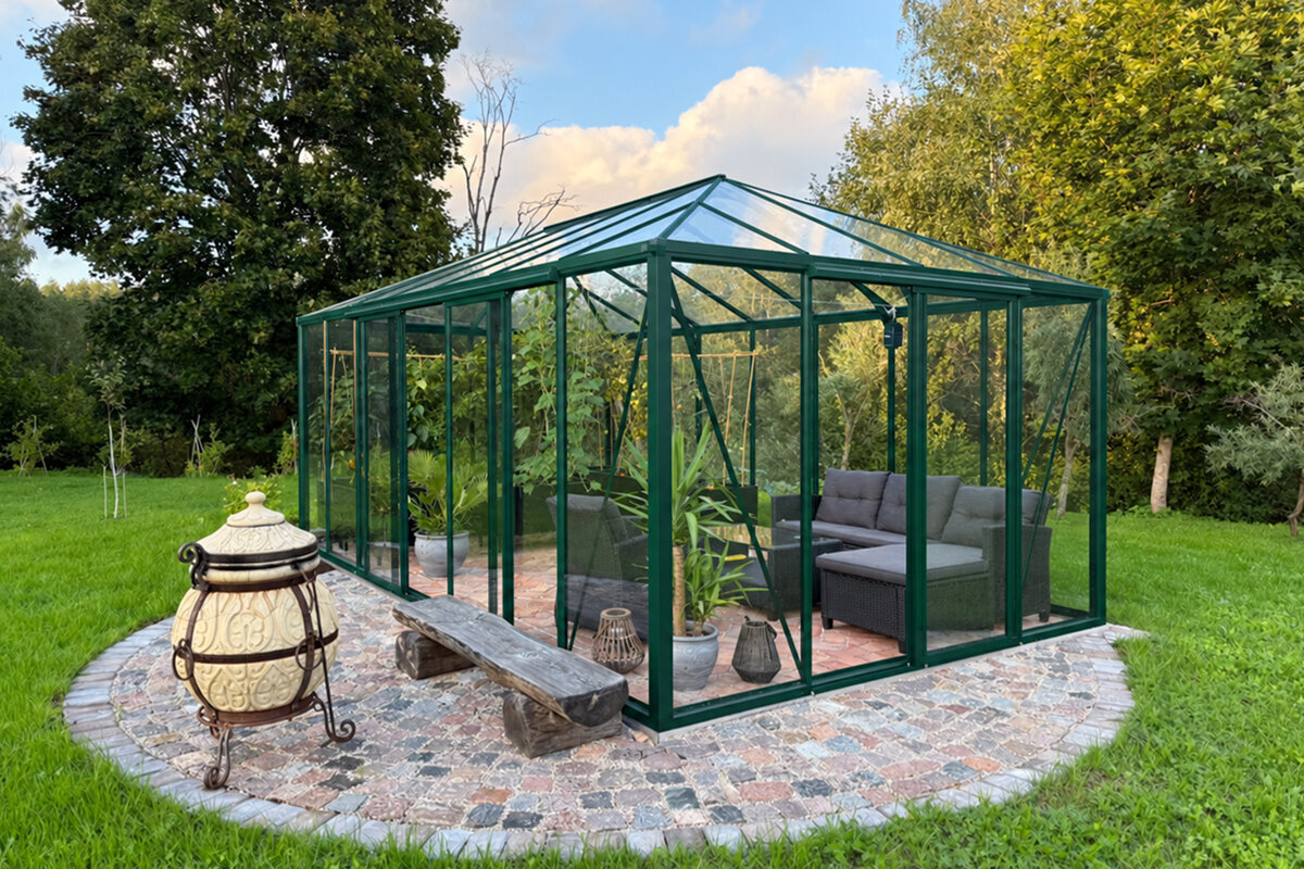
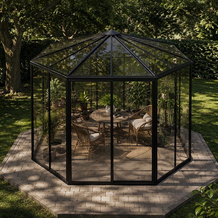
A greenhouse is made of transparent surfaces and slim lines. That is precisely why frame colour affects its appearance more than expected. Dark profiles draw around the glass like a sketch, while light profiles visually recede. Green frames create a link between technical construction and the living garden. No effect is inherently better; it needs to suit the presence you want.
Consider viewing distance. Up close, profile colour, fittings and joins are clearly noticeable. From the house or far end of the garden, the silhouette matters most. A strong frame can give a freestanding structure definition. In a small garden already rich in detail, the same colour may create unnecessary visual activity. Colour should make proportions legible, not compete with them. Also consider profile colour at edges and intersections, where the structure becomes visually denser. A frame can seem finer than expected when it orders the lines clearly, or more prominent when it contrasts strongly with its background.
- Dark frames emphasise outlines and make a greenhouse’s geometric form easier to recognise from a distance.
- Light or green frames reduce visual weight and let plants, glazing and surroundings make a stronger impression.
For a sharply defined freestanding option, consider a standard Classic greenhouse with a clear frame line that gives the garden architecture visible structure.
02 · Black frames
Black for contrast and precision
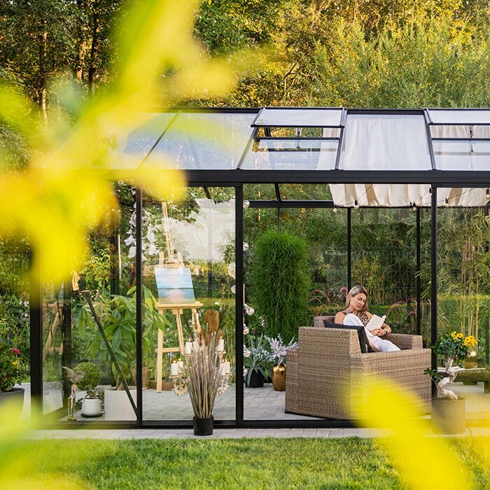
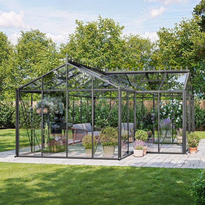
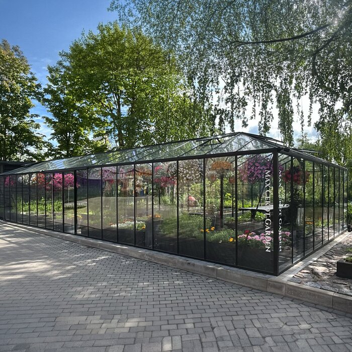
A black greenhouse often feels architectural and deliberately placed. Contrast with the glass highlights glazing bars, rooflines and door frames. It can work beautifully with anthracite windows, dark roof details, black lighting or steel furniture. Beside pale render, gravel and pared-back planting, it also creates a crisp, contemporary composition. Black is therefore less a neutral option than a design statement.
Black can also work in lushly planted gardens when you want structure. Against deep green foliage, profiles stand out clearly, while pale flowers and terracotta create lively contrast. Consider nearby dark fences, sheds or facades, however: if several weighty surfaces meet, the area can feel compact. Open sightlines, pale ground finishes or airy planting around the site can help. Black feels particularly balanced when its clean lines find a connection in the setting, without every detail needing the same colour. A few repeated accents may be enough for the greenhouse to read as a considered part of the overall design.
- Repeat dark accents sparingly in lighting, furniture frames or planters so the frame does not appear isolated.
- Check the view under overcast skies; black often appears stronger there than in sunny garden photographs.
Beside a dark or clearly structured facade, a full-size standard black Lean-To greenhouse can continue the existing lines with calm precision.
03 · Green frames
Green lets the greenhouse blend in
Green is an obvious choice when a greenhouse should feel embedded rather than displayed in the garden. The shade connects with hedges, lawns, shrubs and perennials without needing to match them exactly. It can feel naturally at home in rural, romantic or long-established gardens. The structure remains recognisable, yet is usually less dominant than the changing seasons of planting.
Surroundings determine success with green too. A frame looks different beside evergreen hedges than against silvery foliage, red brick or a natural-stone wall. Look at the dominant green tones rather than simply choosing a “garden colour”. Very cool or dark planting can make a frame stand out more than expected. Leaving a little space beside dense hedges preserves light, access for care and a readable outline. With green frames, assess the distance between greenhouse and planting. Some separation keeps the silhouette visible, while dense greenery integrates the frame more strongly. This lets you choose whether structure or planting takes priority.
- Green works particularly well where beds and shrubs frame the site and the greenhouse should feel visually integrated.
- Pair the frame with natural materials such as timber, brick or gravel without trying to match every element by colour.
In a mature planted garden, a standard Classic greenhouse with a green frame can retain its form while still feeling pleasantly integrated.
04 · Natural aluminium
Aluminium feels light and understated
Natural aluminium brings a clean, light character to the garden. It is neither as graphic as black nor as plant-related as green, making it a good option for restrained overall schemes. It often creates a balanced connection with pale facades, concrete, natural stone, galvanised metal details or crisp terrace surfaces. The greenhouse appears light while reflections in the glazing and changing planting animate the scene.
Neutral does not mean invisible. Aluminium can appear brighter in direct sun and deliberately cool beside warm timber facades. View neighbouring surfaces together: gutters, sills, railings, planters and fittings all influence the impression. Different metal tones on a home do not need an exact match. More important is that the frame looks like an intentional part of the material palette rather than an accidental addition. With natural aluminium, nearby metal surfaces matter too. Silvery downpipes, fittings or railings can create a calm link. Where very different metal tones meet, a clear, deliberately selected palette is often more convincing than apparent exact matching.
- Natural aluminium supports light, minimalist or material-led garden schemes with stone, concrete and glass.
- Allow for reflections: depending on daylight, the structure can look brighter or more restrained than a colour sample suggests.
Along a pale, straight house wall, a full-size standard aluminium Lean-To greenhouse can feel like a light extension of the existing material palette.
05 · Home and terrace
Use the facade as a colour guide
The facade often provides the most dependable guide for colour selection. Look beyond the render shade to repeating details: window frames, front door, roof edge, downpipes, railings and sun shading. A black frame can echo dark profiles; aluminium can suit silvery metal accents; green can soften the transition from home to garden. One or two connecting elements are enough.
The terrace is the second important reference point because it is often where the greenhouse is experienced most intensely. Timber decking, ceramic tiles, brick and furniture fabrics each create their own colour mood. Strong contrast can frame a seating area and add depth. If the terrace already has many materials and colours, a calmer frame choice is often wiser. Place samples next to the actual surface, not only beside a screen. Also assess colour from indoors. Window frames and the garden view form a fixed picture. A frame that seems discreet outside can appear far more graphic from the living room.
- Look for repeated accents on the house rather than seeking an exact colour match with large facade areas.
- Evaluate views from living spaces and the terrace, as these shape your daily experience of the greenhouse.
For a freestanding structure at the transition to the terrace, a standard Classic greenhouse for the garden offers a clearly defined option that can be positioned flexibly.
06 · Garden style and seasons
Plants change every colour choice
Garden colours in Malta change through the year. Spring brings fresh growth and flowers, summer may bring drier tones, autumn renewed growth and winter structure, depending on exposure and irrigation. A green frame can blend into dense foliage, while black makes a strong outline where planting is sparse. Aluminium responds visibly to light and weather. Consider every season in which you use and see the garden, not only its most colourful month.
Garden style also provides direction. A formal garden often accommodates precise contrasts and clear repetition. A naturalistic garden benefits more from materials and colours that do not demand attention. In a cottage garden, both green and black can work, depending on brickwork, paths and edging. The key is hierarchy: should the greenhouse be a backdrop, a focal point or a linking element? Seasonal effect depends not only on frame colour but on flowers, foliage and ground surfaces around the site. Plan these surroundings as a changing frame, so the greenhouse retains a convincing role in every season.
- Photograph the proposed site through several seasons if the decision does not need to be made immediately.
- Plan planting around the greenhouse as part of the colour composition, while keeping access and care areas clear.
For a flowing transition between living space and seasonal planting, a full-size standard Lean-To greenhouse against the house provides a natural starting point for the design.
07 · Proportion and location
Colour can alter perceived size
The same colour affects a small greenhouse differently from a larger structure. Dark frames can divide a broad glass area and give it definition. On compact forms, however, they make the construction especially visible. Light profiles make surfaces appear visually lighter, while green can seem restrained beside dense planting. Always assess colour and dimensions together rather than as separate decisions.
The background also affects perceived size. Against a pale wall, a black frame is sharply defined; in front of a dark hedge, aluminium can shine more strongly. On open lawn, the silhouette is visible from several sides, whereas a corner between the house and screening can be designed more selectively. Mark out the footprint on site and view it from normal routes through the garden. This reveals sightlines and unwanted dominance early. Viewing height also changes colour perception. From a raised terrace or upper window, rooflines are more prominent than from a garden path. Especially with dark frames, check how clearly the structure appears from different heights.
- A contrasting frame increases visible definition; a restrained frame can make glazed surfaces appear lighter.
- Consider background, distance and viewing direction before choosing colour solely from the building frontage.
As a clear focal point on an open site, a standard Classic greenhouse in a striking colour can visibly and intentionally support garden structure.
08 · Deciding with confidence
Check colours in context before buying
A sound colour choice comes from comparison, not a quick impulse. Gather photographs of your home in different light and place them beside material or colour samples. Look at the extent of the frame, not only a small section. Discuss the choice with everyone who regularly uses the garden. This clarifies whether you want quiet integration or a distinct architectural statement.
Practical questions also matter. A greenhouse is cleaned, planted and viewed from different sides. Consider how dust, pollen or water marks may show at the site, without making blanket care claims. Check the current product presentation and available finishes before ordering. If connection to the house, proximity to boundaries or planning conditions matter, ask a perit and the Planning Authority to classify the proposal. If you are choosing between two colours, describe the desired effect in a few words: striking, integrated, or light and clean. This simple priority helps weigh individual factors and avoids choosing a colour solely because of a small sample.
- Create a small material board using a facade photograph, flooring sample, furniture colour and plant images for a realistic comparison.
- Clarify design controls and site-specific requirements early with a perit and the Planning Authority.
For a colour-coordinated extension along the house, you can choose a full-size standard Lean-To greenhouse and compare its effect within the complete setting in advance.
Comparison
Black, green or aluminium compared
The three frame colours serve different design purposes. This overview provides an initial guide, but does not replace looking at your site, existing materials and local light.
| Colour | Effect | Often suits |
|---|---|---|
| Black | Graphic, precise and deliberately present | Dark profiles, clear architecture and contrasts |
| Green | Plant-related, calm and integrated | Hedges, perennials, brick and established gardens |
| Natural aluminium | Light, neutral and material-led | Pale facades, stone, concrete and silvery accents |
| Black against a light background | Clearly outlined and striking | Open spaces and deliberately placed sightlines |
| Natural aluminium among dense greenery | Light with restrained reflections | Bright garden areas with glass and clean materials |
Five steps to a harmonious colour
Take a systematic approach so frame colour is not chosen in isolation. A few focused observations can narrow the choice to options that genuinely suit your home and garden.
01
Set viewpoints
Note the views from the kitchen, living room, terrace, garden path and driveway. Prioritise the perspectives you experience most often each day.
02
Gather materials
Compare facade colour, window frames, paving, roof details and furniture. Look for recurring tones rather than complete uniformity.
03
Observe the light
View the site in sunshine and under cloud. Glass and metal react to light, so the impression changes during the day.
04
Define the garden role
Decide whether the greenhouse should be a focal point, a quiet backdrop or a linking element. This gives black, green or aluminium a clear direction.
05
Review your choice
Compare the preferred colour with photographs and current product information. Consider form, location and adjacent planting together.
Checklist for choosing your colour
Take these points with you when inspecting the site or comparing colour samples. The clearer your answers, the more confident your design decision will be.
01. I know the key views from the home, terrace and garden, and have considered them in different light.
02. I have included windows, roof edges, downpipes and other visible metal accents in my selection.
03. I know whether the greenhouse should stand out deliberately or blend quietly into planting.
04. I have assessed the background at the site: pale wall, hedge, fence, open lawn or mixed materials.
05. I assess colour with glass reflections, plinth, paths and terrace paving rather than from a screen image alone.
06. I consider spring growth, drier summer tones, autumn recovery and winter structure when deciding.
07. I leave sufficient access around the greenhouse for cleaning, planting and maintenance.
08. I check current versions and clarify local requirements in good time before placing the final order.
Frequently asked questions about greenhouse colour
Is black always modern for a greenhouse?
Black is often associated with contemporary architecture, but it can work equally well beside brick, natural stone or classic garden structures. Repetition in the setting and the desired level of presence are decisive. If dark reference points are entirely absent, the frame may be used as a deliberate contrast or appear too dominant.
Does a green greenhouse suit only a naturalistic garden?
No. Green can also work in orderly schemes, for example where hedges, clipped forms or planted screening shape the design. In very minimalist gardens, green usually feels softer than black or aluminium. Decide whether the structure should form part of the planting backdrop or stand as an independent architectural piece.
Is natural aluminium always neutral?
Natural aluminium is visually restrained, but not invisible. Its pale metallic appearance can contrast noticeably with warm timber or dark facades. It often feels especially harmonious beside concrete, pale render and silvery details. Always assess the colour beside the real materials in your outdoor space.
Should the frame colour match the window frames?
An exact match is not necessary. It is often enough for the frame to pick up an existing accent or complement the home’s material palette. Where a house has many different colours, a deliberately neutral option can create more calm than trying to match every shade precisely.
Which colour works with lots of planting?
Green can be especially restrained among dense planting, while black keeps the structure clearly visible. Aluminium brings brightness between foliage and glass. Background and distance are important: colour reads differently directly in front of a hedge than with open space or a path in between.
Do I need to consider building requirements because of the colour?
Possibly. The site and full proposal matter, including scheduled status, conservation value, Outside Development Zone (ODZ) land and existing permit conditions; colour alone does not settle permission. For a greenhouse near the home or a boundary, ask a perit and the Planning Authority to classify the proposal early.
Plan colour as part of the whole picture
A colour that brings the setting together
The right greenhouse colour comes from the interplay of architecture, plants, light and personal taste. Black creates definition, green integrates, and natural aluminium keeps the design light and practical. Defining the greenhouse’s intended role first makes the choice much more confident.
Take time to view the site and compare materials in their real setting. Your greenhouse then becomes not only a practical garden space, but a visibly harmonious part of the home and outdoor area. Bloomcabin offers different design approaches to support your planning.
Explore greenhouse forms and frame options that suit your home, garden style and sightlines.
