
Choosing window and door colours: RAL, inside/outside colours and samples
Planning guide for windows and doors
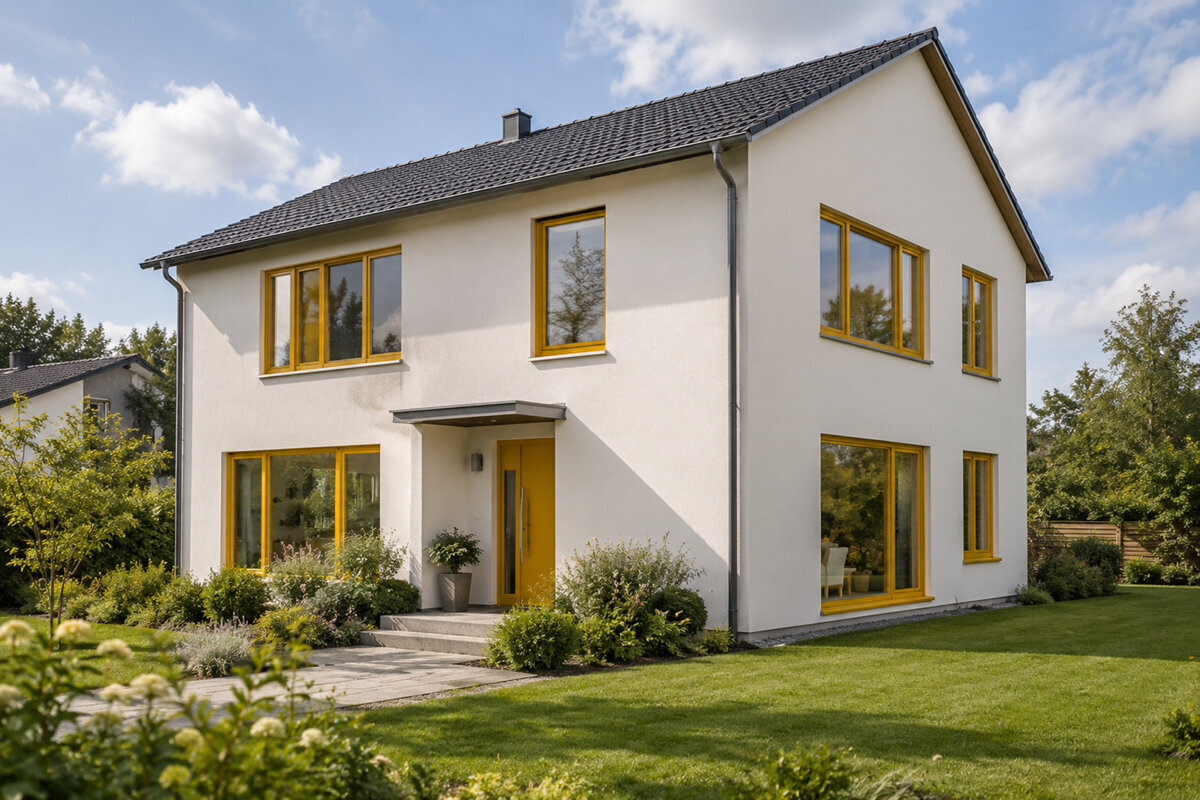
The windows have been measured, the door style is set – then a small colour sample suddenly decides whether façade, roof, rainwater pipes, flooring and furnishings belong together. That is why colour should not be treated as the final click when ordering. With windows and doors, colour, sheen, texture, glazing bars and glass area always work together; the same finish also looks different in north light, low sun and warm indoor lighting. A reliable colour scheme starts with an overview of every opening, the components already selected and real samples at the property. Only then can you judge whether one consistent shade creates calm or different colours inside and out are the better choice.
Start with the building view, not one product
Look first at every side of the house: street façade, garden elevation, gable, roof windows and entrance. A dark frame can define a light rendered façade precisely, while the same contrast may look restless on an already articulated façade. Distance matters too: from several metres away, the rhythm of openings and frame lines stands out; close up, handles, seals, profile edges and surface texture become noticeable. Create an elevation sketch or photo montage and mark every window, external door and large glazed opening. Note the roof colour, façade material, plinth, metalwork and shading alongside it. This reveals which colour should lead and which components may deliberately recede.
A consistent exterior colour does not mean that every element must look identical. A wide Patio Life lift-and-slide door has far more visible frame area than a small window and therefore has a stronger effect on the garden side. Check its colour against fixed façade joints, terrace paving and any railings. At the entrance, the door can act as an accent while windows form a restrained line. Conversely, a door matching the windows can calm the architecture where brickwork, a canopy or lights already draw attention. Before reviewing samples, formulate one design rule, such as “Openings sit quietly within the façade” or “The entrance makes a clear accent”. This rule makes later individual decisions easier.
Use RAL as a shared language for colour
RAL references are primarily a coordination tool. They give a shade an unambiguous reference when windows, doors, shading, letterboxes or metalwork are being planned. Do not simply note a colour name such as grey or green; record the complete agreed designation from the chosen colour system. This prevents several people from working with similar-sounding but different shades. During consultation, ask exactly which visible component the specification covers: internal frame, external frame, door leaf, panel, outer frame or accessory. With a two-colour finish, both specifications belong in the order and approval.
However, a colour designation does not guarantee the same visual impression on every substrate. Texture, sheen, geometry, incoming light and the size of an area all change perception. A sample beside a rough façade looks different from a narrow frame in front of glass. Compare the intended RAL shade not only with a digital image, but also with neighbouring original materials: a façade offcut, brick, flooring sample or painted metal part. If a related product is not specified in the same system, request a real side-by-side comparison rather than relying on similar names. The RAL code clarifies communication; sampling determines the design effect.
Consider the whole opening
Assess inside and outside separately
The exterior responds to architecture, neighbouring buildings and weather light; indoors, the link with wall colours, furniture, flooring and the room atmosphere matters. This can lead to a two-colour solution: a shade outside that brings the façade together, and a lighter or warmer shade inside that does not visually weigh down rooms. This is especially relevant with large glazed areas whose frames remain permanently visible in living spaces. A consistently dark outer frame can be striking outside, yet create a strong grid effect indoors in low rooms or where there are many small windows. Equally, a light internal frame does not mean the façade also needs light framing.
Plan the interior side room by room, but without creating unlimited variations. View flooring, skirting boards, internal doors, kitchen fronts and radiator recesses together. With single-leaf inward-opening windows the internal colour becomes particularly visible when opening, as sash edge and frame sit side by side. Also check which side of an open element dominates from within the room. A useful rule is that recurring rooms can share a common base, while only clearly justified areas differ. Write down that reasoning, for example for a deliberately dark study or a historic colour concept. The choice then remains understandable when dimensions, hardware or later additions are discussed months afterwards.
Treat finish, sheen and texture as separate choices
Colour alone does not fully describe a surface. Matt, satin or glossier finishes reflect light differently; smooth and textured surfaces cast different shadows and feel different to touch. A textured dark surface may appear less reflective, yet show its texture more clearly in side light. A smooth surface can look graphic and calm, but makes reflections more noticeable. Do not inspect samples flat on a table only. Hold them upright, tilt them towards the light and view them from the distance at which windows are normally seen. Pay attention to edges, rebates and transitions to seals, because shadow lines concentrate there.
Compare samples in several lighting conditions: outdoors under overcast skies, on the sunny side and indoors under the usual artificial lighting. Place them beside both a light and a dark reference material. Photographs can document options, but cannot replace viewing with your own eyes because screens, exposure and white balance alter the result. Ask for samples of the exact planned finish, not merely a general colour chip. If window and door are to have different finishes, place both directly beside each other. Then decide on their combined effect rather than on each sample alone: does the pair look intentionally combined or accidentally different? That matters more than finding an abstractly “correct” finish.
Include large glazed areas and moving doors early
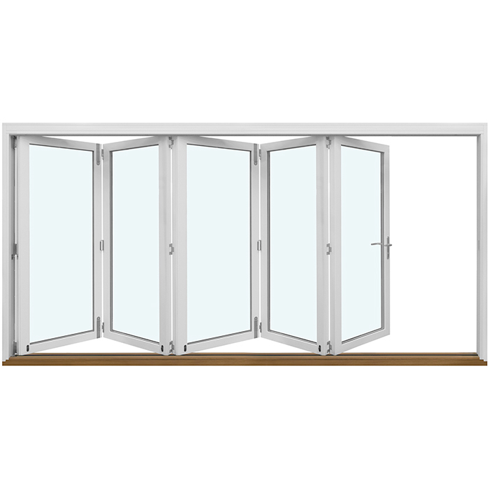
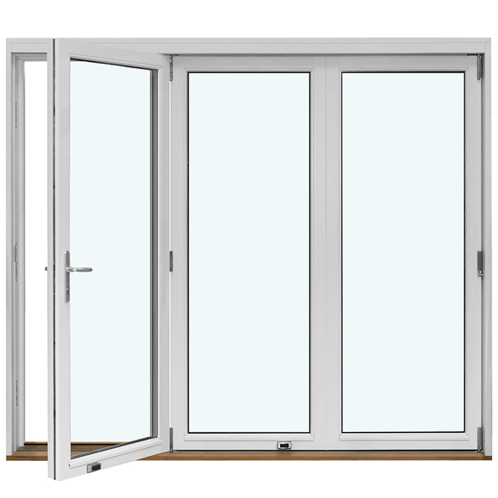
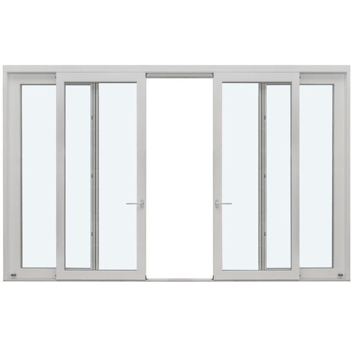
With patio doors, sliding systems and folding doors, colour forms part of the room effect because the frame area often divides entire wall axes. A light finish can visually extend the glass area; a dark frame can present it as a deliberate picture. Check this alongside furniture positions, curtains and the view towards the garden. With outward-opening folding doors the view also changes when leaves are open and folded to the side. Do not ask only for a closed elevation; consider the lines in the position commonly used during summer as well.
Colour must also be considered with the system’s visible parts. Clarify which fittings, handles, covers and threshold areas remain visible inside and out, and in which finish they are planned. A carefully coordinated frame colour loses impact if several visible details differ from it without intention. That does not mean everything must be identical: a restrained contrast can make operation deliberately clear. The important point is to define it as a design decision. Keep one view of every large opening closed and another open. Add notes about flooring, curtains and walls to sample photographs. This turns a sample comparison into a decision for everyday use.
Read glazing bars, divisions and colour together
Glazing bars change the amount of visible colour considerably. The finer and more numerous the divisions, the more strongly the frame appears as a pattern before the glass. A dark colour emphasises this rhythm, while a light or façade-related shade can soften it. Distinguish decorative glazing bars from glass-dividing bars: both influence the view, although their construction may differ. For colour selection, first consider which lines will be visible from the intended distance. In an elevation with glazing bars, draw not only the outer frame but every horizontal and vertical line in the planned colour.
With a historic-style outward-opening “Kombi” casement window the choice of shade and division is particularly closely connected. A historic character does not arise from a dark or light colour alone, but from the relationship between frame width, sashes, glazing bars and façade. Therefore compare not only a small colour sample, but a scaled elevation or reference photo with a similar division. Also consider whether door and windows should speak the same design language. A modern smooth entrance beside strongly divided windows can be an intentional contrast, but it then needs a connecting element such as a related shade or repeating hardware colour.
Consider the whole opening
Do not sample special shapes like standard windows
Round, semicircular, triangular and angled windows distribute colour differently from rectangular formats. Their frame can become a prominent graphic element because the outline itself attracts attention. For fixed-glazed triangular and angled windows you should therefore check the planned exterior colour in an overall gable view. Strong contrast can deliberately emphasise the roof shape; a façade-related shade can integrate the special form more quietly. The right solution does not depend on how unusual the window is, but on whether it should organise the architecture or act as an accent. Include the view from a greater distance too, for example from the garden or opposite side of the street.
Pivot roof windows are another special case: their exterior effect is seen from differing viewpoints and under changing sky light, while inside the reveal and room surfaces also contribute. Do not automatically assign them the colour of vertical façade windows without considering the roof as a distinct plane. Clarify which visible internal frame areas meet wall or ceiling colours. For special shapes, a sample photograph at the installation site is particularly useful if you mark the approximate outline on it. The image does not replace technical planning, but helps assess colour contrast in relation to form. Record the choice separately from glazing, opening and size questions so design and technical configuration are not confused.
Define the entrance door as an accent or part of the window line
Many materials meet in a small area at the entrance: render or brick, canopy, house number, light, handle, sidelight and floor. The front-door colour should therefore not be chosen only after the windows. Decide whether the door creates a clear address or fits into the window line. An accent door needs sufficiently calm neighbouring surfaces; a matching door can still stand on its own through its format, panel or handle. With an outward-opening panelled front door the door leaf colour, visible frame parts and panel appearance should be sampled together. A single sample does not show the distribution of areas.
A glazed sidelight extends the colour and line effect of the entrance. With a single-panel glazed door sidelight, check whether frame colour, door proportions and glass area form a cohesive unit or whether the door should appear as a compact body. Place samples at the real façade position and view them with the door both open and closed. The entrance is experienced up close, so the handle, visible edges and transitions matter more than at an upper-floor window. Also record which interior side suits the hallway. A calm, light effect may be appropriate there even if a stronger shade is selected outside. The decision remains consistent when it considers both arrival situations.
Organise sample comparison as a traceable test
Order or borrow samples early enough that the decision is not made under ordering pressure. Label every sample with the full colour and finish specification, plus its internal or external side. Never compare too many options at once; with too many similar shades, differences become harder rather than easier to see. First set a preferred direction, for example warm dark grey, neutral light grey or muted green. Then select two or three candidates within that direction. View samples in their intended orientation against the façade and pick them up again after a few hours. This avoids decisions based solely on a brief first impression.
Use a simple checklist: what happens in sun, how does the sample look beside the façade, does it suit the roof, how does it appear indoors next to the floor, and which hardware colour is planned? Mark not only “like it”, but why. If uncertain, a larger sample section or visualisation can help, although approval should still rest on a real surface. Include everyone with binding decision-making responsibility before the configuration is confirmed. Later changes often affect more than colour because inside and outside, accessories and several elements must be coordinated. Clear sample approval is therefore not a decorative extra, but part of the full order specification.
Document the order securely by colour
Before ordering, create an element list with room, façade side, product type, opening direction, exterior colour, interior colour, finish and visible accessories. Add a reference to the approved sample. You can then see immediately if, for example, an upper-floor window accidentally receives a different internal side or a patio door differs from the garden façade. With single-leaf outward-opening patio doors the list should also make clear which view means inside and which means outside; terms such as left and right can be ambiguous without a defined viewing position. Always describe the colour together with the relevant side.
Check the order confirmation not only for dimensions and quantities, but line by line for colour specifications. For each uncertainty, ask: is this the full shade? Does it apply inside or outside? Is the required finish named? Does the specification apply equally to the frame and door leaf or sash? Keep the sample designation, elevation sketches and confirmed list together. Windows and doors from Bloomcabin come with a five-year guarantee; delivery takes four to six weeks after order confirmation. Neither replaces careful configuration checking before approval. Fully documenting the colour decision provides a better basis for questions, later additions and coordination with everyone involved in the project.
Frequently asked questions
Is a RAL number enough to coordinate window and front-door colours?
It is an important unambiguous reference, but it is not enough by itself. Surface texture, sheen, area size and light change the impression. Compare real samples of the planned finish directly beside each other and with the façade, roof or other adjacent materials. Document the complete designation for both the interior and exterior side.
When do different colours inside and outside make sense?
When the façade and interior have different design roles. Outside, the frame can organise the architecture; indoors, it should suit flooring, walls and furnishings. Separate assessment is especially worthwhile with large glazed areas. Record the sides clearly so the two-colour specification is not reversed in the order.
Should every window in the house have the same interior colour?
A shared interior colour usually creates calm and makes later additions easier. Differences can make sense where a room has a deliberately distinct colour concept. Do not decide from individual rooms alone; check sightlines and transitions. Every exception should be justified and clearly assigned in an element list.
How many colour samples should I compare?
Start with two or three options within a clear colour direction. More samples often lead to unclear comparisons. Test them outside in daylight and indoors under normal lighting. Also check their effect beside original materials and from different distances before approving an option in writing.
What information belongs in colour approval for windows and doors?
For each element, note exterior colour, interior colour, finish, sample reference, visible fittings or accessories, and the view inside and out. Add the product type and opening direction. Check these details line by line in the order confirmation. This turns a design intention into a clearly verifiable configuration.
Next step
A convincing window and door colour does not come from a screen image, but from a coordinated sequence of decisions: start with the building view, use the RAL reference as a shared guide, assess inside and outside separately, sample the real finish and document every element clearly. Large glazed areas, glazing bars, special shapes and the entrance each deserve individual consideration because they show colour differently. Limit the choice, view samples at the property and decide only after comparing several lighting conditions. When the confirmed element list contains the same details as the sample approval, the concept remains understandable from the first window to the final door.
