
Warm or cool pergola lighting: choosing colour temperature
Pergola lighting
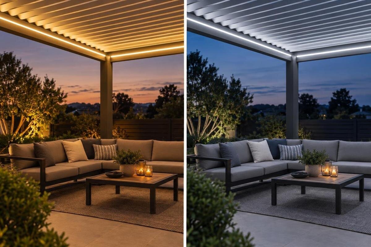
After sunset, pergola lighting becomes part of the view from both the seating area and the house. Warm and cool describe the apparent colour of white light; neither label tells you how bright a fitting is or whether it is right for every outdoor setting. A warmer tone may feel relaxed at dinner, while a cooler one can suit people who prefer a cleaner-looking light for conversation or close tasks. The finish, planting and neighbouring lights all affect the result. This guide explains how to compare colour temperatures in realistic evening conditions, then separate that choice from brightness, controls and fitting suitability.
01
What colour temperature tells you
On a light fitting’s specification, colour temperature is usually listed as correlated colour temperature (CCT), measured in kelvins (K). The scale can seem backwards if you read it as heat: a lower value gives a warmer-looking white with more yellow or amber, while a higher value generally appears cooler, whiter or bluer. For example, a 2700 K fitting will usually look warmer than one at 4000 K. Those numbers help explain the scale; they are not a universal target for a pergola. CCT describes the appearance of the light, not the fitting’s physical temperature, and the exact impression also depends on the fitting and surroundings.
Keep CCT separate from brightness and power. Brightness, or light output, is commonly given in lumens, while watts describe electrical power; neither tells you whether the white looks warm or cool. Two fittings with the same CCT can still look different because their output, optics and colour rendering differ. Dimming may lower the output without changing the colour. A warm light is not automatically dimmer, and a cool light is not automatically brighter. Check that a listed CCT applies to the exact fitting and setting you are considering, then read it alongside the rest of the specification.
Choose for the activities under the pergola
Begin with a typical evening under the pergola. For a long meal or relaxed conversation, many people prefer warm white because it resembles familiar home lighting; others like a more neutral white that feels continuous with a kitchen or dining room. If the table is also used for cards, reading or serving food, consider whether an amber-looking tone would suit those close tasks. These are preferences, not rules that assign a Kelvin value to an activity. Think about what matters most in your household and judge the light while doing that activity, rather than by a mood image alone.
Make the comparison realistic by noting what is normally happening at the same time: whether doors are open, interior lights are on, and the pergola is used for a quick supper or a longer evening. The colour you like may change when other lighting is visible, so do not make a decision from a sample seen in isolation. If the space serves several purposes, decide which one deserves the most comfortable setting and whether another setting is genuinely needed. If more than one person uses the space, compare options together; a short note about everyday use is more useful than a broad label such as cosy or modern.
02
Compare light against finishes and planting
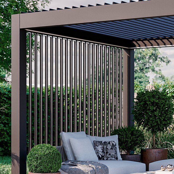
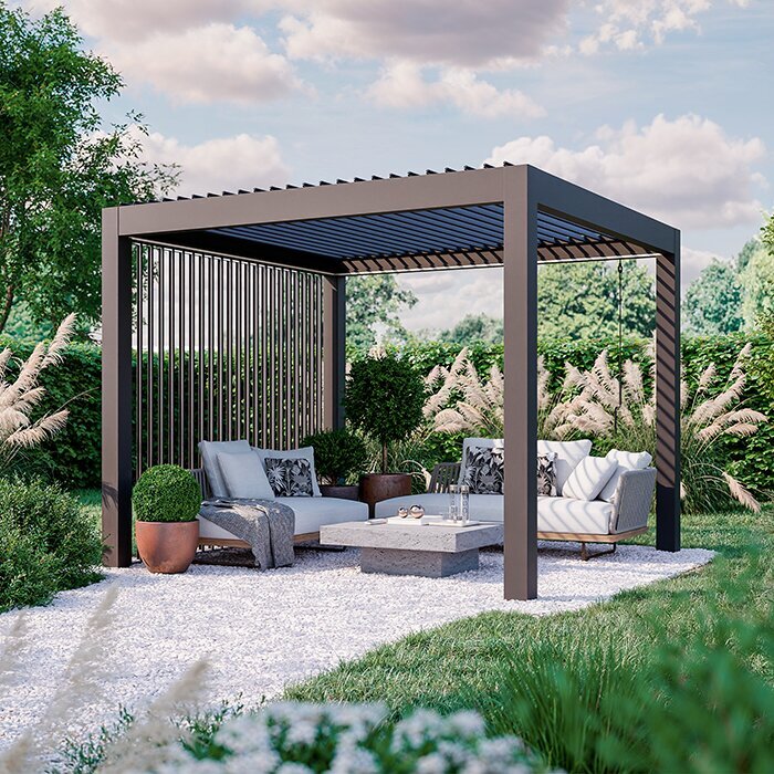
Materials and colours change the overall impression of white light. Warm white often brings out golden or red notes in timber, brick and tan fabrics; cooler white can make grey metal, pale paving or crisp white surfaces look more neutral. These are tendencies, not reliable rules: texture, nearby colours and the fitting’s colour rendering all affect what you see. If you’re considering the Bloomcabin Pergola as part of your outdoor plan, assess the actual selected finish alongside a candidate light rather than relying on a daytime image. Treat the pergola finish and lighting as related design choices, while checking the specifications for each separately.
Include planting and soft furnishings in the comparison. Green leaves, a coloured cushion and white tableware can look different under two otherwise similar lights because the light source and surrounding colours influence their appearance. Look at the full scene—table, paving, posts, fabrics and garden edge—rather than judging a single surface. Glossy surfaces may reflect colours nearby, while texture can change how a finish appears under the same light. Check the view after daylight fades as well as in the afternoon; a daytime finish alone cannot tell you how its colour will read under electric light.
Include the house and existing outdoor lights
Where a pergola sits beside the house, compare the candidate tone with the room visible through the doors or windows. Warm outdoor light next to a cooler kitchen can look especially amber; cool outdoor light beside a warm interior can feel stark. The change is easier to notice when both spaces are in view. If you’re planning around a wall-mounted pergola, judge the wall finish and indoor lighting with the outdoor light on. A structural description does not specify a matching colour temperature, so include the adjoining room in your comparison.
Note the other lights that usually stay on after dark. A porch fitting, security light, landscape lighting, street lighting or neighbouring windows may cast a warmer or cooler white than the pergola. You might want a close visual match or prefer a contrast; neither is an engineering requirement. A small area of cool white can seem prominent beside a larger warm-lit area, especially when the colours are far apart. Assess the scene with regular background lights operating, and decide whether those sources can be changed. If they cannot, choose the pergola tone in relation to the light you will actually see rather than expecting different fittings to match perfectly.
03
Warm white for a relaxed evening look
Warm white is a common preference for a laid-back evening feel because its yellow or amber cast can resemble familiar domestic lighting. It may sit comfortably beside timber, brick, warm paving or candlelight, and some people like it for conversation and meals. Those are visual preferences, not guarantees about comfort or performance. If you’re considering the Bloomcabin Bioclimatic Pergola, compare the intended fitting against the actual finish and seating area; a pergola model name does not specify whether a light is included or what colour it produces. Ask for the exact fitting information before treating a particular look as part of a package.
Warmth can also go too far for a particular palette. A very amber-looking white may make clean white surfaces look creamy and can shift the appearance of food, skin tones or pale fabrics. Whether that feels inviting or inaccurate is personal, and the fitting’s colour-rendering characteristics matter as well as its CCT. Do not assume a warm lamp will be softer or dimmer: output and distribution are separate specifications. If close tasks such as reading or serving food matter, check that both the light level and colour appearance suit them. A warm tone may still be your choice, but it is worth seeing how it looks on the surfaces you use.
Cooler white for a crisper appearance
Cooler white can make a pergola feel crisp or contemporary, particularly beside cool grey, white or blue-toned finishes. It may also look more distinct from a warm-lit interior. That does not mean cooler light reveals more detail in every case or renders colours more accurately; those depend on the fitting and the scene. When the standard pergola model is part of a wider redesign, look at the chosen finish under an actual candidate light, not just a render. A cool appearance is a styling choice, not evidence of greater brightness or better colour quality.
Some people prefer a neutral or cooler white for food preparation, reading or games because the scene feels less amber. Others find higher CCTs stark during a long meal, especially when warm timber and indoor light are nearby. Consider the whole evening: a light that looks crisp during a quick outdoor task may feel different over dinner. If both moods appeal, compare a warm and a neutral-to-cool sample, and record the CCT values rather than relying on words such as ‘bright white’. Marketing descriptions are not consistent enough to replace the fitting’s specification.
04
Fixed colour, dim-to-warm or tunable white?
A fixed-CCT fitting stays at one general colour appearance, while dimming usually changes light output only. Some products are designed to become warmer as they dim; others offer tunable white, allowing the user to select between colour temperatures. These functions are not interchangeable. If adjustable colour appeals, confirm that the exact fitting, driver, controller and pergola configuration support it together. With the Bloomcabin Wall-Mounted Pergola, for example, ask which specific light and control options are documented for the chosen setup instead of assuming that a wall-mounted model includes adjustable white.
Think about whether you would genuinely use more than one setting. One comfortable tone may be simpler if the pergola is mainly used for one kind of evening; adjustable white may help if the same space alternates between a meal and close tasks. Learn how the colour changes, what range is available, whether settings can be saved, and which control operates it. Confirm those details from the fitting and control manuals, not from a general description of dimmable lighting. If the control arrangement is unclear, ask the supplier and a qualified electrician to confirm the supported combination before ordering.
Compare samples after dark
Colour temperature is difficult to judge from product photography because screens display images differently and a camera may alter white balance. A sample in a shop can help, but the surrounding wall and daylight may make it appear unlike the same light outdoors at night. For a scheme being considered with the bioclimatic pergola model, include the actual finish and precise candidate fitting in a night-time comparison. Ask whether you can see a demonstration or sample safely in conditions close to your own. A photograph of the structure cannot establish the colour or output of a particular fitting.
Compare like with like: use candidate fittings with similar output, and note each CCT, colour-rendering information and control setting. Look at the light alongside the surfaces that matter—table, paving, timber, foliage and adjoining room—and consider the main activities rather than judging the lamp by its appearance alone. A temporary demonstration must use a suitable product as its manufacturer permits; an indoor-only fitting is not a safe outdoor trial. A phone screen or tinted image is no substitute for a real sample. Record what looks right and what seems too yellow, blue or stark, so you can compare the options afterwards.
05
Check the fitting’s outdoor suitability and mounting approval
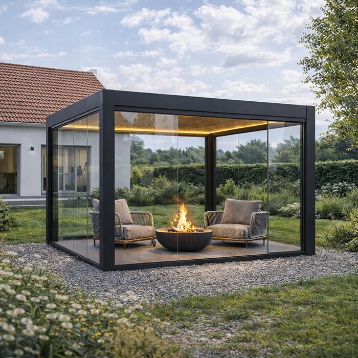
Colour temperature is only one part of choosing an outdoor fitting. Confirm its rating for the actual exposure at the pergola, the manufacturer’s permitted mounting position, and any documented approval for use with the structure. If you’re comparing the wall-mounted model, keep the exact pergola and fitting documentation together; the model label alone cannot confirm exposure suitability or mounting approval. Also check whether any selected dimming or tunable-white function is compatible with the specified controls. These are product-specific questions, not conclusions that can be drawn from a warm or cool label.
Use the exact fitting and pergola manuals as references, and have a qualified electrician confirm the electrical requirements and proposed arrangement. A roof or partial shelter does not automatically make an indoor fitting suitable outdoors, and an outdoor rating alone does not prove a fitting can be mounted in every position. Exposure, permitted mounting and supported controls need to match the manufacturer’s documentation. Where approval or compatibility is not documented, get a clear answer from the relevant supplier and qualified professional before finalising the specification. Colour preference can be settled by viewing samples; installation suitability needs product-specific confirmation.
Put the comparison into a clear lighting brief
Before confirming a choice, turn your observations into a short lighting brief: the activities, the preferred warm-to-cool appearance, the finishes to check, and whether one fixed setting or adjustable white would be useful. Include the exact CCT values you compared, plus separate notes on brightness and colour rendering. If you’re considering a Bloomcabin bioclimatic pergola configuration, note the exact setup you are discussing and ask which fitting details and mounting approvals apply to it. This gives the supplier a clear description of your preferences without treating a model name or style image as a lighting specification.
Separate your priorities from the details you are willing to compromise on. For example, you might prefer a close match with the adjoining room but accept a slightly warmer appearance at the table. Record any differences of opinion within the household, along with the option everyone found acceptable during the comparison. Keep the sample’s fitting reference, CCT and control setting together so the supplier can identify the option you mean. If you choose adjustable white, describe the settings you expect to use rather than simply asking for flexibility. A useful brief explains why you preferred a particular option and what remains to be confirmed before ordering.
Frequently asked questions
Is warm white always the best choice for pergola lighting?
No. Warm white often gives a relaxed, familiar look, but that is a preference rather than a rule. Compare it with a neutral or cooler option against your actual finishes, house lighting and usual activities. Some people enjoy its amber cast; others find it too yellow for their setting.
Does a higher Kelvin value make a pergola light brighter?
No. Kelvin describes the apparent colour of white light: a higher value generally looks cooler. Brightness is specified separately, commonly in lumens, while watts describe electrical power. Compare those details independently rather than using colour temperature as a guide to brightness.
Which colour temperature should I choose for outdoor dining?
There is no single value that suits every table or household. Some people prefer a warm-looking light for a long meal; others like a more neutral white, particularly when the kitchen is in view. Compare the exact CCT values available against your tableware, finishes and interior lighting.
Will a dimmer change warm light to cool light?
Not necessarily. A standard dimmer usually changes light output without changing colour temperature. Dim-to-warm and tunable-white functions are specific features, so check that the exact fitting and control system support the effect you want.
Can I use an indoor light fitting under a covered pergola?
Do not assume a roof makes an indoor fitting suitable outdoors. Check the exact fitting’s rating and manual against its intended exposure and mounting position, then have a qualified electrician confirm the proposed arrangement.
The best colour temperature is the one that looks right in your evening setting and suits the activities under the pergola. Compare the actual tones with your finishes and the light from the house, then confirm the fitting, controls and mounting details for the specific configuration. Your own night-time view is a more useful guide than choosing the highest or lowest Kelvin value by default.
