
Black, anthracite, white or greige: which pergola colour suits?
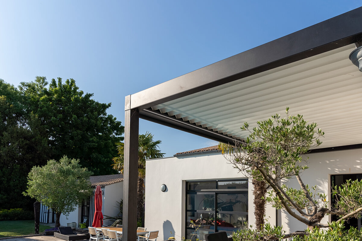
Terrace and garden design report
Find a pergola finish that brings the house and outdoor setting together: black, anthracite, white or greige.
Choosing an aluminium-pergola finish takes more than instinct. Consider the façade, window frames, paving, daylight and desired garden presence; this guide then weighs black, anthracite, white and greige.
Quick guide: which pergola colour suits you?
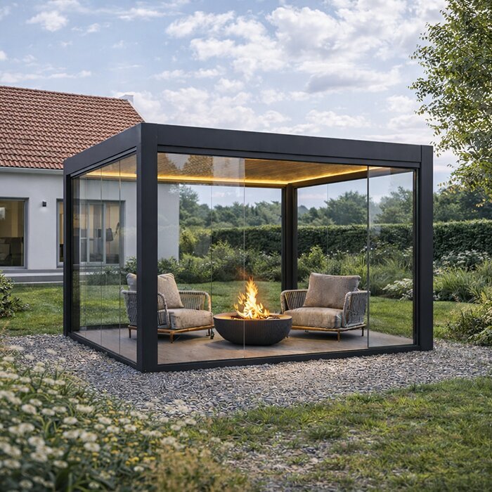
For a crisp, prominent outline, choose black. Anthracite adapts readily to many contemporary façades and window frames. White lends sunny or compact outdoor areas a lighter appearance. Where timber, natural stone or warm render defines the terrace, greige is often an effective fit.
The strongest choice comes from considering the house, paving, furniture and care expectations together. Use existing colours as reference points rather than matching every element exactly. A considered contrast can look refined when it is repeated elsewhere instead of appearing accidental.
01
Architecture first
Base the frame colour primarily on window profiles, roof edges and facade finishes. Paving supports the decision, but should not determine it alone.
02
Assess the light realistically
Against a pale façade, a dark frame reads strongly. Light finishes can make the setting feel more open, yet may lose definition when the background is similarly pale.
03
Factor in maintenance
Every finish reveals dust, pollen, water splashes and fingerprints differently. Choose the everyday appearance that best fits how you use the area.
Colour shapes more than first impressions: it also affects contrast, light and the routine care your pergola needs.
A pergola extends a home’s architecture into the garden. Its colour can make that transition quiet or deliberately distinct. Dark finishes create graphic edges, while pale options feel lighter and reflect more daylight. Greige mediates between the two, pairing warm natural materials with clean contemporary form.
Do not judge from a single swatch alone. View the proposed finish from your usual seat, the garden path and indoors. Cloudy conditions and evening light can alter the impression substantially. A colour that looks balanced on a small sample may be much stronger or more restrained across posts and frames.
Rigid design rules are unnecessary. First decide whether the frame should echo windows and roof details, respond to the paving or introduce contrast. That priority makes the merits of black, anthracite, white and greige much easier to judge.
Inspection 01 · first consideration
Let colour continue the architecture
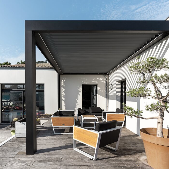
Treat the posts, perimeter frame and roof plane as another architectural line rather than simply garden furniture. Relate their colour to durable features such as the façade, window frames, gutters or balustrades. The addition can then remain intentional even after paving or planting changes. On sharply ordered new builds, unrelated colours are particularly conspicuous.
Next, choose whether the structure should blend into the house or establish a separate outdoor zone. A façade-related shade reduces its visual prominence; a darker difference can define the seating area. Either approach can succeed when its logic continues through outdoor lights, furniture frames or planters. Read the building’s strongest geometry first: rooflines, window divisions and balustrades provide better cues than temporary decorations. Finally, step back and check whether the chosen frame still belongs with the house rather than appearing detached from it.
- Start with long-lasting elements: windows, roof details and facade finishes are more reliable references than seasonal decoration.
- Check the view from inside. It quickly reveals whether the pergola complements the home calmly or takes too much visual attention.
For a crisply structured contemporary scheme, compare bioclimatic aluminium pergolas as a visible architectural feature.
Inspection 02 · second consideration
Black for bold contrast
Black draws a pronounced outline around a pergola. Set beside pale render, stone or open lawn, it can give an outdoor area added depth and definition. It also relates naturally to dark glazing frames, black lights and minimal furniture. On a compact terrace, check whether that boundary feels elegant or makes the area appear tighter.
Its appearance shifts considerably as the light moves. Sun makes black look sharp; shade can quieten the entire structure. Pale dust, pollen and dried rain marks may be conspicuous on dark horizontal sections, which is worth considering if easy-looking upkeep is important. Distribute black elsewhere to make the decision feel intentional—for example, through glazing frames, a balustrade or lighting. If the property has no comparable dark feature, place a sample beside both the façade and paving before deciding how prominent the finished frame should be.
- Black works best when it answers other dark features instead of standing alone within an otherwise pale composition.
- On a small terrace, inspect shaded and indoor views to ensure the outline retains enough visual lightness.
For a deliberately framed terrace, explore standard black aluminium pergolas as a high-contrast option.
Inspection 03 · third consideration
Anthracite as a versatile mid-tone
Because it occupies the ground between strong black and bright white, anthracite is readily incorporated into many aluminium-pergola schemes. It often sits comfortably with grey glazing frames, contemporary brick, concrete-style finishes and natural stone. The structure remains legible without necessarily supplying the composition’s strongest contrast. Where a home already uses several greys, anthracite can tie them together quietly.
Do not rely on its versatility without checking the actual shade. Changes in ambient light may make anthracite appear blue, neutral or warm. Hold the sample against the façade and alongside the paving rather than assessing it on a tabletop. Cool anthracite can create purposeful contrast with warm decking; greige offers a gentler alternative. Existing metalwork also matters: warmer versions may complement beige-grey stone, whereas cooler ones emphasise modern grey surfaces. Judge the undertones together at the property, not by the colour name alone.
- Anthracite suits homes and gardens with several greys where you want to avoid a fully monochrome result.
- View samples in sun and overcast light; timber, brick and stone make subtle warm or cool notes easier to detect.
For a modern, quietly defined cover, consider bioclimatic pergolas in anthracite as a fitting design starting point.
Inspection 04 · fourth consideration
White brings brightness and space
White can give a terrace an airy, open character with a hint of Mediterranean styling. It is well suited to pale render, light window frames and understated paving. Compared with a dark outline, it carries less visual weight in a small outdoor area. Against abundant foliage and flowers, the bright structure can also provide a fresh, clearly defined counterpoint.
The surrounding palette still needs careful thought. A white frame may lose some definition against matching render, depending on the light, while dark windows or furniture introduce useful contrast. Include pollen, dust and splashes in the expected care routine. Gentle regular cleaning maintains brightness without unnecessary surface wear. Nearby pale façade details, textiles or planters can repeat the finish. If the scheme needs stronger definition, use deeper-toned furniture or green planting while preserving the pergola’s overall light appearance.
- White supports an airy composition and can give tight courtyards or narrow terraces a greater sense of space.
- Against an especially pale wall, bring in darker seating, lights or planters to give the pergola clearer definition.
For bright outdoor settings, standard white aluminium pergolas can complement an open terrace layout.
Inspection 05 · fifth consideration
Greige unites warm materials
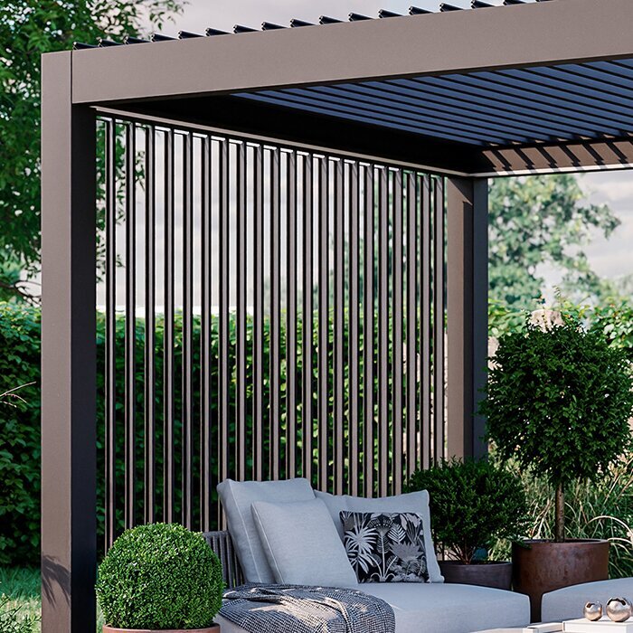
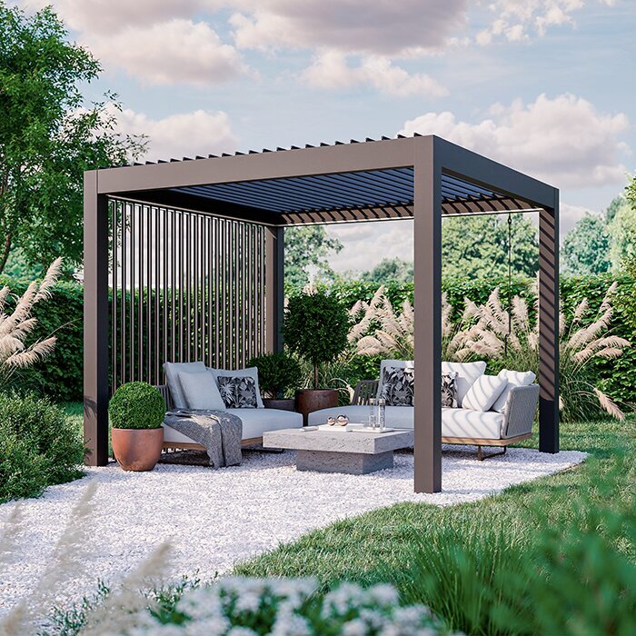
Greige combines grey with a warm beige note, helping precise aluminium forms relate to timber, sandstone, travertine and warm brick. Its effect is generally gentler than anthracite and less forceful than black. For a contemporary garden that should avoid a cold or severe mood, it offers a balanced direction.
This finish is especially useful when neither the façade nor the paving is distinctly warm or cool. A neutral-warm frame can draw cream render, timber, grey pavers and greenery into one composition. Examine existing undertones closely: pinkish, yellow or blue notes in paving can conflict unless samples are compared directly. Greige also handles settings containing several natural materials particularly well, linking boards, pale stone and warm walls without making them identical. Test it beside each material, preferably under diffuse light when subtle temperature differences are easiest to see.
- Greige suits terraces combining timber and stone because it can bridge natural finishes and contemporary surfaces.
- Set the finish beside grout, plinths and timber oil; these small areas can determine whether the complete palette feels settled.
Where warmth and clean form should meet, view bioclimatic pergolas in greige as a connecting design element.
Inspection 06 · sixth consideration
Coordinate paving, furnishings and planting
Because paving occupies so much of the view, it has considerable influence on the frame colour. Grey ceramic can reinforce the precision of black or anthracite, while timber may feel warmer and lighter with white or greige. Matching the floor exactly is unnecessary. Some distinction allows each material to remain clear instead of becoming an accidental collection of similar greys.
Furnishings, fabrics and plants further alter the result. Pale cushions and silver foliage can soften a dark frame, while colourful textiles and summer flowers enliven white. Avoid basing a permanent structure solely on today’s furniture; it should still work after the table, chairs or planting plan changes. Remember smaller fixed details as well. Grout, plinths, drainage and permanent screening can affect the composition more than photographs suggest. Furniture, by contrast, is easily replaced and can carry a deliberate accent colour.
- Include grout colour in your assessment: it can make grey paving appear markedly cooler or warmer.
- Choose a durable colour logic for permanent elements, then use cushions, rugs and pots for seasonal accents.
Where terrace furniture changes often, standard aluminium terrace pergolas provide a calm base for changing accessories.
Inspection 07 · seventh consideration
Judge light and perspective properly
The same finish can look different from morning to evening, as cloud, direct midday sun and changing colour temperature alter its contrast. Move samples through several real lighting conditions rather than judging them only in favourable sunshine. Direction matters too: backlight can brighten a pale frame, whereas a dark profile becomes emphatic against a luminous sky.
Study the proposed frame from rooms opening onto the terrace. From indoors, it joins the outlook and may affect sightlines, window alignment and the apparent depth of a room; from the garden, it changes how the house reads at a distance. Photograph test areas or move cardboard samples between likely post positions to temper first impressions. Keep each sample upright against the façade rather than flat on the paving, so the light reaches it as it would the finished frame. Images from the principal viewpoints make later comparisons easier.
- Check finishes in direct light, diffuse cloud and twilight, as contrast and undertones show differently in each condition.
- Include both indoor and garden viewpoints: the structure links the living area, terrace and wider landscape.
For a pronounced roof and frame presence, bioclimatic pergolas with dark frames deserve particularly careful daylight comparison.
Inspection 08 · eighth consideration
Maintenance and long-term appearance
No single colour is always easiest to keep looking clean; use and exposure decide that. A pergola beneath trees encounters pollen, leaves and organic residue differently from one on an exposed rooftop terrace. Light dust is often clearer on dark finishes, while white reveals darker dirt and water splashes. Mid-tones may disguise marks better, but regular cleaning remains necessary.
Think beyond the installation day to how the finish will sit in an evolving garden. Strong contrast remains a deliberate statement; anthracite and greige often adapt more readily as furniture and planting change. Always follow the relevant product’s care guidance, avoiding abrasive tools or harsh cleaners that are unsuitable for its surface. The immediate setting also determines what becomes visible. Trees create different deposits from those found on an exposed terrace, while pollen, dust, leaves and water marks vary by site. Match both colour and cleaning routine to the area’s real conditions and use.
- Assess actual exposure to leaves, dust, hard water and regular handling; these factors affect visible residue more than general claims about colour.
- Make cleaning part of the choice. A colour is right when its ordinary maintenance appearance suits your everyday routine.
For a restrained, adaptable base, consider neutral-finish standard aluminium pergolas within your long-term garden design.
Comparison
Colour comparison for home and terrace
This overview condenses the design differences. It does not replace comparing samples on site, but helps narrow down colours by intended effect, suitable surroundings and visible everyday marks.
| Colour | Design effect | Suitable references around home and garden |
|---|---|---|
| Black | Striking, graphic and high-contrast. | Dark window frames, crisp facades, pared-back furniture frames. |
| Anthracite | Contemporary, balanced and versatile. | Grey glazing frames, contemporary brick, concrete-inspired surfaces and stone. |
| White | Light, bright and welcoming. | Pale facades, compact terraces and airy garden settings. |
| Greige | Warm, calm and unifying. | Timber, natural stone, warm render tones and gentle colour schemes. |
| Maintenance view | Depends on location and use. | Check samples beside paving and facade in changing light. |
Choose your colour in five clear steps
A structured process avoids making the choice from a screen image or a short-lived furnishing idea. Work from the house towards the details, and test every shortlisted finish at the actual site.
01
Map fixed references
Record the façade, glazing frames, roof details, balustrades and paving. As these endure longer than furniture or pots, let them guide the palette.
02
Set the desired presence
Choose between a pergola that recedes and one that clearly defines the terrace. Subtle integration and intentional contrast are separate, equally sound objectives.
03
Test samples on site
Hold colour samples against the facade, paving and terrace edges. View them from inside, from the terrace and from the garden path in changing daylight.
04
Compare undertones
For grey and greige in particular, identify whether surrounding materials lean warm, cool or neutral. Beside render, timber and stone, slight differences become unexpectedly obvious.
05
Allow for everyday care
Account for nearby trees, pollen, water splashes and your usual cleaning pattern. The practical choice is the finish that suits this site, not a theoretically inconspicuous colour.
Checklist before choosing your final colour
Complete each check before committing. A finish should remain convincing when expanded from a small sample across a permanent structure and viewed over many years.
01. Key references recorded: glazing frames, roofline and fixed architectural details.
02. Paving assessed together with its grout, borders and edging stones.
03. House view, seating perspective and adjoining-room outlook checked.
04. Finish samples viewed under sun, cloud and evening light.
05. Desired effect named clearly: quiet connection or deliberate contrast.
06. Warm and cool notes compared across brick, timber, stone and permanent metalwork.
07. Likely residue from trees, pollen, water and regular use considered.
08. Permanent frame finish selected without relying on temporary furnishing trends.
Frequently asked questions about pergola colour
Which pergola colour suits anthracite windows?
Start by checking the precise shade used on the windows, because anthracite ranges from warm grey to cool and nearly black. Repeating that shade often gives the quietest result. Black is another option when you want stronger definition, particularly if lights, balustrades or other exterior elements already carry a dark finish.
Will a black pergola dominate a small terrace?
Façade tone, available light and the main viewpoints all influence the answer. A black outline can give a compact terrace elegant definition, although it remains pronounced against a pale wall. Judge it from the adjoining room as well as outdoors. Light-coloured furniture and planting can keep the composition feeling open if the frame appears visually heavy.
Is white more demanding to maintain?
It depends more on exposure than colour alone. White readily reveals darker dirt, pollen and water splashes, while deep finishes can highlight pale dust and dried droplets. Follow the care directions supplied for the pergola and choose gentle cleaning products and methods appropriate to its surface.
Does greige suit contemporary architecture?
Greige offers a way to soften contemporary geometry without making it look traditional. Its warmer undertone helps aluminium framing sit comfortably beside timber, natural stone, cream render and warm-grey paving. It is therefore a useful alternative when cool anthracite would make the scheme feel more severe than intended.
Should the pergola match the window colour?
Exact repetition is optional. Related shades can establish enough visual continuity between the pergola and house. Match the windows when a calm, unified result is the priority; alternatively, introduce a contrasting frame colour and repeat it elsewhere to organise the terrace and architecture.
How can I choose confidently and avoid a mistake?
Shortlist two suitable finishes, then test both where the pergola will stand. Compare them with the façade and paving and from inside the home. Before ordering, confirm any relevant planning, installation or local requirements with the appropriate authority and carefully verify the selected product configuration.
Compare colours
Choose colour with the whole setting in mind
Each option sets a different mood: black gives definition, anthracite creates continuity, white adds openness and greige introduces warmth. Choose the pergola finish that responds convincingly to the home’s existing architecture while supporting the atmosphere intended for the terrace.
Give samples, viewpoints and light conditions proper time. An aluminium pergola remains a visible fixed structure, while textiles, furniture and plants can change. With a clear colour logic, it becomes a natural part of home and garden rather than an afterthought.
Browse Bloomcabin pergola finishes and select a colour direction designed to sit comfortably within your outdoor area over time.
