
Black, Anthracite, White or Greige: Which Pergola Colour Works?
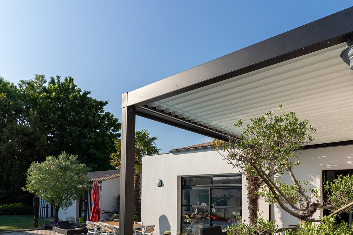
Design guide for patios and gardens
From black and anthracite to white and greige: choose a pergola finish that brings house and garden together.
Pergola colour should not be settled by a first reaction alone. Read the wall finish, window frames, paving and changing daylight together, then decide how much emphasis the structure deserves. This guide examines the four finishes in turn.
Quick answer: which pergola colour suits you?
Black gives the posts and roofline a decisive outline. Anthracite usually settles comfortably beside contemporary joinery and façades. White eases visual weight in bright or compact spaces. Choose greige where timber, stone and warm-toned render establish the patio’s character.
Reach a decision by reading the house elevation, paving, furnishings and likely upkeep as one composition. Let existing shades guide you without copying them exactly. Contrast feels intentional when another feature elsewhere in the garden quietly answers it.
01
Start with architecture
Base the frame colour first on window frames, roofline and façade. Patio paving should support the decision, not make it alone.
02
Read changing daylight
Against a pale wall, dark framing reads clearly from a distance. Lighter finishes create openness but may merge visually with an equally pale background.
03
Factor in maintenance
Each shade reveals dust, pollen, water splashes and fingerprints in its own way. Pick the everyday appearance that best fits your cleaning habits.
The finish governs first impressions, but it also changes perceived contrast, available light and the routine needed to keep surfaces looking well.
Think of the pergola as an architectural line continuing beyond the house. Colour can soften that connection or announce it. Deep finishes draw firm edges; pale ones reduce visual weight and return more daylight. Greige offers a middle course, setting natural warmth against precise contemporary aluminium.
Do not judge from a loose swatch alone. Look from the chair you normally use, along the garden path and through adjoining windows. Repeat the exercise under cloud and near dusk. Once spread over posts and rails, a restrained sample may become forceful, while another may recede.
A useful choice does not require a rigid design formula. Decide first what the frame should do: answer the windows and roofline, relate to the paving or introduce a separate accent. That purpose makes the relative merits of black, white, greige and anthracite much clearer.
Section 01 · architectural context
Let colour continue the architecture
An aluminium pergola is a permanent visual feature rather than simply another piece of outdoor furniture. Its posts, perimeter and roof add a new line to the elevation. Relate this line to durable features such as the render, window joinery, gutters or railings. The result can remain coherent as planting and furnishings evolve, which matters particularly on strongly ordered contemporary homes.
Next, choose between visual continuity and a clearly defined outdoor zone. Bringing the frame close to the wall colour makes it quieter; setting a dark tone against a pale elevation gives the seating area a firm boundary. Either approach can succeed when it appears intentional. Echo a contrast through a lamp, chair frame or planter rather than leaving it isolated. Read the building’s broad geometry before its accessories: eaves, repeated window proportions and balustrades usually provide the strongest clues. Finally, step back through the garden and confirm that the proposed frame still belongs with the house instead of reading as a detached object.
- Give priority to the parts least likely to change. Joinery, roof edges and exterior wall finishes offer steadier guidance than temporary ornaments or seasonal textiles.
- Look outward from the living area as well. This angle makes it easy to see whether the new frame supports the elevation or overwhelms the view.
For an orderly contemporary composition, use bioclimatic aluminium pergola designs as reference points for a visible architectural addition.
Section 02 · using black
Define the patio with black
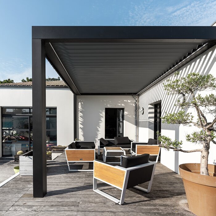
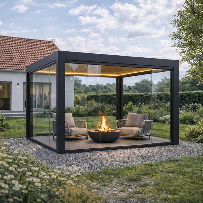
Black draws a decisive boundary around a pergola. Set beside light render, stonework or open lawn, it can lend depth and definition to the outdoor room. It also answers dark joinery, understated metal furniture and black exterior lamps. On a restricted patio, view it from several angles to decide whether the enclosure feels composed or cramped.
Its character shifts as daylight moves. Sun gives black a sharp, deliberate presence, whereas shade can make the frame withdraw. Light-coloured dust, pollen and dried rain marks may register strongly across dark upper rails. That is a practical consideration rather than a reason to dismiss the finish. A few related accents elsewhere help the choice feel grounded: window profiles, a balustrade or exterior lighting may provide enough repetition. If the house offers no comparable dark feature, hold a generous sample beside both wall and paving before deciding how much contrast you want.
- Black succeeds most naturally when the garden or elevation already contains a few dark notes; otherwise, it may look detached from an entirely pale composition.
- On a small terrace, review both shaded elevations and views through the windows so the boundary remains crisp without becoming visually weighty.
To give a patio a sharply defined edge, browse black standard aluminium pergola options and assess how their contrast works beside your house.
Section 03 · using anthracite
Anthracite: an adaptable middle ground
Anthracite occupies a useful position between emphatic black and bright white. It often sits comfortably with grey joinery, current brickwork, cement-effect paving and varied stone. The frame remains legible without automatically becoming the composition’s strongest element. Where a house already carries several greys, anthracite can gather them into a more settled whole.
That flexibility still demands a real sample. Surrounding colour and weather can pull anthracite towards blue, neutrality or a warmer grey. Hold it vertically at the wall and beside the paving instead of judging it on a tabletop. A cool version may create a purposeful counterpoint to honey-toned decking; greige will usually provide a gentler transition. Compare existing metalwork closely too. Beige-grey masonry may favour a warmer anthracite, while cooler architectural surfaces can support a steely shade. The label on the colour card matters far less than the undertones revealed on your property.
- Choose anthracite when several greys already occur across the building and garden, but you do not want every surface to merge into one monochrome scheme.
- Revisit the swatches under sun and overcast skies; timber, masonry and stone will expose subtle undertones that a colour card alone can conceal.
For contemporary shelter with restrained definition, examine anthracite bioclimatic pergola designs as one architectural route worth testing.
Section 04 · using white
White brings air and brightness
White can give a terrace an open, almost Mediterranean mood. It relates readily to pale render, white joinery and quiet paving, while imposing less visual mass than a deep finish in restricted spaces. Against generous planting, the bright frame supplies a fresh architectural pause among foliage and flowers.
The surrounding whites still need careful comparison. Where both wall and frame are very pale, their edges may disappear at certain hours; dark windows or furnishings can restore definition. Include pollen, road dust and water splashes in your expectations for routine care. Regular cleaning with suitable gentle methods protects the bright appearance without needless abrasion. Nearby details can repeat the finish through light textiles, wall trim or simple planters. If the scene needs stronger structure, introduce deeper seating tones or dense greenery while allowing the pergola itself to retain its light character.
- In a narrow terrace or enclosed courtyard, white can reduce the apparent weight of the roof and give the surrounding area a broader visual feel.
- Where a pale wall leaves too little definition, bring in darker chairs, lighting or planters rather than abandoning the frame’s light overall effect.
For an outdoor scheme built around brightness, consider white-finished standard aluminium pergolas within a spacious, open-looking patio arrangement.
Section 05 · using greige
Greige joins warm materials
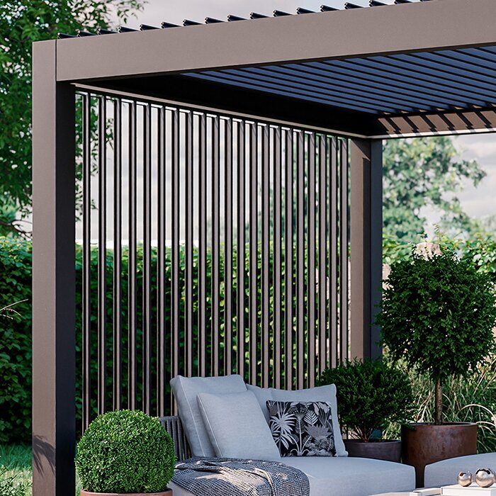
Greige sets a beige warmth within a grey base. This makes it a useful mediator between precise aluminium and tactile finishes including wood, sandstone, travertine and warm brick. It generally feels gentler than anthracite and quieter than black, suiting contemporary gardens that should remain relaxed rather than severe.
It becomes especially useful when wall and paving sit somewhere between cool and warm. A terrace may contain creamy render, grey slabs, wooden boards and abundant planting; a warm-neutral frame can hold those ingredients together. Study every underlying hue before committing. Paving with noticeable pink, yellow or blue notes deserves a direct sample comparison so the colours do not quarrel. Greige is often at its best amid several natural finishes, joining light masonry, decking and a warm elevation without making them identical. Set the swatch against each surface and revisit it in soft, overcast light, when temperature differences become easiest to read.
- On patios combining stone with wood, greige can form a measured link between organic textures and the clean geometry of a modern metal frame.
- Compare the sample with grout, the wall plinth and the finish used on decking. These modest details often determine whether the full palette feels composed.
To combine warmth with disciplined geometry, look at greige bioclimatic pergola designs as a bridge between the surrounding finishes.
Section 06 · surrounding materials
Read paving, furnishings and planting together
Because paving occupies so much of the view, it has considerable influence over the frame colour. Grey porcelain may reinforce black or anthracite, whereas timber can appear warmer and less heavy beside greige or white. Exact matching is unnecessary. A measured difference keeps floor and structure visually legible instead of producing an accidental collection of near-greys.
Moveable elements change the reading too. Pale cushions and silver foliage can lift a deep frame; brighter fabrics and summer flowers can animate white. Still, avoid basing a permanent structure on today’s furniture alone. The pergola should remain convincing when the table, chairs or planting design eventually changes. Review the quieter fixed details as carefully as the major surfaces. Grout lines, plinth courses, drainage pieces and permanent screens can influence the finished composition more than a styled image suggests. Chairs and textiles have greater freedom to provide contrast because replacing them later is comparatively simple.
- Do not overlook grout. Its temperature can shift an otherwise neutral grey paved area noticeably towards a cooler or warmer impression.
- Set a durable palette for fixed construction, then let rugs, cushions and containers carry the accents that change with seasons or personal taste.
If your patio furnishings are likely to change, consider standard aluminium patio pergola designs as a composed background for different accessories over time.
Section 07 · light and viewpoints
Test colour through the day
Every finish changes as the day progresses. Morning brightness, passing cloud, full sun and evening light alter both contrast and perceived colour temperature. Test at several times rather than waiting for perfect weather. Direction matters as well: a pale frame may brighten against the light, while a deep profile can cut a strong silhouette across an open sky.
Include the rooms facing the terrace in your review. Seen through glazing, the pergola enters the interior composition and may alter window rhythms, sightlines and the sense of depth. From farther into the garden, it changes how the house reads as a whole. Move substantial colour cards between likely post positions and record the results from several distances; this helps separate an immediate preference from a lasting fit. Hold each card upright rather than leaving it on the paving, because vertical framing receives light differently. A small set of photographs from the main approaches can then make comparisons easier after the weather changes.
- Review each finish in clear sun, soft overcast light and near dusk. Contrast and underlying colour will reveal themselves differently in every condition.
- Use both the interior outlook and the longer garden view. The structure mediates between the living rooms, the terrace and the wider landscape.
Where the roof and frame should have a pronounced presence, give dark-framed bioclimatic pergola designs a thorough appraisal under several daylight conditions.
Section 08 · appearance over time
Maintenance and long-term impact
No single finish is automatically the easiest to keep looking clean; exposure and use matter more. A tree-covered position brings leaf fragments, pollen and organic staining, while an open roof terrace faces a different pattern of deposits. Light dust often contrasts with deep colours, whereas white reveals darker grime and water splashes. Mid-tones may disguise more, but still need routine care.
Think beyond the first season and consider how the frame will relate to a changing garden. Strong contrast continues to make a statement; anthracite and greige may accept new furniture or planting more quietly. Use the cleaning directions supplied for the chosen product, and avoid harsh chemicals or scouring equipment unless explicitly suitable for its surface. The immediate setting will determine what appears most often. Trees, windblown dust, pollen and splashed water create different patterns from those found on an unsheltered terrace. Choose both finish and maintenance rhythm with the real position and frequency of use in mind.
- Characterise the setting honestly. Falling leaves, airborne dirt, mineral-rich water and regular handling can matter more to visible marking than broad advice about colour.
- Treat routine cleaning as a design consideration. The most suitable shade is one whose ordinary appearance and maintenance demands fit comfortably into daily life.
For a calm foundation that can accommodate later changes, explore neutral-toned standard aluminium pergolas within the garden plan you expect to keep long term.
Comparison
Colour comparison for home and patio
This overview condenses the design differences. It cannot replace testing samples at your property, but helps shortlist colours by desired effect, suitable surroundings and visible everyday marks.
| Colour | Design effect | Suitable connections around home and garden |
|---|---|---|
| Black | Bold, graphic and contrasting. | Dark window frames, crisp façades, minimal furniture frames. |
| Anthracite | Modern, balanced and versatile. | Grey windows, brick, concrete-look surfaces and many stone finishes. |
| White | Light, bright and welcoming. | Pale façades, compact patios and airy garden scenes. |
| Greige | Warm, calm and connecting. | Timber, natural stone, warm render and gentle colour palettes. |
| Care considerations | Dependent on site and use. | Check samples beside paving and façade in changing light. |
Choose your colour in five clear steps
A deliberate sequence prevents a temporary furnishing idea or the colours on a display from deciding everything. Begin with the building, move towards smaller details and verify every shortlisted finish at the intended position.
01
Record fixed reference points
Write down the wall finish, joinery, eaves, balustrades and paving. These permanent surfaces deserve more influence than easily replaced furniture, pots or decorative pieces.
02
Decide on presence
Decide whether the frame should sit quietly within the elevation or make the terrace an obvious destination. Integration and contrast are both legitimate design intentions.
03
Test samples on site
Place generous swatches vertically at the wall, beside the paving and near likely posts. Recheck from the house, seating area and garden path as daylight changes.
04
Compare undertones
With greys and greige in particular, identify the temperature of each surrounding finish. Timber, render and masonry can reveal subtle differences that looked insignificant indoors.
05
Consider everyday care
Account for nearby trees, airborne pollen, water marks and the time you realistically give to cleaning. Favour the finish whose normal condition suits that setting.
Checklist before choosing a colour
Complete this final review before confirming the finish. It tests whether a small swatch can translate successfully into an extensive structure and remain convincing in future years.
01. Joinery, eaves and other lasting architectural references recorded.
02. Paving reviewed together with its joints, borders and edge stones.
03. Elevation, seated viewpoint and outlook through adjoining windows all assessed.
04. Swatches revisited under sun, overcast conditions and evening light.
05. Intended result defined: quiet continuity or a purposeful contrasting frame.
06. Wood, masonry, brick and permanent metal details assessed for colour temperature.
07. Likely marking from foliage, pollen, water and regular handling considered honestly.
08. Permanent frame finish chosen without relying on temporary furniture or decorative fashions.
Pergola colour questions answered
Which pergola colour suits anthracite window frames?
Using anthracite on both frame and windows generally produces continuity. Black offers a stronger distinction where the elevation already contains enough deep accents to support it. Compare the actual joinery outdoors, since colours sold as anthracite range from warm grey through cooler tones to shades approaching black.
Is a black pergola too dominant on a small patio?
Façade tone, available daylight and the main sightlines all affect the answer. A black frame can give a compact terrace elegant definition, but its edge will remain pronounced against a pale wall. Review it through the adjoining windows; lighter upholstery and planting can soften the composition if additional openness is wanted.
Does a white pergola require more upkeep?
A white finish makes some dark grime, pollen and water splashes easy to see. Deep finishes have the opposite tendency, revealing light dust and dried droplets. Exposure therefore matters more than colour alone. Use the cleaning approach specified for the product and favour non-abrasive methods appropriate to its surface.
Does greige suit modern architecture?
Yes. Greige can relax the severity of contemporary architecture while retaining its clean geometry. Warm stone and wood sit naturally beside its beige-grey base, without making the result appear old-fashioned. Beside cream render or warmer grey paving, it may feel more resolved than a distinctly cool anthracite.
Must pergola and window finishes be identical?
No exact match is required. Related undertones can create sufficient continuity between the frame and the house. Repeating one shade gives the calmest result, while a contrasting tone can define the terrace successfully when the same accent appears elsewhere in the elevation or garden.
How do I reach a confident final decision?
Shortlist two finishes, then assess full samples where the pergola will stand, including views against the wall, paving and through nearby windows. If positioning, planning or other local requirements could affect the project, consult the appropriate local authority before ordering and verify the selected product configuration.
Compare colours
Choose colour with the whole setting in mind
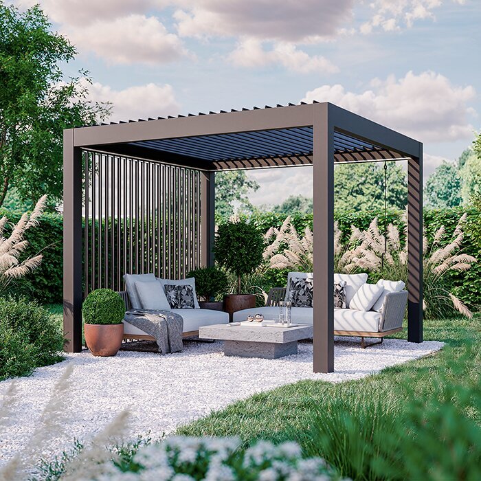
Each finish serves a separate purpose: black draws a boundary, anthracite settles varied greys, white reduces visual weight and greige introduces warmth. Choose by asking which treatment responds most convincingly to the existing building and supports the mood intended for the terrace.
Allow time to revisit swatches from different positions and in changing light. The aluminium structure will remain while chairs, fabrics and planting evolve. A well-founded palette makes the pergola feel designed with the property rather than attached as a later, unrelated object.
Browse Bloomcabin pergola configurations, then select a finish that can remain at ease with your outdoor setting as it develops.
