
Warm or Cool Pergola Lighting: Finding the Right Tone
Pergola lighting guide
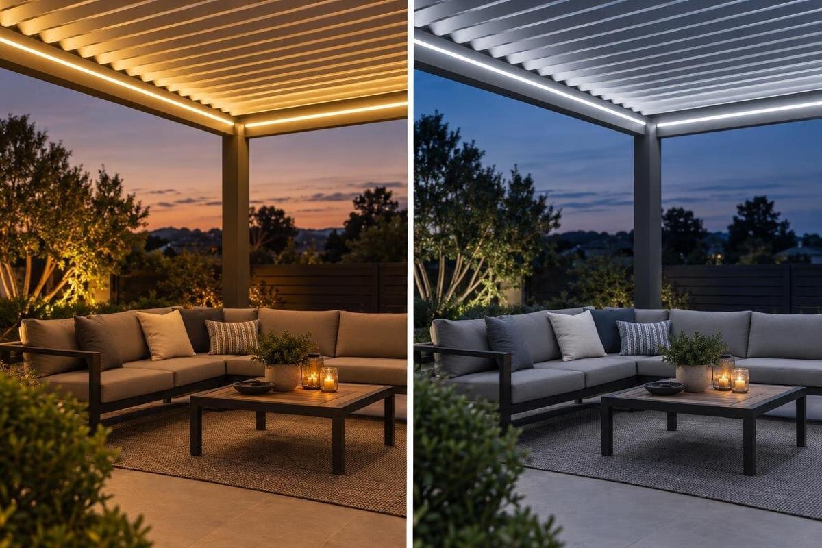
Warm or cool white can change the way a pergola looks after sunset, but colour temperature is a matter of preference rather than a design rule. Warmer light usually has a yellow or amber cast; cooler white looks more neutral and may appear slightly blue. That difference can alter the impression of a meal, a seating area, plants and nearby finishes. Kelvin alone does not tell you how bright a fitting is or how faithfully it shows colour, so use it as a comparison point, not a verdict. Think about your usual evening activities, then test a sample in context and verify the exact fixture options and approved mounting details for your pergola.
01
What colour temperature tells you
Colour temperature describes the apparent tint of a white light source and is usually given in kelvins (K). It does not describe how hot the lamp becomes or how bright it is. In everyday product language, a lower Kelvin figure looks warmer, with a more yellow or amber cast; a higher figure looks cooler, generally whiter and sometimes slightly blue. About 2700 K is commonly sold as warm white, 3000 K is often still labelled warm white, and 4000 K is frequently described as neutral or cool white. Product wording varies, so look beyond the category name.
Treat those figures as a starting point, not a precise prediction of the scene. Products with a similar Kelvin value can still render colours differently, and the diffuser, dimming level and colours nearby all influence what your eye sees. A phone photograph may also adjust its white balance automatically, so it cannot reliably show whether a pergola light looks amber or neutral in person. Use the number to shortlist possibilities, then compare actual fixtures or a sample under conditions close to your evening use. Colour temperature is a helpful description, but it is not a complete measure of lighting quality.
Warm white for relaxed evenings
Warm white is a common preference for slow dinners and conversation because its amber cast can make the scene feel softer. It often sits comfortably beside timber, terracotta, woven fabrics and candlelight, although the result depends on the colours actually around the pergola. Some people like the way it avoids a stark, bright-white appearance after dark; others find a strongly amber tone too yellow. The same fitting can also read differently when indoor lights spill through a window or a nearby wall reflects the glow. Treat “cosy” as a personal response, not a guaranteed effect of a particular Kelvin number.
Warm light can give white dishes, pale paving, grey textiles and green leaves a warmer cast than they have in daylight. That may suit an earthy palette, but not if you want neutral whites or foliage to look close to their daytime appearance. The change is visual: it does not heat the air or make the seating area physically warmer. When considering Bloomcabin Bioclimatic Pergola, ask which specific fittings are offered for your configuration before comparing their white tones. For a dining setting, use your usual plates, glasses and table linen in the comparison rather than judging only the light source. Look at the table both before and during a meal: an amber tone you enjoy for conversation may not be your preferred way to see the food. There is no need to reject that tone on principle; decide whether the overall effect suits your evenings.
02
Cooler white for a crisp appearance
Cooler white is often chosen by people who prefer a cleaner, less amber view. It may suit a pergola used for reading a menu, sorting dishes after a meal, playing a board game or checking small items, especially when the surrounding palette is pale or neutral. Those are preferences, not proof that a cool source is brighter or automatically better for tasks: output and light distribution matter separately. A higher Kelvin value can look too stark to someone who prefers a softer atmosphere for a long dinner. If warm indoor lighting spills outside, the difference between the two settings may also be noticeable.
On warm-toned timber, woven textures or red-brown paving, cool white can create a sharper contrast; on grey metal or blue-grey finishes, it may feel more at home. Neither effect is inherently good or bad, and a nearby wall can shift the impression again. When comparing lighting options for Bloomcabin Wall Pergola, consider the view towards the house as well as the view out into the garden. A cooler pool of light beside a warmly lit doorway may be a contrast you enjoy, or it may make the two areas feel visually disconnected. Judge that relationship with the indoor lights set as you normally use them. Also distinguish a preference for cooler colour from a preference for more light: if one sample is much brighter, you are comparing two differences at once. Ask to see comparable light levels before deciding that the cooler tone is the feature you prefer.
Which activities matter most after dark?
Think about what happens after dark instead of trying to assign a universal better or worse rating to warm and cool light. A table set for dinner, casual conversation, reading, a card game and clearing dishes can all create a different preference, though none determines a particular Kelvin value. Ask which moment represents most of your usual use, and whether you want the pergola to blend visually with warm interior lamps or stand apart with a cleaner tone. If you entertain only occasionally, give routine evenings more weight than a special event. This keeps the decision tied to how you use the space.
One fixed colour temperature may be all you need if the same atmosphere suits your usual activities. If you want a crisper look for one task and warmer light for relaxing, note both preferences before choosing a system; changing the colour is possible only when the selected product supports it. In a lighting discussion about Bloomcabin Pergola, describe a typical evening in order: perhaps setting the table, eating, then staying outside for conversation. Identify which part lasts longest and which matters most to you. These need not be the same, so consider what compromise you would accept with a fixed tone. Ask other regular users which appearance they prefer, too, rather than choosing around a single person's reaction to a demonstration. A short list of priorities gives the supplier a clearer brief than asking for a light that is simply suitable for everything.
03
Compare the light with nearby finishes
Surfaces affect the overall impression because the light you see is reflected from more than the fitting itself. Pale walls and paving may make a warm source seem creamier, while a cool source can give the same surfaces a cleaner appearance. Timber, coloured textiles, painted metal and planting add their own tones to the view. Strongly coloured surfaces can also reflect a noticeable tint onto nearby objects. Consider the complete setting, including the table, seating and any wall in view, rather than judging a white light against an isolated patch of paint.
If possible, compare a sample beside the finishes that will actually be under the light, and do it after sunset. A small paint chip can be useful, but a larger surface may give a more realistic impression; plants and patterned fabrics may also look different under artificial light than they do by day. If this bioclimatic pergola option is on your shortlist, bring samples of the proposed furniture fabrics and finishes into the lighting discussion. Group them as they will appear together rather than inspecting each in isolation. For example, judge a seat cushion against the table and paving, not just against a plain white card. Note which surfaces you are keeping and which you have yet to choose. That helps you decide whether to select a light that suits the existing palette or reconsider an undecided fabric or paint colour before committing to the whole scheme.
Colour temperature and colour rendering
Colour temperature describes the tint of a white source; colour rendering is a separate consideration. It describes how colours appear under that light compared with a reference, and manufacturer data may include a measure such as CRI or Ra. A similar Kelvin value does not guarantee that two fittings will show red fruit, skin, fabrics or plant leaves in the same way. These measures can help when comparing specifications, but they do not tell you which overall tone you will prefer. If the appearance of particular colours matters, look at both the colour-temperature details and the available colour-rendering information.
Separate two questions when judging a sample: do you like the overall white tone, and do the objects beneath it look as you want them to? You might enjoy an amber atmosphere while disliking how a particular fabric appears in it. Equally, a neutral-looking source is not automatically the one you will prefer for dinner. For a setting around a wall-mounted pergola model, include the wall finish alongside a few familiar objects in the comparison. Choose items whose colours matter to you, rather than an assortment with no connection to the space. If two fittings have similar Kelvin values but make those objects look different, record the exact fitting names and ask about their colour-rendering specifications. This keeps the comparison tied to identifiable products. It also avoids treating every unwanted colour effect as a reason to move to a warmer or cooler white.
04
Keep colour tone separate from brightness and glare
Kelvin is not a brightness rating. A light’s output, often stated in lumens, is a separate specification, and the way that output is directed affects how much reaches a table or seating area. Two fittings with the same colour temperature can therefore look very different in use, while a warm source is not automatically dimmer than a cool one. A dimmer usually changes the light level; it does not necessarily change the white tone. Check the fixture’s information before assuming that lowering the output will make its colour warmer.
Glare is another separate issue: changing from cool to warm white does not shield a visible source or alter its position. If a light feels uncomfortable to look towards, its placement, brightness and shielding need attention as well as its colour tone. Whether you are planning around the Bloomcabin Pergola model or another structure, describe the problem precisely when discussing the lighting. Is the whole scene too blue for your taste, is the table brighter than you want, or is the source itself uncomfortable to look at? These observations concern different aspects of the fitting and should not be reduced to a request for warmer light. Keep a brief note of each concern and where you noticed it. That gives the lighting discussion a useful distinction between the atmosphere you prefer and a brightness or positioning issue that needs separate attention.
Confirm the exact fixture and approved mounting
Before choosing a colour, identify the exact light fitting being considered. Confirm its stated colour temperature, whether that tone is fixed or adjustable, and whether the fitting is included or offered as an option for the particular configuration. If a control or dimmer is part of the plan, check that the manufacturer says it is compatible with the chosen fitting. Product names and general descriptions are not enough to establish these details. Ask for the relevant product information so you can compare the actual options rather than relying on a broad label such as “warm” or “cool”.
Colour preference does not replace checks for outdoor suitability or approved mounting. Review the exact fixture manual and outdoor rating for the setting, and ask the pergola manufacturer or supplier to confirm that the intended mounting position is approved for that specific structure. Get qualified electrical input for the selected equipment and controls; do not infer that a fitting is suitable simply because it looks appropriate. For Bloomcabin’s bioclimatic pergola, as with any model, request the relevant manuals and documented confirmation for the configuration under consideration rather than assuming that a fitting or mounting option is standard.
05
Test the setting after sunset
A useful comparison takes place at the time of day when you expect to use the pergola. Try the sample after sunset, with the surrounding indoor and outdoor lights in the state they are likely to be in during a normal evening. Compare warm and cool options at a similar light level if possible; otherwise, a brighter sample may seem more appealing for reasons unrelated to its colour. Look at the view from the places where you sit or eat, and give yourself time to judge the whole scene rather than the fitting alone.
Notice how the table, nearby finishes and any visible indoor lighting work together. If one tone looks appealing close to the fixture but too yellow or too blue across the seating area, that is useful information for the final choice. When planning around Bloomcabin’s wall pergola, record the exact fitting and setting used for each comparison, rather than relying on a phone image to remember the colour. Write down what you liked or disliked in plain terms: the table looked inviting, the wall seemed too yellow, or the contrast with the room beyond was distracting. If you are viewing a demonstration elsewhere, note which surroundings differ from your own terrace. A display can help you identify a preference without reproducing your setting exactly. Before choosing, return to the priorities you set for ordinary evenings and check that the preferred sample meets them, not just that it made a strong first impression.
Fixed or adjustable white light?
A fixed-colour fitting provides one consistent white tone. It can be a straightforward choice when the same atmosphere suits most evenings, and there is no inherent quality disadvantage in choosing a fixed setting. Decide whether the sample looks right for the activities you do most often, then check that the exact fitting’s stated colour temperature matches the option you tested. A label such as warm white can cover more than one Kelvin value, so retain the precise specification when comparing quotations or product information.
Adjustable or tunable white may be useful if you genuinely want to move between warmer and cooler appearances, but the feature must be supported by the specific fitting and its controls. Ordinary dimming does not necessarily change colour temperature, and not every product offers the same range or method of adjustment. Ask the supplier to demonstrate the exact option, if available, and confirm how it is controlled. If that flexibility is not documented or important to your routine, choose the fixed tone you prefer in a real evening test rather than assuming adjustability will be available.
Frequently asked questions
What colour temperature counts as warm white?
Warm white is commonly around 2700–3000 K, though product labels vary. About 4000 K is often described as neutral or cool white. Compare the actual fixture or a sample if you can, rather than relying on the label alone.
Is cool pergola lighting brighter than warm lighting?
Not necessarily. Kelvin describes the apparent colour of the light, not its output. Brightness also depends on the fixture’s output and how its light is directed, so check those details separately.
Is warm white best for outdoor dining?
There is no universal best choice. Some people prefer the softer, amber appearance of warm white for meals, while others want a crisper, more neutral look. Check how each option appears with your tableware and nearby finishes.
Can warm and cool lights be used together?
They can be combined if the chosen fixtures and controls support the arrangement. Different white tones may look uneven when they illuminate the same area, so decide whether the contrast is intentional and verify the available controls.
What should I confirm before choosing a fitting?
Check the exact fixture’s colour-temperature specification, whether its white tone is fixed or adjustable, and the relevant outdoor rating and manual. Confirm that the intended mounting is approved for the specific pergola, with qualified electrical input.
Choose the white tone that looks right with your finishes and suits the way you spend evenings under the pergola. Warm white often appeals to people who want an amber, relaxed appearance; cooler white suits those who prefer a cleaner, more neutral look. Neither preference is an engineering rule, and colour temperature is not a measure of brightness. A comparison using familiar tableware, furniture and surrounding lights will tell you more about your preference than a warm or cool label alone.
