
How to Choose Warm or Cool Light for a Pergola
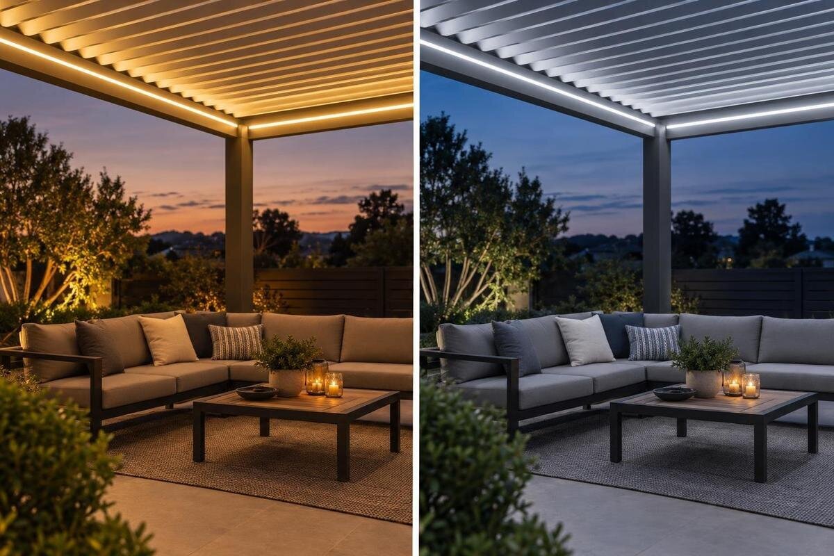
Pergola lighting
Once the sun has set, the colour of the light can change how a pergola feels without changing the structure itself. Warm white tends to look more amber; cooler white looks cleaner or more bluish. Neither is automatically the right outdoor choice, and Kelvin is not a measure of brightness or safety. The useful question is how each option looks with your activities, finishes and nearby indoor lights. This guide explains what to compare, how to judge the appearance and which product details need separate verification.
01
What colour temperature tells you
Colour temperature describes the apparent colour of white light and is usually stated in kelvins (K). Lower Kelvin values look warmer, with a yellow or amber cast; higher values look cooler, shifting towards a cleaner white or bluish impression. These terms refer to appearance, not heat, electrical load or brightness. A lamp marked warm white may not look exactly like another carrying the same label, because manufacturers use broad category names differently. Read the Kelvin figure as well as the wording, and use it to compare products rather than treating a label as a precise promise. The fitting and surrounding surfaces also affect the result.
For orientation, many ranges place warm white at about 2,700–3,000 K, neutral white around 3,500–4,000 K and cooler, daylight-like white at roughly 5,000 K or higher. These bands are approximate, not universal boundaries; some ranges offer values between them. Kelvin does not say how much light reaches a table, how accurately colours appear or whether a fitting is suitable outdoors. If you are also considering the Bloomcabin Bioclimatic Pergola, keep your preferred light colour as a separate item in the project brief. The pergola model name does not specify a light fitting or its performance. Use the Kelvin figure to describe the appearance you want, then check the proposed lighting equipment separately.
How warm light looks during an evening
Warm white often gives a seating or dining area a softer, amber-leaning appearance after dusk. People who want a relaxed, intimate mood may prefer it for conversation or a meal, especially if the lounge visible through the doors is also lit warmly. That is an aesthetic preference, not a rule about outdoor spaces, and a warm label does not promise a particular level of visibility or comfort. Check that the fitting supplies the light you need for the activity, then judge the atmosphere for yourself rather than expecting a Kelvin number to make the choice. A warmer tone can still be paired with suitable task lighting; check output separately.
Look at white plates, pale fabrics, timber and skin tones under the sample: warm light can make whites appear creamy, although the effect varies with the source and surface. If you are considering a Bloomcabin Pergola, picture the evening table as well as the structure when choosing a light colour. Use the crockery and cushions you actually intend to keep, rather than judging an empty patio. You might enjoy a creamy appearance on a tablecloth but prefer a less amber tone on a favourite blue fabric. Neither reaction needs to decide the whole scheme; identify which surfaces matter most from your usual seat. Compare these with light spilling from the house, since a mood-board image or warm-white label cannot reliably show the complete combination.
02
What cooler white can and cannot do
Cooler white can create a cleaner, more neutral or daylight-like impression. Some people prefer it when they want the pergola’s light to sit close to a cooler indoor scheme or want the outdoor colours to feel less amber. Others find the same tone stark or bluish when they expect a relaxed evening mood. These are visual reactions, not fixed results: shade, brightness, surrounding colours and individual preference affect what you see. A higher Kelvin value is not automatically more practical, brighter or better for an outdoor seating area. Treat a crisp look as a preference, not a measure of task illumination.
Compare the actual light with the house, paving and fabrics rather than relying on a screen image, which can shift colour through photography and display settings. When considering the Bloomcabin Wall-Mounted Pergola, include the view through the adjoining doorway in your colour comparison. Imagine sitting outside with the indoor lights on, then looking out from the room you use most in the evening. Decide whether you want the two areas to look similar or visibly different. A cooler outdoor tone need not match every indoor lamp, but the contrast should be one you enjoy rather than an unintended result. If you like a neutral look but dislike a blue cast, compare values in the middle of the available range instead of jumping straight to the coolest option.
Choose according to how you use the space
Write down the main activities in order: supper, conversation, reading, quiet time or moving between the house and garden. Then describe the mood you want in plain terms, such as soft and welcoming or crisp and neutral. This gives you a practical basis for judging warm and cool samples, rather than following a trend or a blanket claim that all outdoor lighting should be warm. If several activities matter, note when each happens and whether one lighting scene is expected to serve them all. The priority is your routine, not a universal lighting rule.
At a table, you might prefer one atmosphere for conversation but clearer light for reading a menu or handling food. Colour temperature is only part of that choice: output and a separate task light may matter more than shifting from warm to cool. Describe what you need to see as well as how you want the space to feel. For example, distinguish a long supper with friends from an evening spent reading at the same table. If these uses suggest different preferences, decide whether separate lighting areas or an adjustable white-light option would be worthwhile. This gives you a reason to ask about those features without assuming that a cooler tone alone will make a reading or dining area more useful.
03
Compare the light with nearby finishes
Review fixed finishes in daylight and after dark: paving, wall paint, timber, metalwork, cushions and nearby planting. White light is not visually neutral in every setting. A warm source can make some cool grey finishes seem softer, while a cooler source can make cream surfaces appear less warm; the precise effect depends on the lamp and material. Treat these as possibilities to check, not guaranteed changes. If a wall or another broad surface is prominent, include it in the comparison because it may reflect light and influence the overall colour impression.
Look at the pergola from inside the house as well as from the seats. A distinct shift between warm indoor lamps and cool outdoor light can stand out; matching tones may make the transition feel more continuous, while a deliberate contrast can also suit the setting. If you are looking at the bioclimatic pergola from Bloomcabin, bring together samples of the finishes planned for that area and assess them under the proposed light. Separate fixed choices, such as paving and wall paint, from cushions or table linen you may replace. This helps you avoid choosing a light colour around one temporary accessory. Note which combination you prefer and why: perhaps the wall looks less yellow, or the timber has the appearance you want. Those observations are more useful than simply calling a sample warm or cool.
Test the appearance after dark
Colour samples are most useful in the actual setting after dusk, when differences that daylight hides may become obvious. If possible, compare the exact fitting or a representative sample in the intended area. Keep the comparison fair by using similar brightness, position, direction and shade, and change one factor at a time. A brighter sample may look more dominant and can be mistaken for a different colour temperature. Ask a supplier about a demonstration or sample option; do not assume a small swatch or a similar-looking lamp will show the exact result.
View the light from the table, a lounge seat and the doorway, and consider how it looks from indoors as well as under the pergola. Give your eyes a moment to adjust, then ask other regular users what they think. Ask specific questions: does the table look too amber, does the white fabric seem blue, and which option would they choose for an ordinary evening? Keep a brief note of each response so that one striking first impression does not become the only basis for the decision. Phone photographs and screens are poor final judges because exposure and automatic white balance can shift the result. If a wall-mounted pergola from Bloomcabin is on your shortlist and an on-site trial is unavailable, request Kelvin information and clearly identified examples of the proposed lighting, while recognising that these cannot reproduce your own setting exactly.
04
Keep fittings and controls consistent
If the pergola will have several fittings, decide whether they should provide a consistent tone of white light or serve separate areas. Similar Kelvin values can help reduce visible variation, but identical labels do not guarantee a perfect match: manufacturers and lamp models may render the same nominal value differently. Where consistency matters, choose from a documented range and check how a replacement could be matched later. Avoid mixing warm and cool sources in the same view unless the contrast is deliberate and looks right in the finished setting.
Adjustability can be useful if mealtimes and quieter evenings call for different moods, but dimmable does not necessarily mean tunable white. A dimmer may reduce output without changing colour temperature, unless the lighting is specifically designed to change both. For a tunable system, the fittings and controls need to work together. When discussing lighting for a Bloomcabin pergola model, distinguish three requests: a fixed white tone, adjustable brightness and adjustable white tone. State which of these you want rather than asking only for adjustable lighting. Read the exact product instructions and ask the supplier to confirm the complete combination. Also consider whether everyone using the space would prefer a simple fixed setting or would make regular use of the extra adjustment.
Colour temperature is not colour rendering
Kelvin describes the colour appearance of the light source, not how faithfully it shows the colours of objects. Manufacturers may publish a colour-rendering index (CRI) or other colour-rendering data for that separate question. Two lamps with a similar warm or cool label can make food, clothing, wood and skin look different. If accurate colour appearance matters to you, compare the available information for the exact fittings and, if possible, see them in person. Colour temperature cannot tell you how well a lamp renders colour.
When comparing lighting for Bloomcabin’s bioclimatic model, obtain colour-rendering details from the proposed light’s maker and keep them alongside, rather than in place of, its Kelvin value. If two samples have a similar white tone but make a cushion or a timber surface look different, record that difference separately from your warm-or-cool preference. You may like the atmosphere of one lamp but prefer how another shows the objects around the table; that is a useful distinction to discuss with the supplier. Consider the balance of light too: a strong contrast between a lit surface and dark surroundings can dominate the overall impression. Fixture position and glare need their own layout assessment, rather than being treated as problems that a different Kelvin value will necessarily solve.
05
Check outdoor suitability separately
Do not select a fitting on appearance alone. Colour temperature says nothing about whether a light is suitable for the intended outdoor exposure, compatible with a pergola, approved for a proposed mounting position or appropriate for local electrical conditions. Confirm the manufacturer’s outdoor rating and the exact fixture instructions, along with documented mounting approval for the structure. A product image or pergola listing is not proof that a particular light can be installed there. This check is separate from whether you prefer an amber-leaning or cooler white.
Where wiring, controls or mounting are involved, have a qualified electrician assess the exact fitting, pergola configuration and installation plan. Ask for the relevant manual and documented approval rather than relying on general advice or a similar-looking model. For Bloomcabin’s wall-mounted model, confirm the proposed lighting options for the exact configuration with the supplier and qualified professional. Keep the colour preference in the brief, but do not treat it as permission to substitute a different fitting. If a heater is also planned, its instructions and clearances require separate attention; a warm-white lighting choice does not answer any of those installation questions.
Turn your preference into a clear lighting brief
Before purchasing, record the mood you want, your main activities, the colours you want to see naturally and the tone of nearby indoor lights. For each candidate, note its Kelvin value and colour-rendering information, then record output, dimming or tunability details and its outdoor rating. Keep personal observations separate from published specifications: ‘preferred for supper’ describes your response, while the stated Kelvin value identifies a product characteristic. Where information is missing, mark it as a question rather than filling the gap from a photograph or a broad warm-white label. Include the exact fitting reference so that a later quotation can be compared with the option you assessed. This turns a general colour preference into a clear purchasing brief without confusing atmosphere with technical suitability.
Shortlist a couple of options and compare them under similar conditions, or ask for reliable product information if a trial is not possible. Choose the one that suits your preferences and meets the separately confirmed installation requirements, not the one with the most dramatic name or the highest Kelvin number. If one tone does not suit every use, consider whether separately controlled areas or a compatible tunable system are available and worthwhile. Keep the chosen specifications with your project notes so that future replacements can be matched more easily.
Frequently asked questions
Does warm white make a pergola warmer?
No. Warm white describes the apparent colour of the light, not heat output or the air temperature. A warm-coloured lamp is not a substitute for a heater, and Kelvin does not tell you a fitting’s power consumption. Assess any heater separately and follow its own product documentation.
Is cool white brighter than warm white?
Not necessarily. Kelvin describes colour appearance; brightness depends on the light output and how the fitting distributes it, among other factors. Compare the stated output and the effect in the space as well as the colour temperature. A higher Kelvin value by itself is not evidence of more light.
Which Kelvin value is best for a pergola?
There is no single best value. Warm white commonly appears around 2,700–3,000 K, neutral white around 3,500–4,000 K, and cooler daylight-style white often around 5,000 K or higher. Labels and boundaries vary, so use the figures to shortlist options, then choose the appearance you prefer.
Can I use warm and cool lights together?
Yes, if the effect is intentional and the sources work together as you want. Different tones can stand out when they are visible in the same area, so consider whether separate zones make sense. Check the exact lamp and control specifications; dimming does not automatically change colour temperature.
How do I check whether a light is suitable outdoors?
Check the manufacturer’s instructions and documented outdoor rating for the fitting’s intended exposure and mounting arrangement. Confirm that it is approved for the pergola configuration. A product image or a warm or cool label does not establish suitability; ask a qualified electrician to review the proposed fitting and controls.
Warm and cool light describe different evening atmospheres, not different levels of lighting performance. Choose the appearance that suits the way you use the space, check how it looks with the actual finishes and nearby indoor light, and compare options under realistic evening conditions. Confirm brightness, colour rendering, controls and outdoor suitability separately for the exact fitting and structure. Your preferred colour temperature should make sense at the supper table, from your favourite seat and in the view from the house—not just in a product photograph.
