
Warm or cool pergola lighting: choosing colour temperature
Pergola lighting
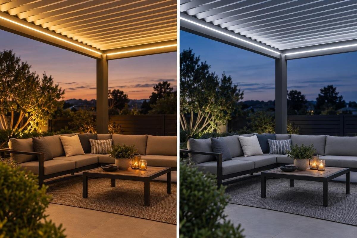
After dark, the same pergola can read as relaxed and intimate under warm white light or crisp and more neutral under a cooler white. Neither choice is automatically better, and colour temperature is not a measure of brightness, heat or quality. The useful comparison is how the actual light looks with the table, finishes, planting and nearby house lighting, then whether that appearance suits dinner, conversation or practical tasks. This guide explains what the Kelvin label tells you, what it leaves out and how to compare options without treating preference as a technical rule.
01
What warm and cool colour temperature mean
Colour temperature, often labelled correlated colour temperature (CCT), describes whether white light looks more yellowish or bluish. Lower Kelvin figures generally appear warmer; higher figures generally look cooler. As a loose guide, 2,700–3,000 K is commonly sold as warm white, around 3,500–4,000 K as neutral white, and 5,000 K or above as cool or daylight white. These are shopping conventions, not firm boundaries: makers use labels differently, and products between the ranges may be described in several ways. A 3,000 K lamp in one fitting can still look different from another because its spectrum, optics and surroundings affect what you see. Treat the number as a starting point, not a promise of mood.
CCT describes colour, not heat, brightness, power use or quality. It also cannot tell you how faithfully a fitting renders timber, food, foliage or skin; colour rendering and the rest of the specification matter. Camera exposure and screen settings can distort a product photo, so two images are poor evidence that one light is warmer. Use the Kelvin number to narrow choices, then judge an actual sample or demonstration in the intended setting. If you are considering Bloomcabin Bioclimatic Pergola, compare lighting specifications separately from the structure itself. Look for the chosen fitting’s stated CCT rather than assuming that the pergola’s name or promotional images establish its lighting options.
Warm white for relaxed dining
Warm white is often chosen for dinner because its golden cast can make the scene feel softer and closer to candle or lamplight. It can sit comfortably with honey-coloured timber, brick and earth-toned tableware. Those are tendencies, not rules: one warm lamp may look pleasantly mellow, another strongly amber, and a pale grey or blue-white setting may make that contrast more obvious. If the pergola is mainly used for meals and conversation, ask whether you enjoy that warm cast on plates and faces rather than relying on words such as ‘cosy’ or ‘relaxing’ on a package. The result also depends on how much light the fitting gives and how broadly it spreads.
Compare the light with the illumination coming from the house, since the transition from indoors can change how warm or cool an outdoor source appears. If you are considering a wall-mounted structure such as Bloomcabin Wall-Mounted Pergola, assess the lamp against your actual exterior finish and table setting, not just a catalogue image. Warm white that suits timber may make a cool-toned wall look more yellow than expected. If that contrast bothers you, neutral white may be a better fit, even when warm white looks attractive on its own. Judge the view from the doorway you use most, with the indoor lights set as they normally are.
02
Cooler white for practical tasks
Cooler white can make an outdoor scene feel crisper or more neutral, which some people prefer for serving, reading a menu, sorting ingredients or tidying up. It may sit more naturally with cool-grey or bright-white finishes than a distinctly amber source. However, cooler CCT does not automatically mean clearer vision or a brighter work area. The amount and spread of light, the task surface and contrast all matter. A menu, book or serving board may be easier to use when light falls evenly on it, regardless of whether the tone is warm or cool. Consider the fitting’s output and coverage as well as colour temperature; do not ask Kelvin to solve a brightness problem.
When discussing lighting for Bloomcabin Pergola, describe the tasks you want to do rather than simply asking for a cool-white option. Compare warm and cool examples at a similar apparent brightness where possible, so the brighter sample does not win simply because it puts more light on the table. Look at menu text, food, glassware and the finish beneath the light, as well as how the scene feels from your usual seat. Keep your comments on visibility separate from your colour preference: you might find the text equally readable under both lights but prefer how one makes the table setting look.
One colour temperature or separate zones?
A pergola may serve more than one evening purpose: people might eat at one end, then settle elsewhere to talk. If both areas are visible at once, using one CCT across them usually gives a more continuous impression. A warmer table zone and cooler reading or serving area can still work, but the difference should feel intentional rather than like two unrelated fittings. Separate controls can make the contrast more useful, but only if the proposed fittings and controls are compatible. Consider whether the zones are genuinely used independently; if both lights are normally on together, mismatched whites may be more noticeable than helpful. Judge the plan as a whole, not as separate Kelvin numbers.
When describing your layout for the bioclimatic pergola model, mention whether the dining and seating areas are seen together from the house or garden. Compare a single white tone with a zoned approach from those shared viewpoints, rather than judging each area alone. Also consider the view from inside: matching the indoor colour can make the transition feel continuous, while a different tone can mark the pergola as its own evening setting. There is no required match. Think about which lights you normally use together and whether you like the combined appearance before deciding that separate activities need separate colour temperatures.
03
How finishes change under different light
Warm light can make cream, sand, terracotta, red brick and warm timber read more golden; cooler light can make whites and greys appear bluer or more neutral. This is a tendency, not a colour chart. Two fittings with the same CCT may render coloured objects differently, and gloss, texture and nearby surfaces affect the overall impression. Dark finishes reflect less light back into the scene than pale ones, but switching to cool white does not make a dark ceiling or wall behave like a reflective surface. Judge the materials together rather than buying a particular CCT in the hope of correcting a finish.
If you have paint, tile, fabric or timber samples, view them under each candidate light after sunset and at the distance where they will normally be seen. Avoid relying on a phone photo: automatic white balance can shift warm and cool whites, and the screen may not show the original scene faithfully. If the wall-mounted pergola model is on your shortlist, include your own exterior wall in the comparison instead of judging a product image against a neutral background. Consider existing wall lights and indoor spill as well, since both can change how the same finish appears.
Planting and surrounding lights
Planting introduces greens, reds and yellows that can respond differently to the spectrum of a light. A warm source may put a honeyed or olive cast over leaves; a cooler source may look cleaner to one person and stark to another. The Kelvin label alone cannot predict which result you will prefer. Look at the plants from the seat or table, not just from under the fitting, and include pots, painted fences or garden structures that form part of the view. If foliage is only a background, the table setting or house may matter more to your choice than matching a light to the garden.
Make a note of existing exterior lights and their colour before comparing options, especially if several sources will be visible at once. When planning lighting around the Bloomcabin pergola model, include nearby planting and lights in your description of the setting. A warm light may look quite different beside a cooler wall light, even if each is attractive on its own. Decide whether you want a coordinated view or a clear contrast, then compare the actual sources together. Include the garden as you normally see it after dark, rather than judging the pergola light with all the surrounding lights switched off.
04
Colour temperature is not brightness
A warm lamp can be bright and a cool lamp can be dim; Kelvin is not a brightness scale. Output, beam shape, direction and diffuser affect how much light reaches a surface and how it feels to look at. A cooler white may seem more alert or stark, but that impression does not prove it provides more useful light. Likewise, choosing warm white will not necessarily fix a fitting that feels too bright or uncomfortable. Keep the questions separate: colour temperature describes the appearance of white light, while output and optical design affect other aspects of the experience. Check the exact fitting rather than comparing CCT figures alone.
If Bloomcabin’s bioclimatic pergola is on your shortlist, ask any lighting proposal to identify the exact fitting and its stated output, not just its white tone. This lets you distinguish a colour preference from a concern about how much light reaches the table. When a source feels harsh, changing its CCT may alter the colour without resolving the discomfort. Describe whether you dislike the tone, the brightness or looking towards the fitting, rather than using ‘too cool’ to cover every concern. Discuss fixture suitability and mounting with a qualified professional using the exact product manuals, separately from choosing the colour you prefer.
Dimming and tunable-white controls
Three control descriptions are easy to confuse. A fixed-CCT fitting stays at its specified colour. A dimmable fitting can reduce or increase output with compatible control equipment, but that does not necessarily change its colour temperature. A tunable-white fitting is intended to offer more than one white tone, so check its stated CCT range and how it is controlled. Some products change warmth as they dim, but do not assume this feature from the word ‘dimmable’. Read the exact fitting and control documentation; the advertised function needs to match the installed combination. If you need a particular tone at every dimming level, confirm that point explicitly.
If Bloomcabin’s wall-mounted pergola is part of your comparison, decide whether you want one fixed tone or adjustable white before discussing lighting. Ask which exact fittings and controls are documented for the proposed arrangement, rather than assuming a tunable option or compatible dimmer is included. If you expect to use warm white for meals and a cooler tone for another activity, confirm how you would make that change using the proposed controls. Also ask whether your preferred tone remains available when you dim the light. One well-tested CCT may be simpler than paying for an adjustment you rarely expect to use.
05
Compare the light in its real setting
Compare samples in conditions that resemble your usual evening use. Ideally, see the exact fitting or a representative demonstration after dark, with indoor and outdoor lights set as they normally are. View warm and cool options side by side at a similar apparent brightness where possible; otherwise, the brighter one may seem clearer simply because it puts more light on the scene. Look from the dining seat, a standing position and the doorway you commonly use. This is a visual comparison, not an installation test: a colour-temperature label cannot establish whether an outdoor fitting is suitable for your pergola.
Check objects that matter to you: faces, food, white plates, timber, pale paint and nearby leaves. Give each option time, because an immediate glance at a bright sample can bias the comparison. If you cannot see a demonstration, use the CCT and colour-rendering details to shortlist candidates, but treat online images as illustrations rather than proof of the result. Make brief notes in plain terms—too amber, pleasantly soft, too blue or balanced—so you can explain what you prefer without confusing a taste judgement with a specification.
What to confirm before choosing
Ask for the exact light fitting’s specification, not only a broad description such as warm white. Check its stated CCT or adjustable range, its output, available control functions and any colour-rendering information relevant to your finishes. If a proposal includes more than one type of fitting, ask for the details of each rather than assuming they share a tone or control. This makes it easier to compare like with like and check claims against the right manual. A showroom label or product image is not a substitute for the exact fixture details, particularly if you are comparing similar-looking options.
Also verify the outdoor rating and documented mounting approval for the exact fitting and pergola arrangement, using their manuals. A qualified electrician or other appropriate professional should confirm whether the proposed electrical controls and mounting are suitable; do not infer this from colour temperature or the structure’s name. If a particular light or control is not documented for your setup, ask what verified alternative is available. Once these practical details are confirmed, choose warm, neutral or cool according to the scene you prefer, rather than treating any one tone as the technically correct answer.
Frequently asked questions
Is warm or cool lighting better for a pergola?
Neither is automatically better. Warm white often suits a golden, softer look, while cooler white can appear cleaner or bluer. Choose according to the atmosphere and finishes you prefer, then check the actual fitting: colour temperature does not determine brightness or overall lighting quality.
What Kelvin range is considered warm white?
As a rough guide, warm white is often labelled around 2,700–3,000 K. Neutral and cool-white labels tend to cover higher figures, but manufacturers use ranges differently. Read the exact fitting specification and, where possible, view a sample rather than relying on the label alone.
Does cool white make a pergola brighter?
No. Kelvin describes the apparent colour of white light, not its brightness. Output, the fitting’s optics and how light reaches a surface all affect the result. A warm fitting can be bright, and a cool one can be dim, so check those details separately.
Can warm white work for reading or serving?
Yes, if the chosen fitting provides suitable light for the task. Warm white does not automatically make a space harder to use, just as cool white does not guarantee better visibility. Compare the actual light on a menu, serving area or other task surface.
Does dimming change a light from warm to cool?
Not necessarily. Dimming usually changes the light output, while colour temperature stays fixed unless the fitting is specified to change its white tone as it dims. Tunable-white fittings offer adjustable colour only within their documented range and with the specified controls.
Warm white is a sound choice when you enjoy its golden cast; cooler white suits a cleaner, more neutral appearance. For a pergola used in different ways, compare both against the finishes, planting, adjoining lights and actual evening tasks. Treat CCT as one part of the specification, then let the real scene—not a universal rule or product photo—decide the final tone.
