
Warm or Cool Pergola Lighting: Choosing Colour Temperature
Pergola lighting guide
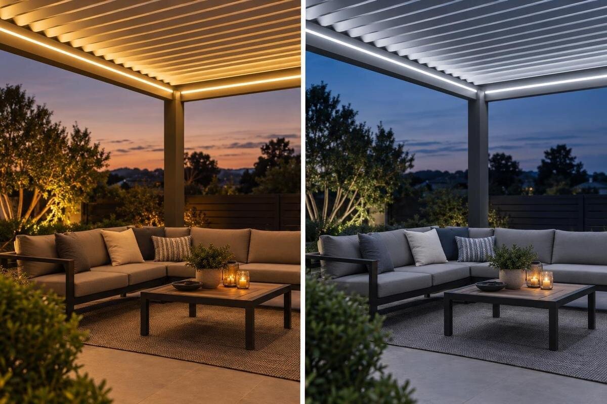
A pergola light can make a patio feel relaxed, crisp or somewhere in between, but “warm” and “cool” describe the light’s colour appearance—not fixture heat or overall brightness. Colour temperature is only one part of the decision: output, colour rendering, surrounding lights and nearby materials all affect what you see. Compare likely options in the evening, in the space you plan to use. This guide explains common Kelvin labels, how different tones may read during dinner or practical tasks, and what to confirm in the exact fixture specifications.
01
What warm and cool colour temperatures mean
Colour temperature, often called correlated colour temperature (CCT), describes the apparent tint of a white light source and is measured in kelvins (K). Lower numbers generally look warmer, with more yellow or amber; higher numbers look cooler, with a whiter or bluer cast. As a rough comparison, many products sold as warm white sit around 2700–3000 K, 3500 K often falls between warm and cool, and 4000 K can read as neutral or cool. These are broad reference points, not strict boundaries. Labels such as “soft white,” “warm white” and “daylight” vary among manufacturers, so check the Kelvin value as well as the marketing term.
Kelvin describes colour appearance, not how much light reaches the table, how faithfully colours appear or how much heat a fixture produces. Output is commonly listed in lumens; colour rendering is addressed by ratings such as CRI. When considering a Bloomcabin Pergola, treat the structure and the light fitting as separate decisions: the product name alone does not confirm a lighting package or particular CCT. Two lamps with the same Kelvin number can still look different because their colour rendering, optics and surroundings differ. Use Kelvin to narrow choices, then compare actual samples in the setting.
Choose a tone for the way you use the space
Warm white is a common preference for dinners and unhurried conversation because its yellow or amber cast can feel gentle against a dark garden. It can also sit comfortably beside candlelight or warm-toned indoor lighting, if those are part of the scene. The effect is subjective, though: a dim warm fixture may make a table hard to use, while a brighter one can feel more animated. If you are considering a Bloomcabin Bioclimatic Pergola, base the separate lighting decision on the activities expected underneath it, not on the pergola category. Think about your most frequent use rather than trying to satisfy every occasional task with one tone.
Cooler white often gives a crisper, more alert impression and may suit games, reading or tasks that involve checking small details. It is not automatically easier to see by: output, optics, contrast and where the light lands matter too. At night, a high-Kelvin white can feel stark next to amber-toned materials or warm indoor lamps, while a more neutral tone may be a workable middle ground for a space used for meals and practical jobs. Ask which mood you want for ordinary evenings and which tasks need separate support. Preferences differ between households, so no one Kelvin value is a universal pergola standard.
02
Adjustable white for mixed-use patios
One fixed colour temperature may be enough when the pergola has one main purpose, but a shared space can host both conversation and detailed tasks. Some fixtures offer selectable CCT or tunable white, allowing a choice among stated white tones. Check how the manufacturer describes that adjustment rather than treating the terms as interchangeable. A dimmer is not the same thing: many dimmable LEDs reduce brightness while keeping a similar colour appearance. A product described as “dim-to-warm” changes tone as it dims only if that behaviour is included in its specifications. Do not assume that a dimming control will turn cool white into warm white.
If adjustable white matters, find the fixture’s Kelvin range, number of settings and control method; a broad label such as “adjustable” does not tell you the actual endpoints. Check whether the setting can be changed when needed or is selected at installation, and whether separate lights respond together or independently. For a plan that includes a Bloomcabin Wall-Mounted Pergola, keep these questions attached to the proposed fixture rather than assuming the pergola itself supplies the control. A remote or app may be part of one fixture’s setup but not another’s, so verify the exact model before relying on a particular routine.
Nearby finishes and colour rendering
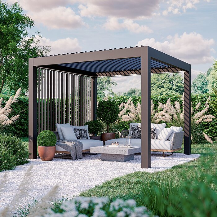
Nearby materials can shift how white light feels. Warm light may intensify yellow, orange or red notes in brick, timber, cushions and plant pots; a neutral or cool source can make pale stone, grey metal or white surfaces look cleaner, but it may also reveal blue undertones. These are tendencies, not guarantees: the finish, texture, neighbouring colours and light output all matter. Glossy tile and polished metal can reflect light differently from matte concrete. Include the dining table, floor, fence and wall in your comparison, because a small sample viewed alone cannot predict the overall palette.
Colour rendering is separate from CCT. A CRI value, where supplied, offers a broad indication of how a source renders colours relative to a reference, but it does not tell you whether the light will look warm or cool or predict every individual hue. Two fixtures labelled 3000 K can render red fabric or green leaves differently. When choosing finishes for a Bloomcabin Pergola, compare a distinctive cushion, painted surface or timber sample under the candidate light if its colour matters to you. Decide which materials you want to keep looking familiar and which changes in tone you enjoy; a Kelvin number alone cannot make that judgement.
03
Match nearby light sources deliberately
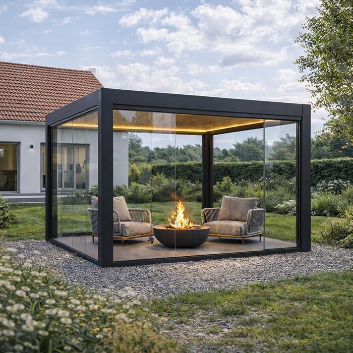
Light seen from the house may matter as much as light under the pergola. If the patio is visible through a kitchen or living-room window, a very cool exterior source beside warm indoor lamps can make the two spaces feel visually disconnected; a similar tone can create a quieter transition. Neither approach is mandatory. Some people prefer outdoor light to read as its own zone, especially when the interior and patio serve different purposes. With a bioclimatic pergola in the plan, decide whether the outdoor area should blend with or contrast against nearby interior light, then check the actual view from the rooms you use.
Include existing porch lights, wall sconces and path lights in that decision. A pergola fixture may look balanced on its own and feel mismatched once neighbouring sources are switched on. Compare their stated CCT where available, but do not rely only on matching numbers: lenses, brightness and reflected surfaces can change the effect. If the lights operate separately, you may be able to treat the pergola as a warmer or cooler zone; if they will routinely be on together, closer colour appearances can look more cohesive. Consider both the seated patio view and the view from inside before settling on a tone.
How surrounding surfaces affect light at night
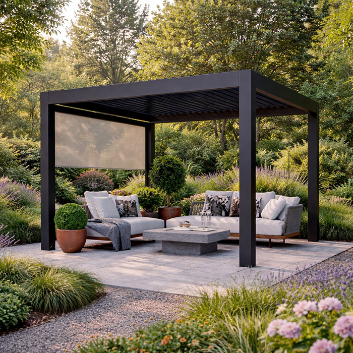
The background outside the pergola changes how a light reads after sunset. Dark fencing or dense planting can make a lit dining area stand out sharply; pale siding, stone or paving can reflect light back into the scene and make the same source feel more prominent. For a wall-mounted pergola, include the wall and nearby surfaces when comparing samples instead of judging a lamp against a blank showroom background. The light’s Kelvin rating has not changed, but the contrast around it has. That is why a product photograph against a neutral backdrop is a weak guide to how a fixture will look on your patio.
Seasonal surroundings can add another change. Leaves may soften or partly screen the view in warmer months, while bare branches expose more of the fence, siding or sky; snow, if present, can reflect more light than dark paving. These differences affect the appearance of the whole scene, not the fixture’s colour temperature. If the pergola is used across seasons, picture the seating area in its darker-season setting as well as in summer. Where you cannot test both, look for a demonstration with similar surfaces and note which surroundings are likely to be present when you use the light most.
04
Consistent white tones across multiple fixtures
Repeated fixtures within the pergola deserve a closer comparison than lights in separate outdoor areas. Along one table or seating area, a single light with a noticeably different white tone can interrupt an otherwise consistent scheme. If you are comparing a wall-mounted pergola model, note how many separate light sources you plan to use and which will illuminate the same surfaces. Decide whether those fixtures should share one colour appearance or serve distinct uses. This gives you a clear basis for comparing a set of lights, rather than choosing each one independently and discovering the differences only when they are all switched on.
For fixtures intended to look alike, compare their Kelvin information and view them side by side where possible. Equal labels do not always produce identical appearances because construction and colour rendering vary. If adjustable fixtures will be used together, check how you will select the intended white tone on each one; this is separate from deciding whether their brightness should match. Keep the exact model details and chosen CCT setting for future replacements. When replacing a light, compare it with the remaining fixtures before judging the overall result, especially if an unexpected blue or amber cast would stand out across the same table.
Compare brightness as a separate decision
Brightness and distribution need their own comparison. Two lights at the same CCT can create very different usable light because their lumen output, optics, distance and surroundings differ. A higher Kelvin value does not mean more lumens, and a cooler-looking option can seem brighter to some viewers even when its output is similar. When comparing a separate fixture for Bloomcabin’s bioclimatic pergola, note the stated output and intended task as well as the CCT. For dining, seeing faces and food may matter; for reading or tabletop games, even coverage of the work area becomes important. Colour alone cannot answer either question.
Compare candidates at a similar intended brightness whenever possible; otherwise, the brighter sample may win simply because it is brighter, not because its colour temperature suits you better. If dimming is part of the planned use, judge the light at the setting you expect to use, while remembering that dimming may not change CCT. Direct glare and a poorly chosen beam are separate issues that colour temperature will not correct. Keep them on the list for the fixture and placement review, but do not try to solve them by choosing a warmer or cooler white. A well-chosen tone still needs adequate, comfortable illumination for the activity.
05
Test colour temperature after dark
A useful test happens after dark, when the pergola will actually be used. Arrange samples or a demonstration at the planned location and compare one tone at a time against the real table, floor, seating and wall. Keep fixtures at a similar brightness and viewing position so you are judging colour, not an accidental difference in output. Give your eyes a few minutes to settle when switching between distinctly different whites; a quick glance can exaggerate the contrast. Use a supplier’s or qualified installer’s approved demonstration method rather than improvising an outdoor electrical setup.
Check more than one view: sit where you normally eat, stand where you serve food and look back from the house if that is part of the scene. Notice whether food, faces, cushions and surrounding materials look the way you want, and whether the pergola remains visually connected to nearby outdoor lights. Write down each candidate’s Kelvin value, output or dimmer setting, and your impression so memory does not decide the purchase for you later. Phone photos can shift white balance and exposure, so use them for rough notes only, not as the final judge of colour.
Confirm the exact fixture and its approved use
Before ordering, check the exact fixture data rather than relying on a broad category name. Look for its stated CCT or selectable range, lumen output, colour-rendering information if provided, and whether dimming changes colour. Confirm which control is compatible and whether it will operate as you expect; a separate switch or dimmer cannot be assumed to provide tunable white. Keep the manufacturer’s model number with the product record, because versions within a product family may have different specifications. These details explain what a light can do; they do not by themselves confirm that it can be mounted in a particular place.
For outdoor use, the exact fixture’s outdoor rating and the pergola manufacturer’s documented mounting approval must fit the proposed location. Have a qualified electrical professional review compatibility, the supplied manuals and the planned connection; do not infer approval from a similar-looking fixture or from the pergola’s product name. If lighting is being coordinated with other electrical equipment, verify each item against its own instructions rather than assuming controls or mounting points are shared. Resolve those technical questions before choosing a colour, so the preferred warm or cool tone comes from options verified for the project.
Frequently asked questions
Does warm pergola lighting use less electricity?
Not because it is warm. Colour temperature does not determine energy use; compare the exact fixture’s rated power and expected operating time. Output, controls and how long the light is on are separate considerations.
Will dimming a cool LED make it warmer?
Not necessarily. Many dimmable lights get less bright while keeping a similar colour appearance. Look for a stated dim-to-warm or tunable-white feature, and check the exact fixture’s specifications.
Which Kelvin value is best for a pergola?
There is no single best value. Warm white often looks softer, while neutral or cool white can look crisper. Compare samples against your patio finishes and nearby lights, at the brightness you expect to use.
Does a higher Kelvin rating show colours more accurately?
No. Kelvin describes the apparent tint of white light; colour rendering is a separate property. Check the fixture’s colour-rendering information, if provided, and view important finishes under the actual light.
Can I combine warm and cool outdoor lights?
Yes, if the difference is intentional. Similar tones can make nearby lights feel cohesive, while distinct tones can mark separate areas. Compare the sources switched on together and check how they look from the patio and house.
The most useful colour-temperature choice is one you have compared in the setting where you will use it. Warm white may suit the atmosphere you want for dinner, while a neutral or cooler white may better match your preferences for a mixed-use patio. Judge each option at a comparable brightness, with nearby lights switched on and your main finishes in view. Keep a note of the fixture and setting you preferred so that the choice is easy to carry through to your order. There is no universal winning Kelvin value: the aim is a pergola that looks and feels right to you after dark.
