
Warm or cool pergola lighting: choosing colour temperature
Pergola lighting guide
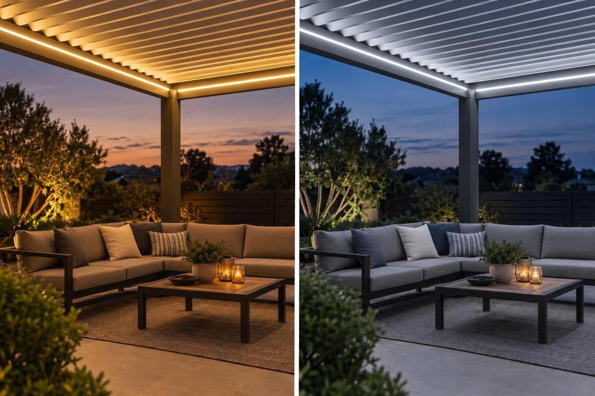
Warm and cool light can make the same pergola feel quite different after sunset, but colour temperature is a matter of preference rather than a rule for a particular structure or activity. Lower Kelvin values usually appear more golden; higher values tend towards a whiter or bluer look. To choose well, compare actual fittings in the setting where you will dine, read or unwind, and keep brightness, colour rendering and outdoor suitability separate from colour temperature.
01
What colour temperature tells you
Colour temperature, usually shown as a Kelvin value (K), describes the apparent hue of a white light source. A lower number normally looks warmer, with a yellow or amber cast; a higher number tends to look whiter or bluer. The word temperature refers to visual appearance, not how hot the fitting gets. A warm-white LED still produces some heat, but its Kelvin figure does not tell you how much. Nor does it tell you the fitting’s brightness or power consumption. Product information often calls this correlated colour temperature (CCT): a useful shorthand for comparing white light, but not a complete description of what you will see.
As a broad guide, many LED labels use about 2,700–3,000 K for warm white, around 3,500–4,000 K for neutral white, and about 4,000 K or above for cool white. The categories overlap, and manufacturers do not always draw their boundaries in the same place. Read the Kelvin value rather than relying only on a label such as warm or cool, but do not treat the number as a promise of identical appearance. Tint, diffuser, optics, colour rendering and nearby surfaces all contribute to the result. If two options are close, an actual sample of the proposed fitting is more informative than the category name.
Warm and cool light in an evening setting
The familiar difference is visual. A warmer source gives a scene a golden or amber cast and may feel softer for an evening sitting area. A cooler source can look whiter or crisper, which some people prefer for a contemporary feel. Neither response is universal: one person may find a warm lamp cosy, while another sees it as too yellow; someone else may welcome a whiter tone, while a companion finds it stark. Imagine the same table set for two different evenings: a leisurely meal with friends and a quiet evening reading outdoors. You might prefer the same tone for both, or find that your preference changes with the activity. Discuss what each person likes about the appearance rather than assuming that words such as cosy or crisp mean the same thing to everyone. These preferences are not engineering rules, and neither colour is inherently more suitable for outdoor use.
Judge the colour at the time you are likely to use the pergola. At dusk, the remaining daylight can make a fitting seem different from how it appears in full darkness; light spilling from a kitchen or sitting room can also affect the view. When comparing structures such as the Bloomcabin Bioclimatic Pergola, keep your preferred light tone as a separate choice from the pergola model. Judge the colour using the exact fitting being considered: a demonstration or sample is more useful than a generic photograph.
02
Colour temperature for dining, reading and relaxing
Map out the usual activities before settling on a tone. A table used for meals and a chair used for a quiet drink may share one pool of light, or they may need different levels. Reading, serving and clearing up call for usable light and suitable distribution; choosing 4,000 K instead of 3,000 K will not fix a fitting that is too dim or poorly directed. For unwinding, a softer-looking tone may be preferred, but that is a personal choice rather than a rule about dining or reading. Give most weight to the activities that happen regularly, rather than designing the colour scheme around an occasional gathering. It also helps to separate two questions: do you like the appearance of the light, and can you comfortably see what you are doing? If the answer to the second is no, reconsider the output or distribution before rejecting the colour temperature. That distinction keeps a practical lighting problem from becoming an unnecessary search for a different white tone.
If the same area serves several purposes, a single white tone may be the simplest choice. Where activities are clearly separate, different lighting zones or adjustable output might matter more than different colour temperatures. The bioclimatic pergola model listing gives a model range from 9 to 24 m²; use the exact selected footprint and furniture plan to decide whether you have one area or several. More floor area alone does not mean that multiple colour temperatures will be useful.
How finishes and planting affect the colour
Timber, paving and paint can look different under different light sources: their appearance depends on the light falling on them, not just their own colour. Warm light may bring out yellow or red notes in wood and brick, while making white finishes look creamier. A cooler source may make grey or blue tones seem more neutral, but can make a warm-toned finish look less golden. These are tendencies, not guarantees: surface colour, texture, gloss and the angle of the light all influence the result. Identify which finishes occupy most of your view when seated. A large pale wall, a timber table and grey paving may give you quite different reasons to favour one tone over another. Rather than trying to make every material look exactly as it does in daylight, decide which overall evening appearance you prefer. Include the furniture you intend to keep, not just the pergola frame, when making that judgement.
Foliage, flowers, pots and outdoor textiles add other colours to the scene, and they will not necessarily look as they do in daylight. Pale walls can reflect light back into the seating area, while darker surfaces may absorb more of it. For a project based on the Bloomcabin Wall-Mounted Pergola, include the house wall in your comparison of light samples. Its appearance forms part of the evening setting, alongside the furniture, paving and planting.
03
Compare samples in the space, not on a screen
If you can compare samples, try to isolate colour temperature from other differences. Looking at the same type of fitting at similar brightness makes the comparison more useful than setting two unrelated lamps side by side. If one option is much brighter, its colour may seem more noticeable, making it harder to tell whether you prefer the tone or simply the higher output. A demonstration of the proposed fitting is preferable to a sample that only looks similar on paper. Keep the furniture, viewing position and surrounding lights unchanged while comparing the options. Look at each tone on its own as well as alongside the alternative, so your decision reflects how it would appear in normal use. If the fittings differ in their diffuser or distribution, note that difference rather than attributing the whole effect to Kelvin. The aim is not a laboratory test, but a comparison that makes your preference easier to explain.
View the options from the seats and table, and include the surfaces and planting you see most often. Compare at dusk and again after dark if that reflects how you use the space. Phone photographs are unreliable evidence: screens and camera settings can shift white balance and display colours differently. If you are considering the Bloomcabin Pergola, use your intended furniture layout to choose where to view the light samples. A product image cannot substitute for seeing the proposed fitting’s light.
Colour temperature is not brightness or colour quality
Brightness and colour temperature describe different things. Light output is commonly stated in lumens, while the effect on a table or seating area also depends on the fitting’s distribution and position. A warm-white fitting can provide more light than a cool-white one, or less. For this reason, do not choose a Kelvin value as a shortcut for deciding whether the light will be sufficient for a particular activity. Compare the output and distribution information for the proposed fittings as well.
Colour rendering is another separate consideration: it describes how well a source shows the colours of objects compared with a reference. A stated CCT does not tell you whether food, fabrics or foliage will look natural, and a higher colour-rendering score does not mean the light is warmer or brighter. Look for the colour-rendering information provided for the fitting, alongside its CCT, and use a real sample where appearance matters. When comparing options, keep separate notes for the white tone and the appearance of familiar objects. You might like the warmth of the light itself but be less happy with how it shows a particular tablecloth or plant. Equally, a whiter tone may show those objects in a way you like without creating your preferred atmosphere. This is why colour rendering and colour temperature belong in separate parts of the comparison, rather than being combined into one judgement about colour quality.
04
Fixed, dimmable and tunable-white options
A fixed-CCT fitting gives one white-light appearance. Dimming usually changes the output, but does not necessarily make the light warmer; some fittings are designed to shift to a warmer tone as they dim. Tunable-white fittings let you adjust CCT across a stated range, while colour-changing RGB fittings are a different category and do not automatically provide the same quality of white light. Check the fitting’s own description rather than assuming what a control will do.
Ask whether you would genuinely use more than one setting. If you tend to leave lights at one level, a suitable fixed tone may be simpler. If flexibility matters, check the adjustment range and which controls are specified for the exact fitting; do not assume that every dimmer or smart control is compatible. Think about what you want to change during an ordinary evening. Wanting less light after a meal is a question about output; wanting a less yellow appearance is a question about colour temperature. You may want one adjustment, both or neither. Describing those preferences clearly is more useful than asking for adjustable lighting without specifying what should adjust. If you are considering the wall-mounted pergola listing, note your preferred adjustments alongside the chosen configuration, rather than assuming that a particular control is included.
Confirm fitting and mounting compatibility
Choose colour temperature only after you know which fittings and positions are actually supported for the pergola. Check the fitting’s instructions, its outdoor rating for the expected exposure and the manufacturer’s documented approval for the proposed mounting position. A fitting described as suitable for outdoor use is not automatically approved for attachment to any pergola. Likewise, a product photograph does not establish whether a light may be fixed to a beam, frame or moving part.
Before finalising the lighting plan, make sure the exact fitting, controls and proposed positions have been reviewed against the manuals for the chosen structure. A qualified electrician can provide input on the electrical requirements and compatibility; the relevant manufacturer documentation should confirm mounting approval. When the Bloomcabin Wall-Mounted Pergola model is the one being considered, use the documentation for that exact model and configuration rather than inferring support from the name or appearance.
05
Coordinate with house and garden lighting
Existing lights can change how a pergola fitting looks. A warm source beside a cooler kitchen light may create a noticeable change in colour between the two spaces, particularly when both are visible at once. That is not automatically a problem: some people prefer a consistent feel across the terrace, while others like the pergola to feel like a separate area. Consider the view from indoors as well as from the outdoor seats. If you usually look out through the kitchen doors, the relationship between the two spaces may matter more than it would in a seating area further into the garden. Decide whether you want continuity or a deliberate contrast before trying to match individual Kelvin figures. The important point is to judge the lights together, rather than treating the pergola fitting as an isolated choice. A difference that you like need not be corrected simply because the stated colour temperatures do not match.
List the lights that will usually be on at the same time, including house lights visible through doors or windows and garden fittings within view. If separate switching is part of the plan, consider how the spaces look with the lights on together and separately, and confirm that the controls are supported. For a project using the regular pergola model, note which surrounding lights are visible from the planned seating positions. This gives you a practical basis for deciding whether you prefer matching tones or a deliberate contrast.
A practical checklist before ordering
Narrow the choice to a small number of plausible CCT values, then record why each remains under consideration. Useful notes describe a preference, such as a less yellow appearance against the paving or a warmer look at the dining table, rather than simply ranking the Kelvin numbers. Where you have compared samples, note which fitting you saw and whether it was dimmed; this keeps your impression tied to the option you could actually order. Resolve any differing household preferences before making the final selection. If you cannot view a sample, use the stated Kelvin value as a guide, not as a guarantee of the finished appearance.
Before ordering, keep the fitting’s CCT, output, colour-rendering information and dimming behaviour together in your notes, along with its outdoor rating and the confirmed mounting position. Record the exact pergola model and configuration too: if the Bloomcabin Bioclimatic Pergola model page is on your shortlist, refer to that specific choice when checking which lighting arrangements are documented. This makes it easier to compare like with like without treating colour temperature as the whole specification.
Frequently asked questions
What Kelvin rating is warm white for pergola lighting?
Warm white is commonly described as around 2,700–3,000 K, but manufacturers’ labels and category boundaries vary. Treat the range as a guide, then check the exact CCT in the fitting’s product information and, if possible, see that fitting lit. Two lights with a similar Kelvin value can still look different.
Is warm light always better for dining outside?
No. Some people prefer the softer, golden appearance of warm white for an evening meal; others favour a more neutral tone. The colour temperature does not determine whether the table is bright enough for serving or reading. Compare the actual light in the setting and consider output and distribution separately.
Does a higher Kelvin value make a light brighter?
No. Kelvin describes the apparent colour of white light, not its brightness. Compare light output, usually stated in lumens, and consider how the fitting distributes light. A higher-CCT fitting can be dimmer than a lower-CCT one, or the other way round.
Can warm and cool lights be used in the same pergola?
They can, if the difference is intentional. Separate areas may suit different tones, but mixed colours can look distracting where their light overlaps. Look at the combined effect after dark, and check that any dimming or switching arrangement is supported by the chosen fittings and controls.
What should I check before using a light fitting outdoors?
Colour temperature does not establish whether a fitting is suitable for outdoor exposure or approved for mounting on a particular pergola. Check the fitting’s outdoor rating and instructions, and confirm the proposed mounting position against the exact pergola documentation. Ask a qualified electrician to review the electrical requirements.
There is no single Kelvin value that suits every pergola or every evening. Warm light may feel more relaxed to one household, while a cooler tone may be more appealing to another. The most reliable choice comes from considering the real activities, finishes and surrounding lights together, then judging the actual fitting rather than relying on a label alone.
