
How to Choose Window and Door Colours: RAL, Dual Colours and Finish Samples
UK window and door buying guide
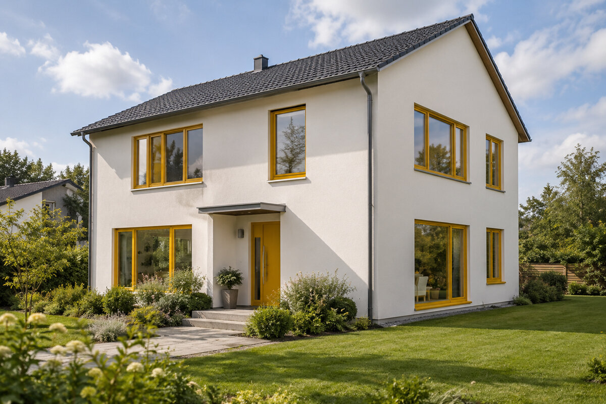
A colour choice can become difficult during a retrofit because the new windows and doors must sit alongside things that are not being replaced: brickwork, render, roof tiles, rainwater goods, paving and perhaps older frames elsewhere on the property. The practical starting point is not a colour chart. First confirm which openings are in the order, how they open, which elevations will be seen together and which existing finishes must remain. Then develop an exterior palette, decide whether the rooms need a separate interior answer, and test real finish samples in their intended setting. This avoids approving a shade that looked convincing in a showroom but appears unexpectedly cool, heavy or reflective at home. A RAL reference gives everyone a common way to record a choice; a physical sample shows how that choice actually reads in light.
Start with the replacement plan, not the colour card
Colour sits on the visible framework of the product, so the opening type changes its visual impact. A broad glazed opening has a much stronger frame pattern than a small bathroom window, while opening sashes introduce lines that a fixed non-opening window does not. Mark every proposed unit on a simple elevation sketch or on photographs of the house. Note approximate proportions, opening direction, groups of adjoining units and what will remain after the work. This establishes where a dark outline would become a feature and where a quieter finish may help glazing recede. It also stops one appealing sample from being selected without considering how often its frame will repeat across an elevation.
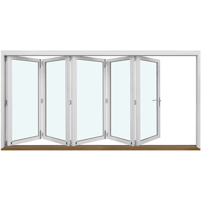
Coordinate access and installation planning with the visual brief from the beginning. For example, the closed grid of outward-opening bifold doors can become a major garden-facing element, so assess its proposed finish next to neighbouring windows rather than in isolation. A rear extension may support a bolder door colour while the retained front elevation calls for a more restrained relationship with existing joinery. Record whether the project is a single replacement, a phased refurbishment or a complete set of openings. That decision affects how closely new and old elements need to relate, and gives the supplier a useful context when preparing the colour schedule.
Read the exterior as a group of permanent materials
Begin with surfaces that are unlikely to change soon: brick, stone, render, roof covering, cladding, coping, gutters and substantial boundary elements visible close to the house. Their undertones matter more than broad names such as grey, cream or red. A pale render can look warm beside one sample and bluish beside another; mortar can be as visually influential as the bricks. Hold candidate samples directly against the wall, then view them from the pavement, garden or approach where the building is normally experienced. A near-match deserves particular caution, because two almost identical colours can look like an unplanned mismatch once the difference is visible.
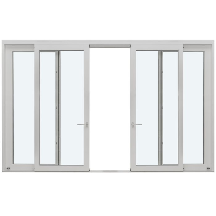
Treat front, side and garden elevations as connected but not necessarily identical design situations. Street-facing windows may be read within a larger composition of roof and masonry, whereas a garden room is often experienced at close range beside planting, decking and furniture. A large opening such as Patio Life side-sliding patio doors should be considered both shut and as part of its surrounding wall, because the visible frame makes a clear border around the view. Decide whether the intention is a quiet transition into the facade, an echo of roof or metal details, or deliberate contrast. Any of these can work when it is chosen in relation to the actual materials.
See the whole opening
Use RAL as a precise reference, not a viewing method
A RAL designation is valuable because it replaces vague instructions such as “almost black” or “a warm white” with a recordable reference. Include it in the quotation review, the elevation schedule and any correspondence where colour is confirmed. It helps the homeowner, designer, supplier and installer discuss the same intended shade, especially where several people make decisions at different times. However, a RAL number does not communicate how a finish will look on a particular profile in a particular location. Screen displays, printed brochures and photographs alter colour through settings, lighting and editing, so they are useful for shortlisting rather than final approval.
Specify what the reference applies to, not just the reference itself. Ask whether it is intended for the exterior face, interior face, frame, sash, panel, glazing bars and any sidelights. If several products are involved, make a table with one row per opening and separate columns for each visible face. This prevents an exterior choice being assumed to apply indoors, or a door panel being assumed to match surrounding frames without discussion. Keep the final schedule with the order paperwork. It becomes a practical record if a later phase of work needs to coordinate with the original installation, or if a sample name is remembered differently by different people.
Choose a finish character as well as a colour
The same nominal colour can read differently according to surface sheen, texture and surrounding reflection. A smoother or more reflective surface can pick up sky, greenery and adjacent brick more readily, while a lower-sheen appearance may make a colour feel softer and more stable. Do not assess colour without also confirming the finish sample supplied for the proposed product. Look at the sample edge-on and face-on, because light catches these surfaces differently. This is especially important beside wide glazing, where the outside scene is reflected in the glass and can alter how the surrounding frame is perceived throughout the day.
Take samples outdoors at several moments rather than making a decision under one ceiling light. View them on a bright overcast day if possible, in direct sun, in shade and near dusk, then bring them indoors to the rooms that will face the frames. Place a light sample beside the actual flooring, paint and worktop rather than matching it to a remembered image. Avoid judging a small piece only at arm’s length; step back far enough to recreate the usual view of the opening. If the result seems different in each setting, identify which setting matters most for the project instead of looking for a colour that can never change with light.
Decide whether one colour can serve both sides
A single colour on both faces is often the simpler visual strategy. It can make the building feel continuous, reduce the number of recorded decisions and suit interiors where windows are intended to form a crisp graphic outline. It is worth testing whether that exterior-led choice works in every relevant room, however. A strong dark frame may complement pale masonry outdoors yet feel prominent around a compact bedroom window. Conversely, an interior colour selected for cabinetry or plaster may not sit comfortably against the roof and wall materials. The right answer follows the views, light levels and rooms involved, rather than a rule that every opening must match on both sides.
Use one finish when interior and exterior objectives genuinely align. In open-plan rooms, note whether several frames share one sightline and whether a nearby internal panel door should coordinate or deliberately differ. It need not imitate external frames by default. Also picture the room after dark: does the frame become too dominant under artificial light, or does its outline support the intended atmosphere?
Use dual colours to solve a real conflict
Dual colours allow the exterior to respond to the architecture while the interior responds to rooms, finishes and daylight. They are most helpful where the facade needs a defined, durable-looking frame colour but the indoor scheme calls for a lighter or less assertive perimeter. They can also make sense when a new glazed extension has a unified outer appearance while adjoining rooms have different interior palettes. Dual colour is not simply an upgrade in visual terms; it creates more choices to verify. Confirm exactly which side is called internal and external for every window and door, particularly where openings connect a conditioned room to a sheltered or enclosed area.
A dual-colour schedule should state the inside and outside colour for every unit, then identify components that require separate confirmation. For a panelled entrance door – outward opening, distinguish the outer door face, inner door face, frame and any associated side glazing in the written brief. Ask to see samples side by side at the doorway, where exterior light and hall lighting meet. Consider continuity from the hall as well: a pale inner face may connect with walls, while a darker frame can still establish a purposeful outline. Do not assume hardware, seals or glass-dividing details follow a colour decision; ask what is available and have each choice recorded.
See the whole opening
Include door surrounds, sidelights and repeated details
A front entrance is rarely experienced as a door leaf alone. The reveal, frame, threshold area, letterplate, handle, house number, external light and nearby rainwater goods all contribute to the impression. Before selecting a door colour, photograph the entrance in daytime and at night, including any porch or canopy that changes the shade. Decide which element should lead: the door panel, a dark structural outline, or the surrounding wall. Matching every adjacent object is unnecessary and can flatten the composition. More useful is a deliberate relationship between the dominant surfaces, with smaller details chosen to support rather than compete with them.
Sidelights deserve their own line in the schedule because their frames can make a chosen entrance colour appear larger or more intense. Where single-panel door sidelights are considered, view a finish sample against both the door-area masonry and the hall finishes seen through the glass. If the sidelights and door will be read as one composition, their exterior relationship should be deliberate; if not, the visual division should also be intentional. Check decorative bars and glass-dividing bars separately where relevant, as these add visible lines and can change the apparent proportion of glazing. Do not rely on a broad phrase such as “match entrance set” when individual elements need confirmation.
Keep large glazed rooms visually calm
Large glazed rooms benefit from a colour decision that considers the view as much as the building. Frames can either recede so that planting, sky and distant outlook dominate, or outline openings as a strong architectural grid. Neither approach is automatically better. Consider what is seen through the glazing during different seasons, whether the room contains dark furniture or pale plaster, and how many frame lines meet at corners or junctions. A relatively quiet colour may make a small room feel less visually segmented, whereas a deliberately contrasting finish can provide useful structure to a simple contemporary space. Test samples against the wall and view through the proposed opening location where possible.
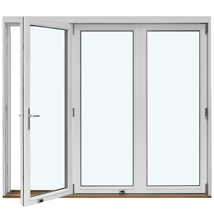
When opening and fixed sections are combined, confirm that every visible profile is included in the colour brief. A Kombi combination window should be reviewed as one assembly, not as unrelated parts. Record the position of opening sections and bars in the order documents. Coordinate neighbouring patio doors at the same time: use a shared exterior colour for unity, or make any contrast clearly intentional.
Match colour decisions to unusual shapes and roof openings
Non-rectangular windows invite a different approach because the perimeter itself becomes a prominent feature. An angled or shaped opening can look like a light-filled cut-out when the frame is quiet, or become a focal point when its colour contrasts with the wall. Assess the sample against the precise background material at the actual height and orientation, bearing in mind that upper-level walls can receive different light from ground-floor elevations. A colour that relates comfortably to standard windows may need reconsideration if an unusual shape is intended to be a distinct architectural moment. Keep the objective clear: connection, restraint or emphasis.
For pivot roof windows, inspect finish samples inside the roof space as well as outside where the external surround will be visible. Sloping ceilings, timber linings and artificial lighting change the perceived colour compared with a vertical wall sample. Think about the view from the bottom of the stair or across the room, not only the close-up view from beneath the opening. Roof products may also be seen against tiles, slate or metalwork from the exterior, so retain a photograph and material reference with the sample notes. Colour selection should support the whole roof-and-room composition without assuming one viewpoint tells the complete story.
Turn samples into an order-ready colour schedule
Before approving an order, create one final colour sheet rather than relying on messages spread across different conversations. For every item, record its location, product type, opening direction, exterior colour, interior colour, requested finish, RAL reference where used, and related elements such as sidelights or bars. Attach dated photographs of the samples beside key materials if that helps the project team understand the intended relationship. Read the schedule against the quotation line by line. The purpose is not to add administration; it is to reveal omissions, such as a rear door that has never been assigned an interior face or a fixed pane assumed to match a neighbouring opening.
Ask the supplier which sample is most representative of the proposed finish and resolve questions before order confirmation. Retain the approved reference and a sample where practical for later decorating, extensions or replacement work. Bloomcabin windows and doors carry a 5-year warranty, and delivery is stated as 4–6 weeks subject to order confirmation; use that period to ensure site access, surrounding finishes and installation sequencing are coordinated rather than treating colour as a last-minute choice. A clear colour schedule cannot make a subjective preference objective, but it gives everyone a shared, reviewable instruction and substantially reduces the risk of a preventable misunderstanding.
Common questions
Is a RAL number enough to choose a window colour?
No. A RAL reference is an effective way to document and communicate an agreed colour, but it is not a substitute for viewing the proposed finish sample. Examine samples against masonry, roof materials and indoor surfaces in changing light. Also record which product faces and components the RAL reference is intended to cover.
Are dual-colour windows suitable for a refurbishment?
They can be useful when an existing exterior needs one response and the interior needs another. Their value depends on the project, not on a general rule. List the internal and external colour for every new unit, including doors and sidelights, so retained frames and new work can be assessed together before confirmation.
Why does the same sample look different at home?
Daylight direction, cloud cover, shade, interior lamps, wall colour and reflective glass all affect perception. Texture and sheen also influence how a finish reads. Take the sample outside and inside, compare it beside actual materials, and view it from the normal approach and room viewpoints before deciding.
Should patio doors and windows always match?
Not always. Matching can create a calm, unified elevation, especially where products are adjacent. A purposeful contrast can also help define a separate extension or entrance. Compare the actual frame patterns and their locations: a large patio door carries more visual weight than a small window, even in the same colour.
What should I check before confirming the colour order?
Check each opening’s location, operation, exterior and interior colour, finish reference, RAL designation where applicable, and treatment of frames, panels, bars and sidelights. Confirm that every sample has been viewed in context. Keep the agreed schedule with the quotation and order records for later coordination and future work.
Before you confirm
The strongest window and door colour decisions are made at building scale and verified at sample scale. Start with the replacement plan and permanent exterior materials, then use real samples to test undertone, finish and changing light. RAL references make the chosen outcome easier to communicate, while dual colours provide an option when interior and exterior priorities differ. Finish by documenting each item rather than relying on a general colour name. That measured process gives a supplier and installer a much clearer brief, and gives you confidence that doors, windows, sidelights and unusual openings will belong to the same considered scheme.
