
Black, Anthracite, White or Greige: Choosing Your Pergola Colour
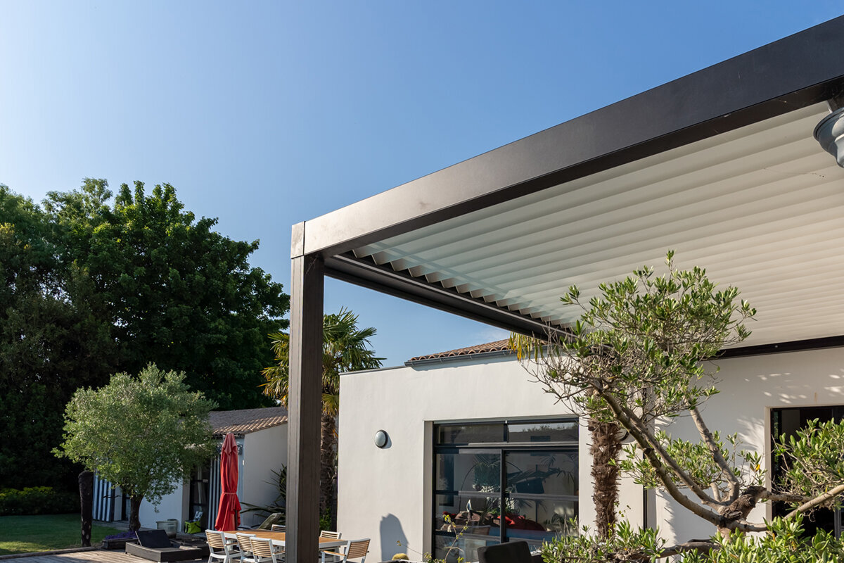
Colour integration report
Black, Anthracite, White or Greige: Choosing Your Pergola Colour
Choosing a pergola colour is less about following a trend than creating a terrace that feels settled within its setting. Black, anthracite, white and greige each change the visual weight of the structure, the character of reflected light and the attention needed to keep it looking composed.
The short answer
To choose a pergola colour, first identify the strongest fixed tones around the terrace: roofline, window frames, brick or render, paving and boundary materials. Then decide whether the pergola should recede into the architecture, define the outdoor room with contrast, or soften the transition towards planting.
Black gives a sharp, contemporary outline; anthracite is a versatile dark neutral; white brightens and lightens a sheltered space; greige brings a warmer, quieter neutrality. None is universally right. View each option against the actual house and consider how marks, shade and seasonal foliage will affect the finished appearance.
01
For strong contrast
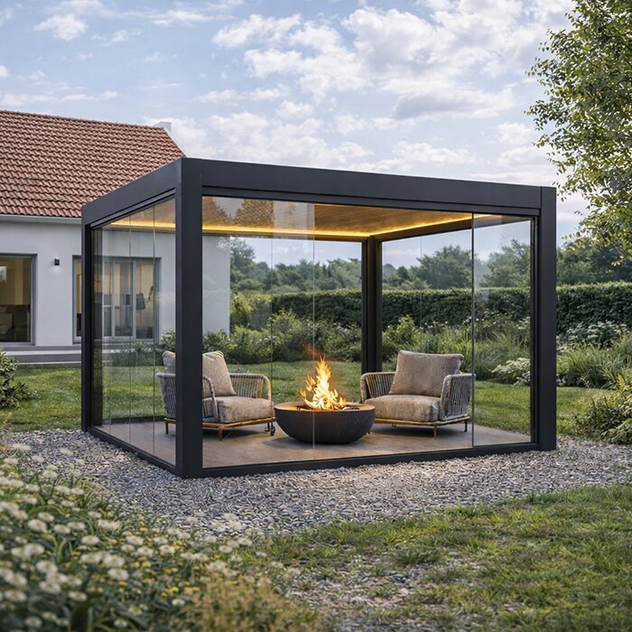
Choose black when pale render, light stone or simple contemporary details can support a clear, graphic frame without making the terrace feel visually crowded.
02
For an adaptable dark
Choose anthracite when you want depth near grey joinery, slate-like paving or mixed materials, with a softer effect than an absolute black outline.
03
For a gentler link
Choose white or greige when brightness, warmth or a less assertive connection between house and garden matters more than dramatic contrast.
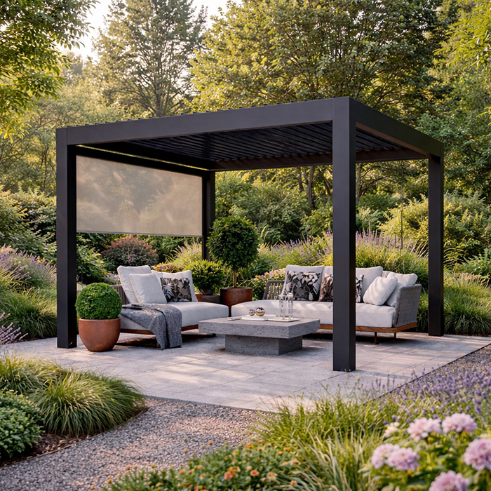
A considered finish connects an aluminium pergola to the architecture, paving and planting around it.
An aluminium pergola occupies a prominent place between house and garden, often framing the view from kitchen doors, a sitting room or an upstairs window. Its colour therefore needs to work at several distances: as a detail against the external wall, as an outline above the terrace and as part of the wider garden composition. Start with the permanent finishes already in place rather than a single paint swatch.
British light also matters. A finish that seems crisp under bright showroom lighting can read quite differently on an overcast afternoon, beside warm brick, pale render or established greenery. Look at samples outdoors beside paving and joinery, then revisit them at different times of day. This gives a more dependable impression than choosing from a screen or matching an indoor room.
The practical question is not simply which colour hides dirt. Pollen, rain marks, dust, leaves and hard-water residue show differently according to contrast, surface texture and orientation. A colour that gives the pergola a deliberate architectural presence may be worth a little more routine care. The most successful choice balances the house’s character, the terrace’s tone and your realistic maintenance habits.
Inspection 01 · Inspection point 01
Read the house before the sample
Begin with the parts of the house that cannot easily change. Window and door frames, gutters, roof tiles, brickwork, render and stone establish the palette the pergola must join. Matching every element exactly is rarely necessary and can look overly controlled. Instead, look for a shared temperature: cool greys and blue-black details tend to sit together, while cream brick, buff paving and timber favour warmer notes.
Consider the building’s period and proportions as well as its colours. A dark frame can add welcome definition to a broad, modern rear elevation, yet feel severe against a small, intricate cottage façade. White can echo traditional joinery but may be too stark beside cool grey cladding. Greige is often useful where materials are varied because it mediates rather than imitates. Hold samples beside the wall, not only on the terrace.
- Photograph the elevation in daylight and shade, including window frames, roof edge, paving and nearby boundary materials for a useful comparison.
- Treat a dominant brick or render tone as the starting point; smaller accessories can be adjusted later if needed.
If the roof form is central to your visual brief, explore a bioclimatic aluminium pergola as part of the overall architectural composition.
Inspection 02 · Inspection point 02
Black creates a deliberate frame
A black pergola makes a confident visual statement. Against pale render, limestone-effect paving or a light contemporary extension, it creates a fine, graphic boundary around the terrace. It can also relate well to black steel-style doors, dark fascias and charcoal outdoor furniture. In a planting-rich garden, the dark structure may visually fall back behind foliage, making leaves and flowers appear more prominent rather than competing with them.
That strength asks for proportion and context. On a compact terrace, a heavy black outline can feel imposing if the house already has dark doors, fencing and paving. It may also highlight pale dust, pollen or dried rain residue in exposed locations. Black works best when it is repeated with restraint in a few architectural details, allowing the pergola to look intentional rather than like an isolated dark object.
- Use black to sharpen a pale elevation, especially where dark window frames or roofline details already provide visual continuity.
- Check it beside your paving: very dark slabs plus black framing can compress the terrace visually, particularly in shade.
For a clean, fixed visual outline, consider a regular black aluminium pergola that complements existing dark exterior details.
Inspection 03 · Inspection point 03
Anthracite balances depth and flexibility
Anthracite is often chosen because it reads as dark and architectural without the absolute contrast of black. It can sit comfortably alongside grey aluminium doors, slate, porcelain paving and many contemporary brick colours. Depending on the surrounding finishes and daylight, it may appear charcoal, soft graphite or subtly blue-grey. That variation is a benefit when the terrace contains several grey materials rather than one precise, uniform shade.
Avoid assuming all greys are interchangeable. A cool anthracite next to warm grey paving, beige render or oak can create an unintended mismatch, while a warmer-looking sample may provide a quieter bridge. Compare undertones outdoors and include a large enough area to judge properly. Anthracite can still show airborne dust and water marks, although its middle-dark character is generally less visually emphatic than a hard black frame.
- Pair anthracite with cool-toned grey joinery, slate-like roof materials or restrained contemporary landscaping for a coherent result.
- Where paving is warm or mottled, test an anthracite sample nearby before treating it as an automatic neutral.
A roof with adjustable visual presence can be paired with an anthracite bioclimatic pergola when the house already uses cool grey detailing.
Inspection 04 · Inspection point 04
White opens up sheltered terraces
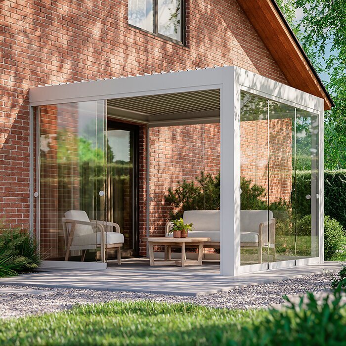
A white pergola reflects light and can make the boundary between indoors and outdoors feel lighter, particularly beside white render, painted timber or pale masonry. It suits coastal-influenced, traditional and Mediterranean-inspired garden schemes, but is not limited to them. On a north-facing terrace or beside a deep rear extension, white can prevent the structure from appearing too weighty and can give the seating area a fresher, more open character.
The trade-off is visibility. Splash marks, urban grime, algae staining from nearby trees and general weathering may be more noticeable on a pale surface, so accessible areas benefit from regular gentle cleaning. White also needs a considered companion palette: brilliant white beside cream brick can look disconnected, whereas off-white paving, light gravel, silvery foliage and pale joinery can make it feel integrated. Assess it against the wall’s true undertone.
- Use white to reduce visual weight beside pale façades or in gardens where a darker structure would dominate the available space.
- Plan routine cleaning around gutters, overhanging trees and cooking areas, where airborne residue may be easier to notice.
To keep a bright terrace composition simple, look at a regular white aluminium pergola alongside pale joinery and light paving.
Inspection 05 · Inspection point 05
Greige softens modern geometry
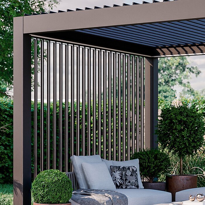
Greige sits between grey and beige, bringing a warmer neutrality to an aluminium pergola. It is especially persuasive where the house includes sand-coloured brick, warm render, natural stone, timber cladding or clay-toned planters. Rather than creating a strong contrast, it can make the terrace feel like an extension of the landscape. This understated quality gives planting, textiles and furniture room to carry seasonal colour without competing with the structure.
Because greige is nuanced, judge it against every nearby material rather than relying on its name. One sample may lean mushroom, another taupe, another grey; daylight will expose the difference. It can be a practical choice for terraces that blend modern and natural elements, but it should still relate to roof and joinery tones. Choose it for its calm, connective effect, not merely because it seems safer than black or white.
- Greige works well with warm stone, timber and softened planting schemes where an emphatic dark frame would interrupt the mood.
- Compare samples next to both the house wall and paving, as either surface can make greige appear cooler or warmer.
For an adaptable warm-neutral scheme, a greige bioclimatic pergola can connect contemporary architecture with natural materials.
Inspection 06 · Inspection point 06
Let paving set the ground tone
The pergola stands on or beside the terrace, so paving often influences the result more than distant roof tiles. Dark porcelain can make a pale structure appear crisp, while pale limestone or concrete makes a dark frame read more pronounced. Veined stone, multicoloured block paving and timber-effect boards introduce several undertones at once. In those settings, an exact colour match is less useful than selecting a pergola finish that belongs to the overall warm or cool family.
Think about scale, too. Large-format pale slabs with a white pergola can create a broad, airy plane, whereas charcoal paving and anthracite form a more enveloping outdoor room. Greige can ease the junction between mixed paving and brickwork. Before committing, lay samples flat on the terrace and view them from inside the house. The eye reads the frame, floor and façade together when looking through glazed doors.
- Match the pergola’s undertone to the paving family, not necessarily its exact shade, to avoid a forced showroom-style pairing.
- Review samples from indoor sightlines, where reflections and door-frame colours can alter the perceived relationship with the terrace.
Where the terrace needs a straightforward, grounded finish, a regular anthracite pergola can sit comfortably with many cool-toned paving choices.
Inspection 07 · Inspection point 07
Use planting as a living material
Planting changes the colour context through the year. Fresh spring greens, dense summer foliage, autumn reds and the quieter browns of winter all alter how a pergola is seen. Black can disappear elegantly behind vigorous climbers and dark evergreen structure, while white becomes a bright punctuation point among foliage. Anthracite provides a measured backdrop to silver leaves and grasses, and greige can echo bark, dried seedheads and natural stone.
Do not choose a colour solely for the garden at its summer peak. In winter, when borders are lower and deciduous trees are bare, the pergola becomes more visible from both house and garden. Consider nearby trunks, boundary fencing and evergreens as well as flowering plants. Leave sufficient visual contrast around doors and pathways for the terrace to remain legible, especially where a dark frame meets a densely shaded corner.
- View the proposed colour beside evergreen foliage and bare branches, since these provide the garden’s most consistent year-round backdrop.
- Use planting to soften a strong frame, but avoid relying on climbers alone to resolve an awkward colour relationship.
When foliage is intended to frame the terrace, a black bioclimatic pergola can provide a composed, recessive backdrop.
Inspection 08 · Inspection point 08
Factor care into the final choice
Every exterior finish benefits from sensible care, and perceived cleanliness depends on contrast rather than a simple light-versus-dark rule. Pale colours can reveal grime, green staining and splashback; black may show dust, pollen and mineral marks; anthracite can soften some everyday residue; greige is often visually forgiving around natural materials. Local conditions make the difference: coastal exposure, roadside pollution, tree cover, hard water and nearby cooking all affect what settles on surfaces.
Build maintenance into the decision rather than treating it as an afterthought. Consider whether the frame is easily reached, whether overhanging branches can be managed and whether the terrace has a water source for routine washing. Use cleaning methods appropriate to the product guidance, and avoid abrasive approaches that may affect the appearance of the finish. If you are comparing quotations, ask what care guidance applies to the selected configuration and finish.
- Choose the colour whose likely marks you can live with, based on tree cover, traffic dust, water quality and access.
- Keep a small sample outdoors for several weeks if possible, allowing ordinary rain, pollen and light to reveal its character.
For a low-key garden scheme with straightforward visual upkeep, consider a regular greige aluminium pergola as a calm link between paving and planting.
Comparison
Finish comparison at a glance
Use this comparison as a design filter, not a substitute for viewing samples on site. Surrounding materials, orientation and local conditions will decide whether a colour feels crisp, subtle, warm or demanding to maintain.
| Finish | Visual character | Works well with and care consideration |
|---|---|---|
| Black | Crisp, graphic and strongly defined. | Pale render, black joinery, lush foliage and light stone paving; dust, pollen and dried water marks can stand out. |
| Anthracite | Dark, flexible and less absolute than black. | Grey joinery, slate-like finishes, cool paving and contemporary brick; check undertones, as residue remains visible in certain light. |
| White | Bright, light-reflecting and visually open. | Pale façades, painted joinery, light paving and relaxed garden schemes; grime, splashback and green staining may be noticeable. |
| Greige | Warm, quiet and naturally connective. | Timber, warm stone, buff brick and soft planting palettes; assess the particular undertone outdoors. |
| Contrast strategy | Make the frame a feature or let it recede. | Coordinate with fixed house finishes before furniture and accessories; dramatic contrast often asks for more deliberate cleaning. |
A practical colour-selection process
A measured sequence prevents a costly visual compromise. Work with the materials already fixed around the terrace, then test shortlisted finishes in the light and sightlines that matter most.
01
Map permanent materials
List façade colour, roof edge, joinery, paving, fencing and nearby stone. Identify whether the dominant group feels warm, cool, pale or dark.
02
Choose the desired role
Decide whether the pergola should make a defining architectural line, quietly match the house or form a softer bridge towards planting.
03
Shortlist two finishes
Narrow the choice to colours that support that role. Avoid adding a third option merely because it is fashionable or familiar.
04
Test samples outdoors
Place samples against wall and paving, then inspect them in sun, cloud and evening shade from inside and outside the home.
05
Check everyday conditions
Consider trees, road dust, splash zones, water marks and cleaning access. Ask for current product and finish guidance before finalising your selection.
Colour approval checklist
Before confirming an aluminium pergola colour, use this final review to ensure the finish works as an enduring part of the home rather than an isolated terrace purchase.
01. Compare samples against the actual wall finish, not a photograph or an indoor paint chart.
02. View each option alongside paving, including joints, veining and changes caused by rain.
03. Check the colour from principal indoor rooms and from the far end of the garden.
04. Identify whether window frames, gutters and roof details are cool, warm, dark or pale.
05. Decide if the structure should contrast strongly or sit quietly within the façade.
06. Consider winter views, when deciduous planting no longer softens the pergola’s outline.
07. Assess likely residue from trees, traffic, hard water and nearby outdoor cooking.
08. Review the selected finish with the current product configuration and applicable care guidance.
Pergola colour questions
Is black or anthracite better for a pergola?
Neither is automatically better. Black delivers a sharper, more graphic outline and often suits pale façades or existing black joinery. Anthracite is a softer dark option that can relate more easily to grey doors, slate-like paving and mixed contemporary materials. Test both outside, because surrounding undertones determine the final effect.
Does a white pergola need more cleaning?
White can make grime, splashback and green staining easier to notice, particularly near trees or busy urban roads. Dark finishes can reveal dust, pollen and dried water marks instead. The better choice depends on your setting and tolerance for visible residue. Plan gentle routine care using the relevant product guidance.
What colours work with red brick?
The brick’s undertone is the useful starting point. Deep black or anthracite can give some red-brick homes a clean contemporary contrast, while greige may feel more relaxed with warmer, softer brick. White can work where painted joinery already establishes it. Compare samples directly against the bricks in daylight before deciding.
Should a pergola match my window frames?
Matching can create a calm, integrated façade, especially where the pergola is close to large glazed doors. It is not essential, however. A related tone often looks more considered than an exact match to every exterior detail. Coordinate the finish with window frames, paving and wall materials as one composition.
Will greige look dated?
Greige can be enduring because it is a restrained neutral rather than a decorative statement. Its success depends on the specific undertone and setting: it generally works well with warm stone, timber, soft render and natural planting. Choose a sample that suits your permanent materials rather than selecting it for a passing trend.
Do I need permission to change pergola colour?
Requirements can depend on the property, location, existing permissions and the nature of the work. A colour change may be relevant where appearance is controlled, including certain sensitive settings or developments. Check with the relevant local authority and, where applicable, your leaseholder, management company or other responsible party before proceeding.
Explore pergola finishes
Choose colour as part of the whole terrace
The best pergola colour is the one that makes the house, terrace and garden feel more coherent in ordinary British daylight, not just impressive in a single photograph. Black, anthracite, white and greige each offer a distinct balance of contrast, brightness, warmth and visual maintenance. Start with fixed materials, then assess real samples across the day.
Treat the final decision as an architectural one as much as a decorative one. Once you know whether the outdoor structure should define, brighten or soften the terrace, the palette becomes far easier to narrow. Bloomcabin can help you explore pergola options while keeping the selected finish aligned with the character of your home.
Compare pergola styles with your house materials, terrace palette and preferred level of routine care in mind.
